Intelligent Machines
Banani, Dhaka · On-site
Sep 2026 – Present
Senior UI/UX Designer
Sep 2026 – Present- Working as an augmented design resource for bKash Limited, designing and shipping user-centered digital products.

I turn messy business problems into simple flows across fintech, logistics and AI. Six years of product design, most recently scaling Truck Lagbe for 40K+ daily users. Now a Senior UI/UX Designer at Intelligent Machines, designing for bKash.
Nine case studies, from product strategy to shipped screens. Open any project for the full story.
Product work that moved the business at Truck Lagbe. NDA projects aren't shown here.
An enterprise vendor management platform that created a new multi-million B2B revenue stream.
A C2C buy and sell marketplace inside the app, drawing 3,500+ monthly visitors and boosting GTV.
Simplified and automated vendor payments, cutting turnaround from four days to one.
A promo-control solution that reduced promotional leakage, saving 1.20 crore BDT a year.
Redesigned and automated the challan flow, making processing 55% faster with less manual effort.
Fixed key drop-offs in the CR model experience, lifting platform completion by 16%.
A rating and feedback experience that reached 72% user adoption.
A truck category and automated payment journey that brought public BRTC trucks online.
Built and maintained scalable design systems that save 45+ hours of design-to-dev work every week.
Leading design from research to handoff, side by side with product, tech, growth and leadership.
Banani, Dhaka · On-site
Sep 2026 – Present
Mohakhali DOHS, Dhaka
Jun 2022 – Sep 2026 · 4 yrs 4 mos
UI/UX design agency · US, remote
Oct 2022 – May 2026
Design community · Remote
Jan 2023 – Mar 2023
Cyberjaya, Malaysia (remote)
Dec 2020 – May 2022
Freelance, remote
May 2020 – Nov 2020
The methods and tools behind the work.
Apps, websites and explorations from earlier years.
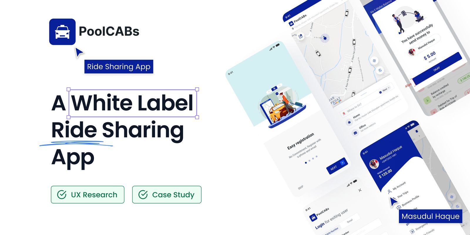
A white-label SaaS rider app for local taxi companies in Malaysia, the UAE and the Gulf. Research with 19 riders and drivers, 23 design problems solved, and around $35,000 in sales that led to three more projects.
Uber coming into the market has made more people want to use apps for getting cabs whenever they need. Because lots of people like using one app on their phones for this. This app I made takes advantage of all the local taxi companies that people still use. I looked at what other similar apps are doing and put in important things to make users happy. The way the app looks and works is also really modern, which helps the business stay in front of other competing companies.
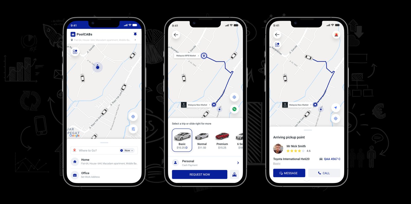
My manager from the company (techtsy.com) approached me with a requirement to create a White Label Saas Software solution for a car ride-sharing platform. The target markets include Malaysia, the UAE, and several Gulf countries, where well-known ride-sharing services like Uber, Grab, and others have already established successful businesses.
At the time, COVID-19 was a significant concern for everyone. As a result, I needed to incorporate safety features to ensure both riders and drivers remain protected. Additionally, a few special features were to be implemented alongside the main ride-booking system.
Some highlight requirements:
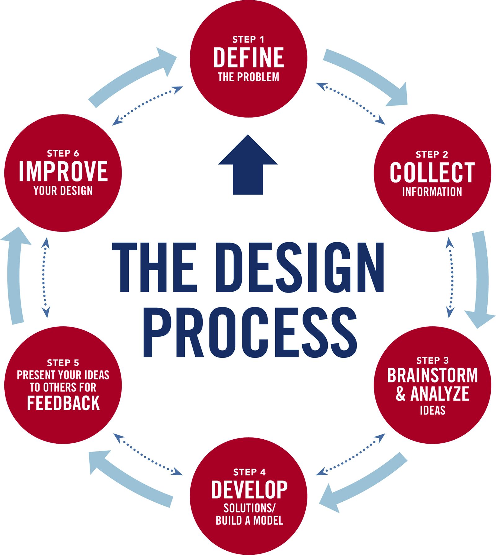
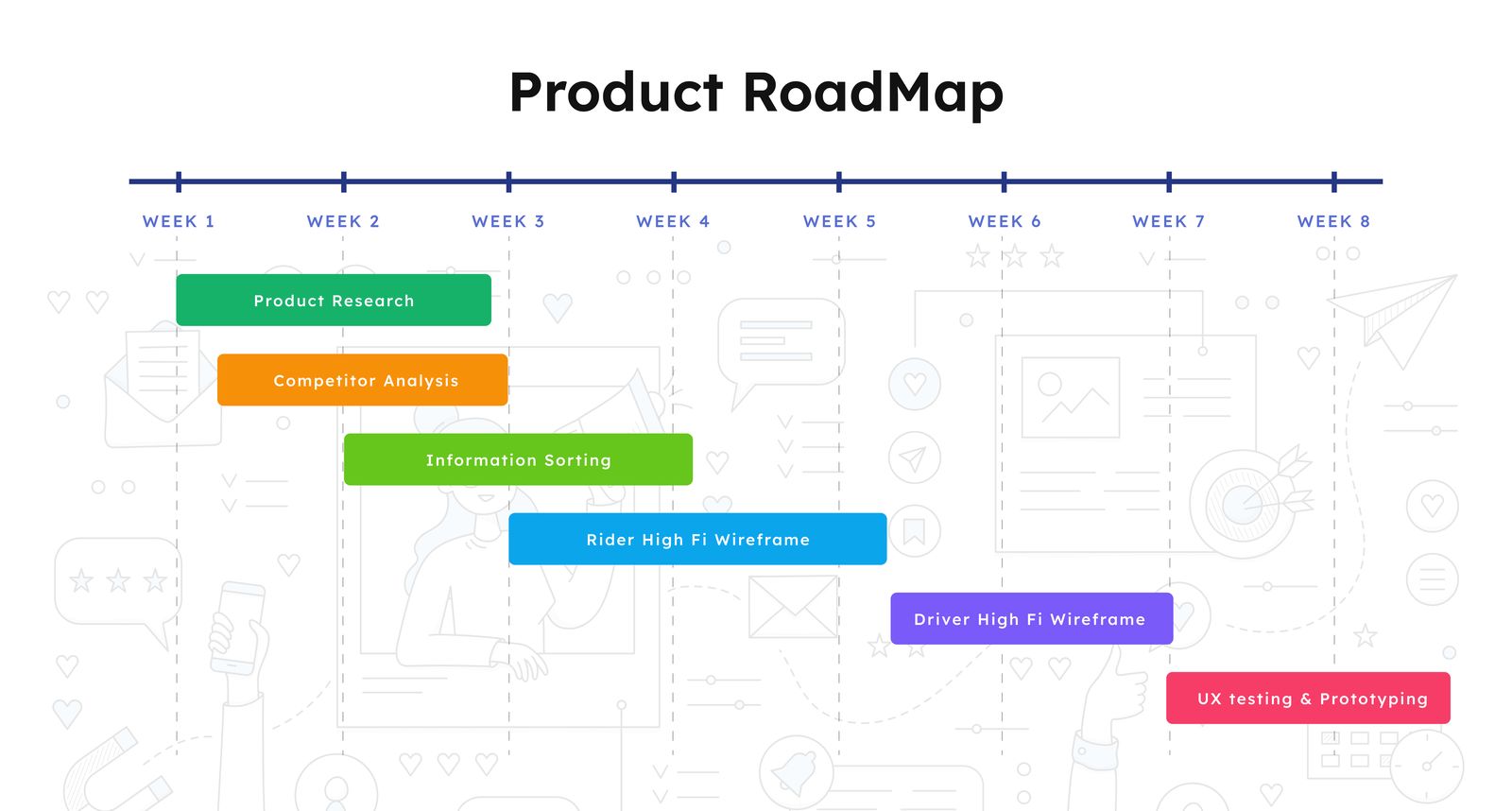
The project had a total duration of 8 weeks for both Rider and Driver app, which was divided as follows:
The design aims to enhance the user experience on both major mobile platforms:
Before diving into the design process, it is crucial to understand the ride-sharing industry and the target users. Several sessions are held with stakeholders, product managers, and project managers to gather information about their goals, the user demographics, target markets, and relevant business logic.
The platform consists of two separate apps for two distinct user groups:
Conducting interviews with stakeholders to learn about their goals, objectives, and expectations for the project.
The primary goal of the user interviews was to engage in conversations with both riders and drivers to gain insights into their needs, frustrations, and preferences.
A total of 19 user interviews were conducted, including 13 riders and 6 potential drivers. Instead of using predetermined question sets, the users were encouraged to share their experiences and discuss their pain points. The aim was to understand their everyday transportation challenges and preferences, as well as their expectations and concerns.
1-on-1 Conversations: The interviews are conducted as casual, one-on-one conversations in various target markets, including Malaysia, the United Arab Emirates, Pakistan, and Bangladesh. The interviewees are encouraged to speak openly about their experiences, with the assistance of my international co-workers.
Feedback from users was measured based on the number of users who mentioned specific issues or concerns.
Analysing the target markets and ride-sharing industry trends to identify opportunities for differentiation and improvement.
I always research the business's competitors before getting started on a design problem. It helps in my ability to identify a market niche and to compare the weaknesses and strengths of my competition. I may also use their areas of strength and weakness to strengthen my. We don't need to recreate the wheel, in my opinion. which issues have already been better resolved. If there is no issue, we must adhere to them.
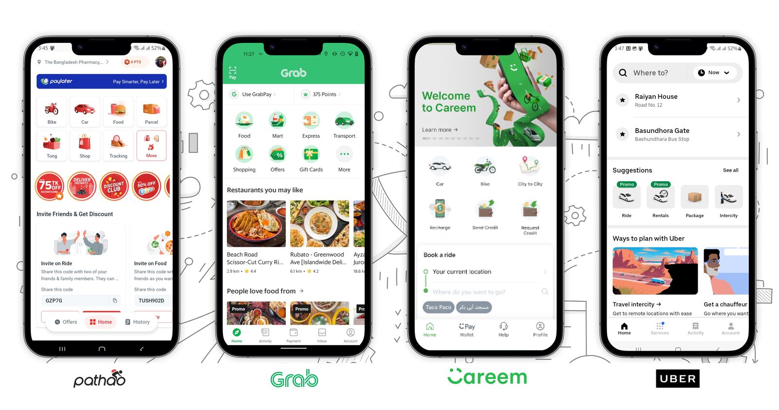
In this project, the competitive analysis focused on evaluating how other popular ride-sharing services addressed the issues identified during user interviews. The competitors analysed included:
Based on thorough market and user research, I've gained valuable insights that enable me to implement meaningful improvements. By adhering to an inclusive design process, I can address real-life challenges faced by users.
Before jumping into design, I discussed the Google Map API-related query with the development team to see how far we could go with the map. We also deeply discussed how we could calculate the fare based on various criteria. For example,
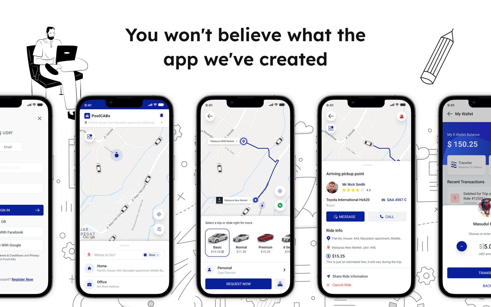
The first problem I want to share is that our stakeholders didn't have any preference colour for this app. So I have to select one which will be the best fit for this application.
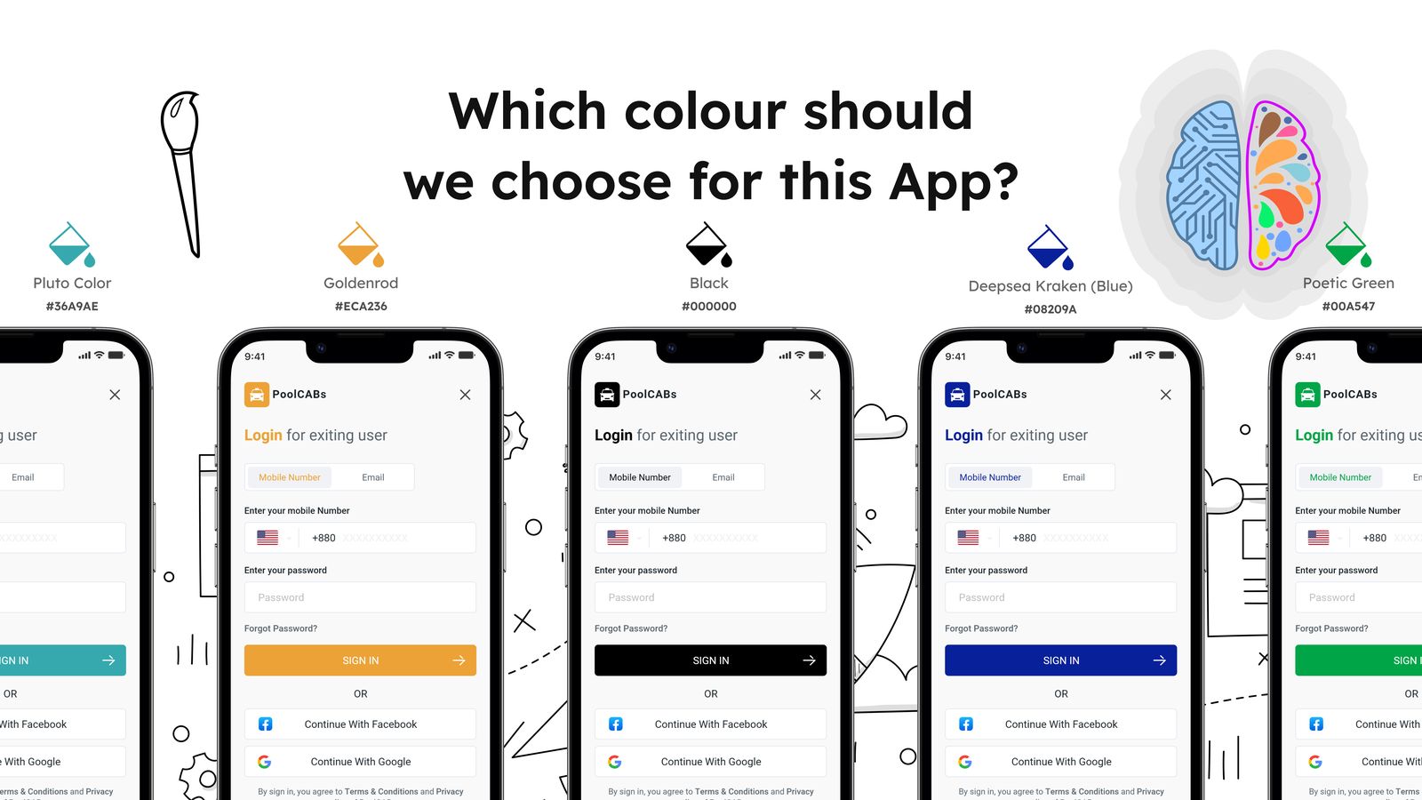
I had a plan to use more vibrant colours, so people could easily remember and identify our brand by its colour. Initially, I took five colours: Pluto, Goldenrod, Black, Deepsea Kraken Blue, and Poetic Green. I discussed with the marketing team about these 5 colours. By considering the printing campaign material and other web material, we can come up with the final list of 2 colours: Deepsea Kraken Blue and Black Colour. But I want to avoid direct contradiction with our competitors, so I decided to drop the black and choose the Deepsea Kraken Blue as our main colour for PoolCabs.
An essential aspect of a Ride-sharing application’s user interface is the use of cab icons to represent various vehicle categories. These visual elements enable users to easily identify the type of cab services available, streamlining the decision-making process and enhancing overall user experience.
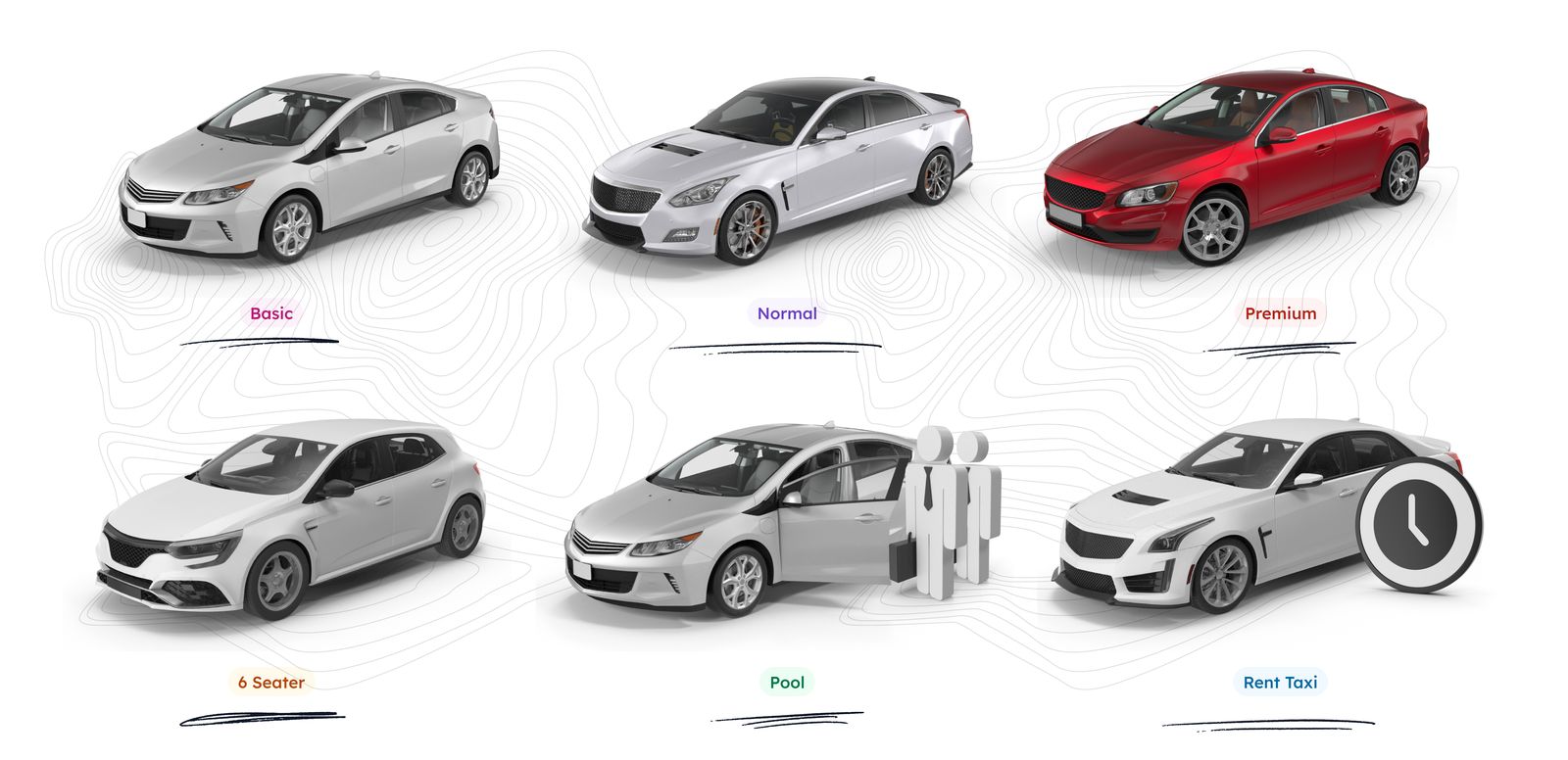
As a designer, I recognize the significance of acquiring high-quality car icons that accurately represent the diverse range of services offered. To achieve this, I source these icons from a reliable third-party service provider, ensuring that they meet the necessary design standards. Upon obtaining these icons, I carefully modify and tailor them to align with the specific requirements of the ride-sharing app.
During the design phase of onboarding users to the PoolCabs app, my main concern was to keep them engaged throughout the journey. To support our plans for launching the app in multiple countries, it was essential to incorporate features that allowed users to select from a variety of languages and currencies.
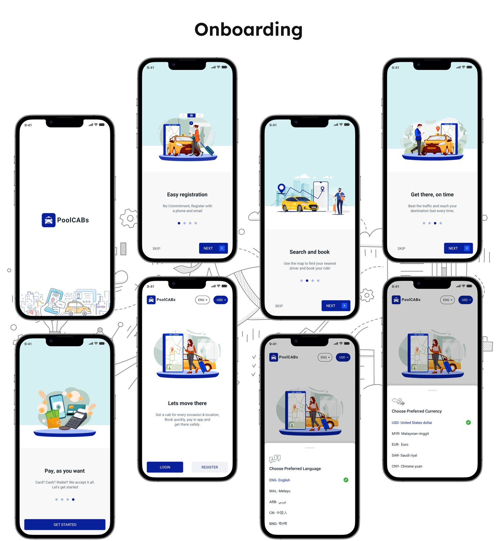
As a design solution for this journey, I extensively used eye-catching illustrations to enhance the overall experience. I collected various illustrations and customized them to align with the branding using Adobe Illustrator.
Additionally, I added the option for users to select their preferred language and currency during this journey. By default, the app will automatically select the currency and language based on the user's region. However, users have the flexibility to update and change these settings if desired.
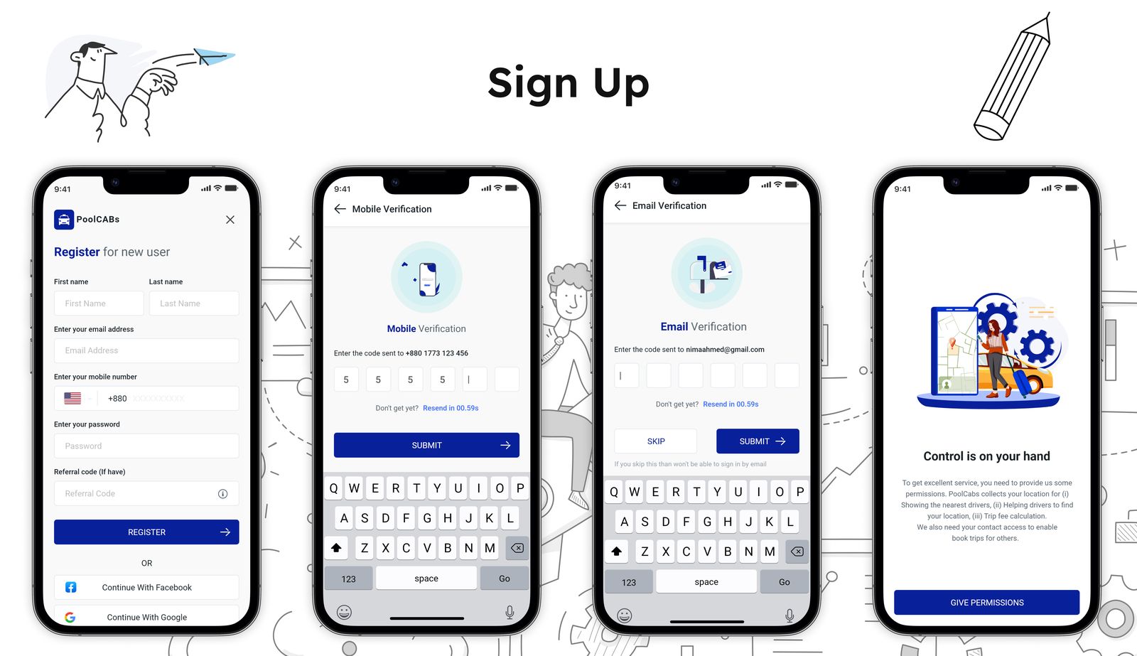
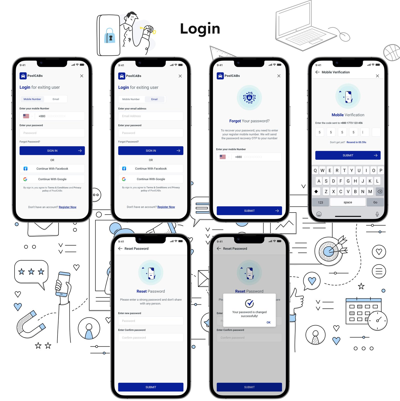
I had received a requirement to allow users to create accounts or log in using both their mobile number and email address. In addition, the developer team had specified that certain necessary device permissions would be required.
Along with that, I proposed a login process that utilized OTP (One-Time Password) as a convenient and secure way to authenticate users. However, considering the target audience of a start-up company, implementing an OTP login system was an expensive solution. Therefore, alternative solutions need to be considered.
We required a home screen design for our PoolCabs app that would cater to everyone's needs. Our app already incorporates support for multiple languages and currencies. However, we wanted the cars available for hire through our app to be accessible to a diverse range of users, including those with special requirements such as disabilities or children.
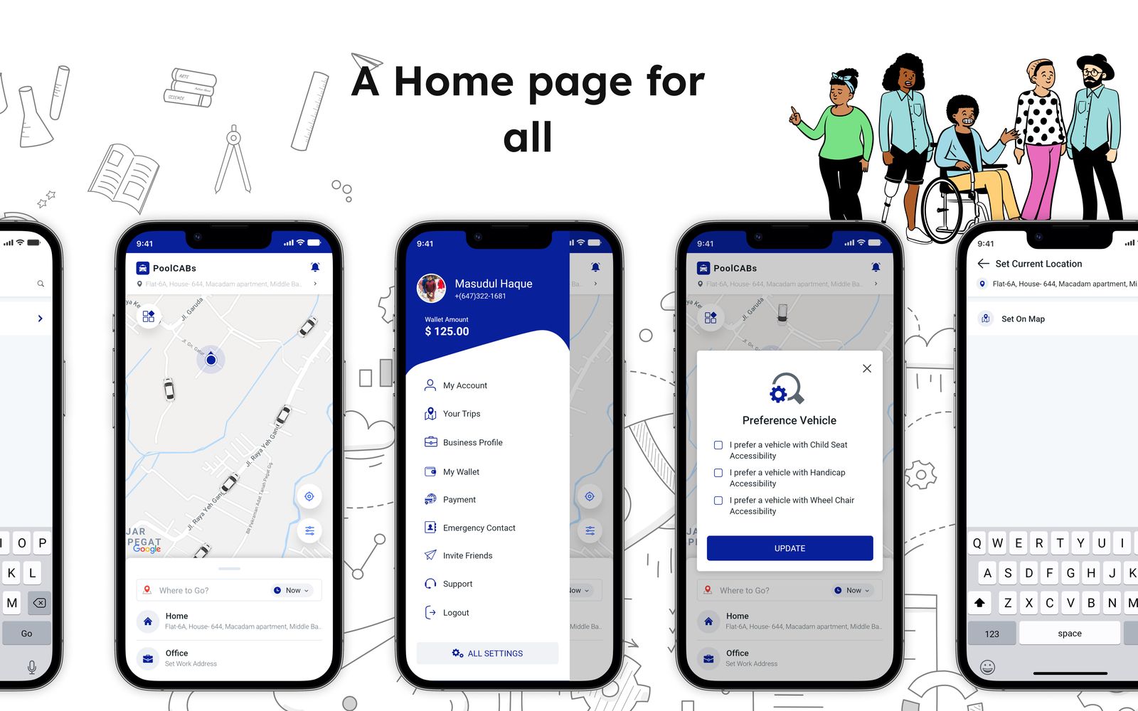
During the design of the home page, inclusive design principles have been followed-
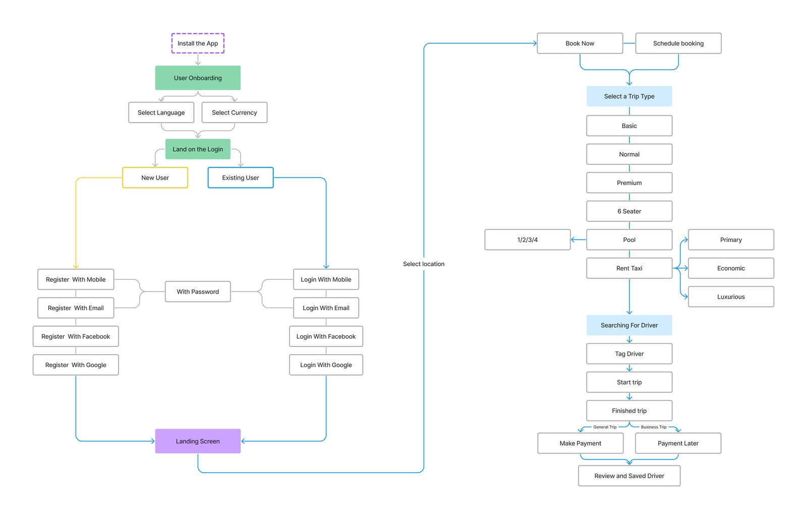
Ensuring a smooth destination setup is a crucial feature of a ride-sharing app. For returning users, the emphasis lies in enabling them to quickly set their location in order to save time and effort.
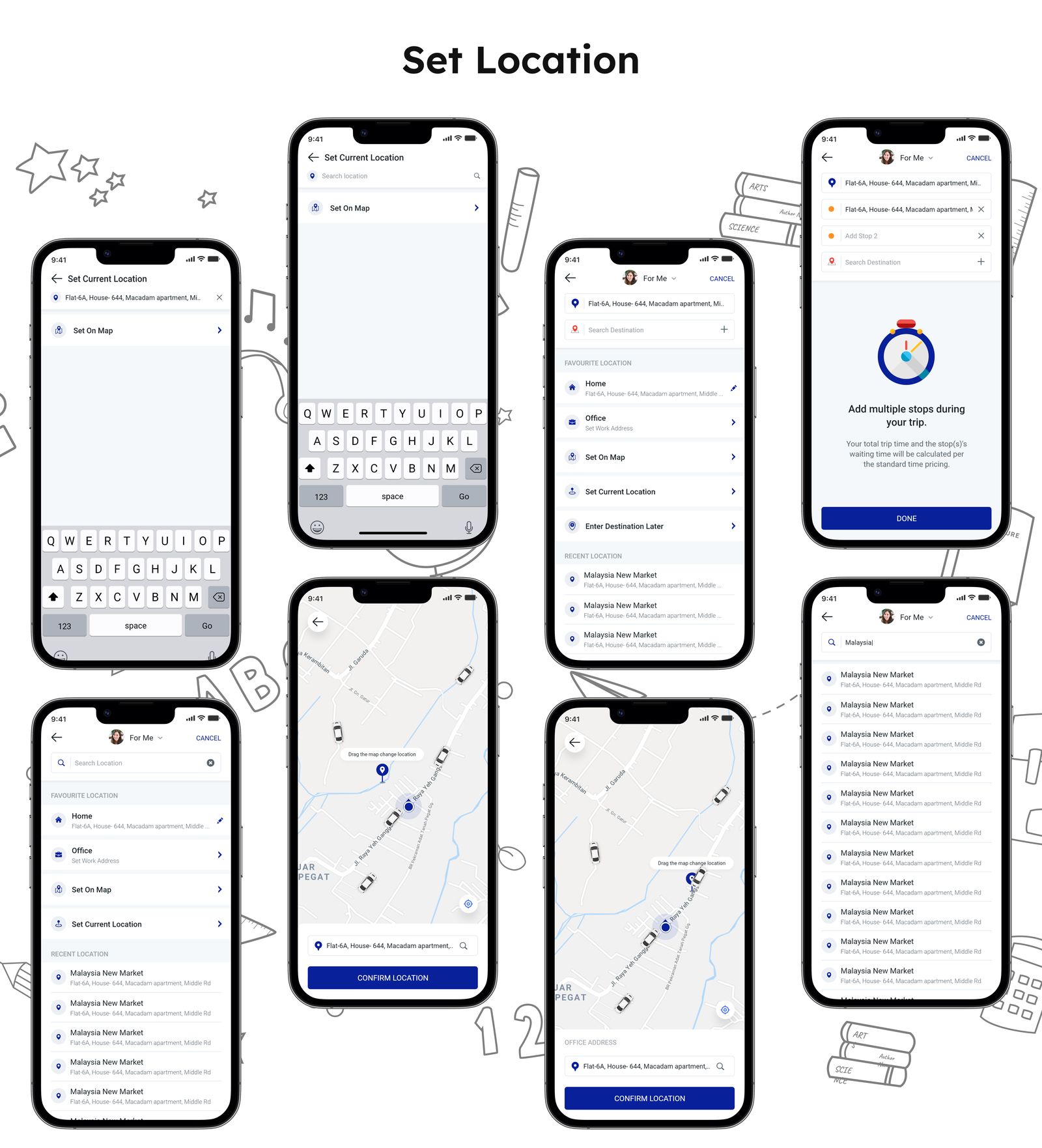
I designed a solution to address the location setup issue, incorporating the following features:
In our daily life, there are often instances where we require cabs at specific times. For instance, with scheduled meetups or a fixed commuting window from home to the office, having a scheduled booking system can prove to be a lifesaver.
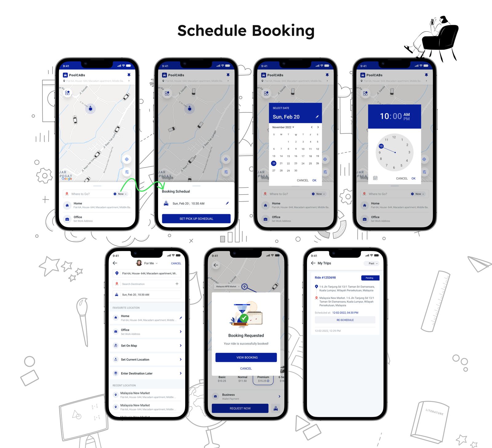
To address the need for a scheduled cab booking system, I implemented the following system:
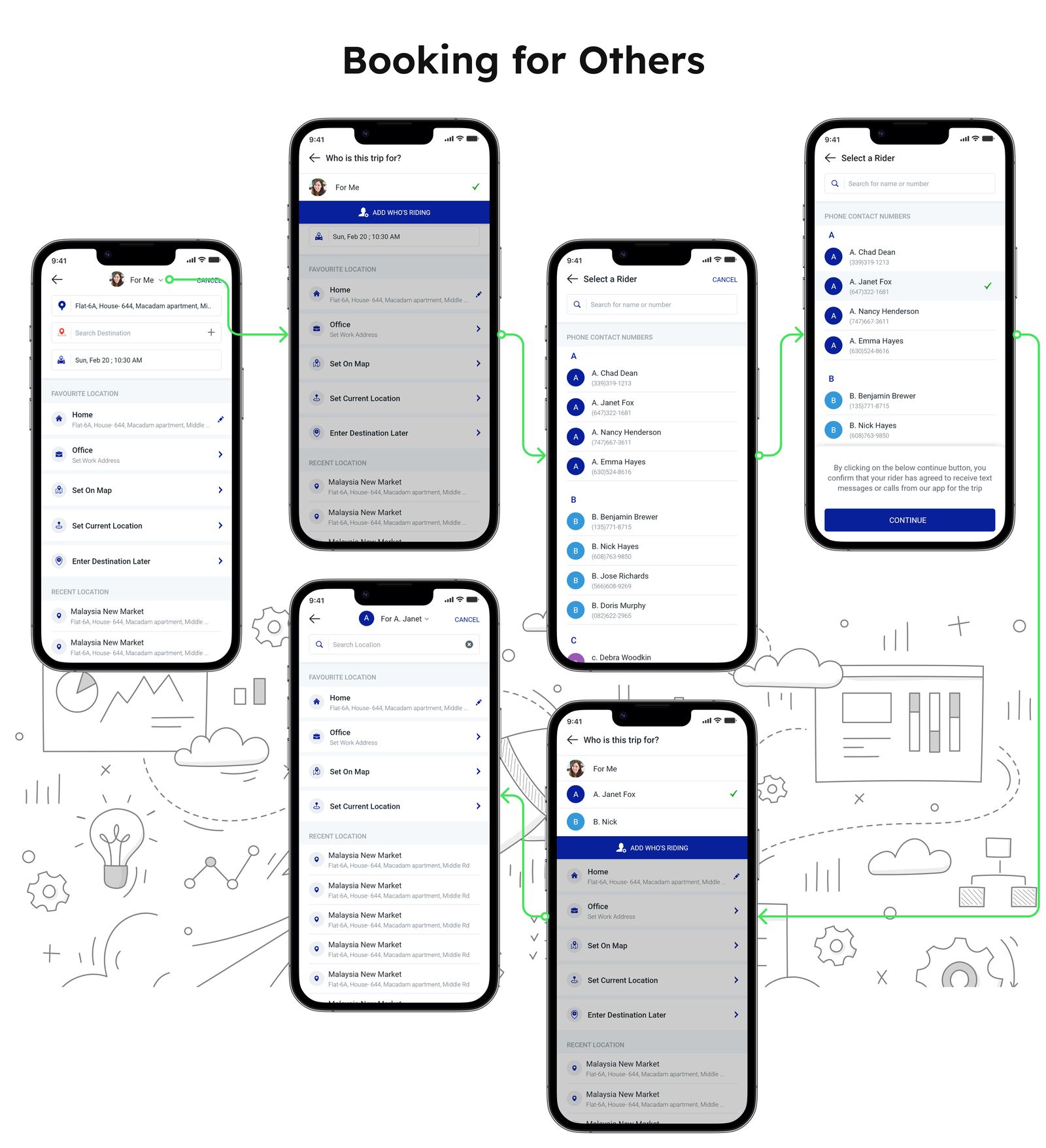
In situations where technological advancements pose difficulties, especially for older individuals like our grandparents, a helpful feature could be allowing someone else to book a cab for them. This way, they can enjoy the convenience of cab services without needing to use smartphones or apps.
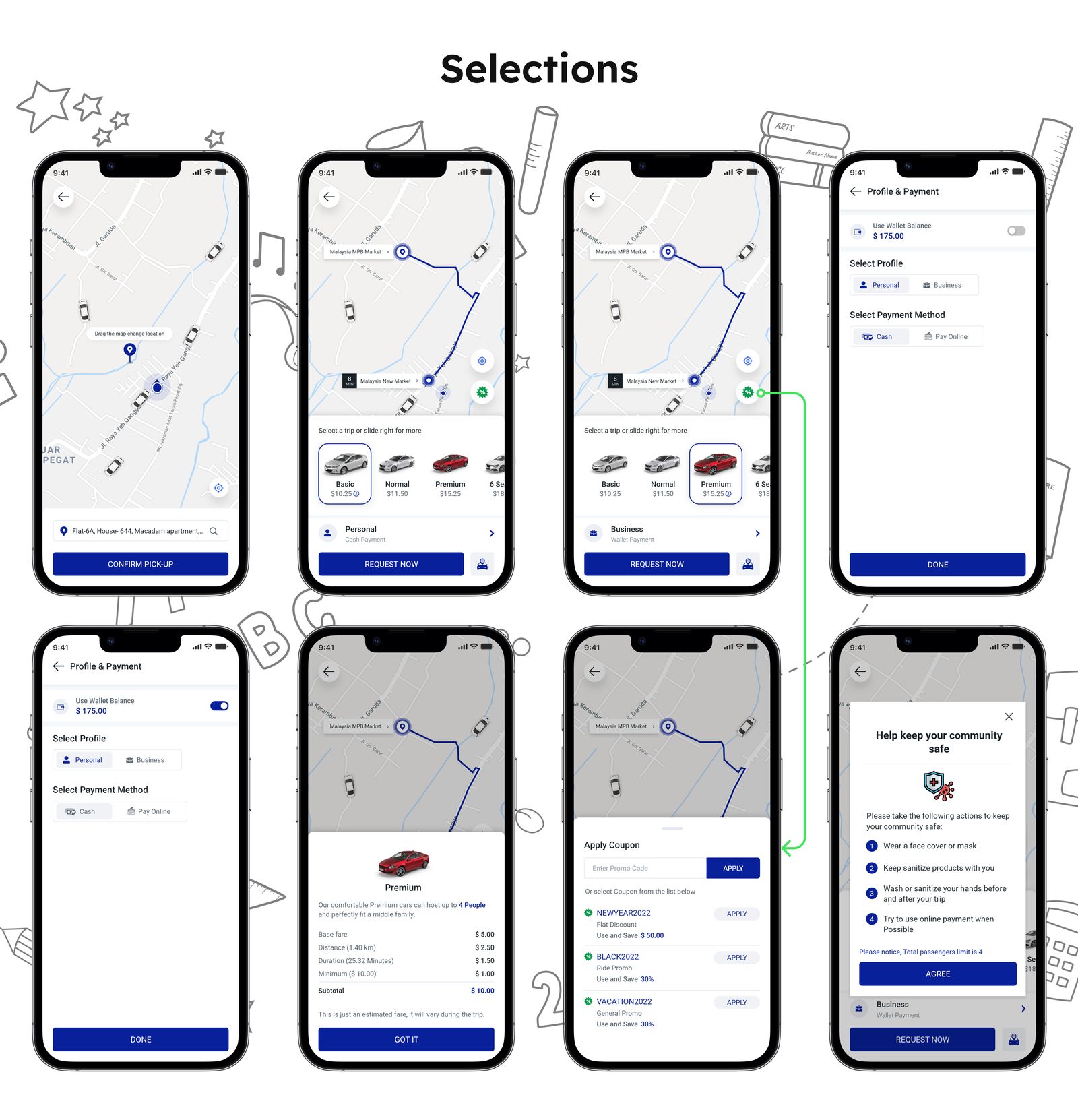
Classification matters everywhere. Every user has their own needs and preferences based on budget and comfort. Some use rides for personal tasks, while others need them for work. That's why having different types of cab options is important to suit these various needs.
After posting a trip, how can a user search for and tag a driver? The tagging process depends on various conditions. Communication with the tagged driver is also a crucial aspect of completing the journey successfully.
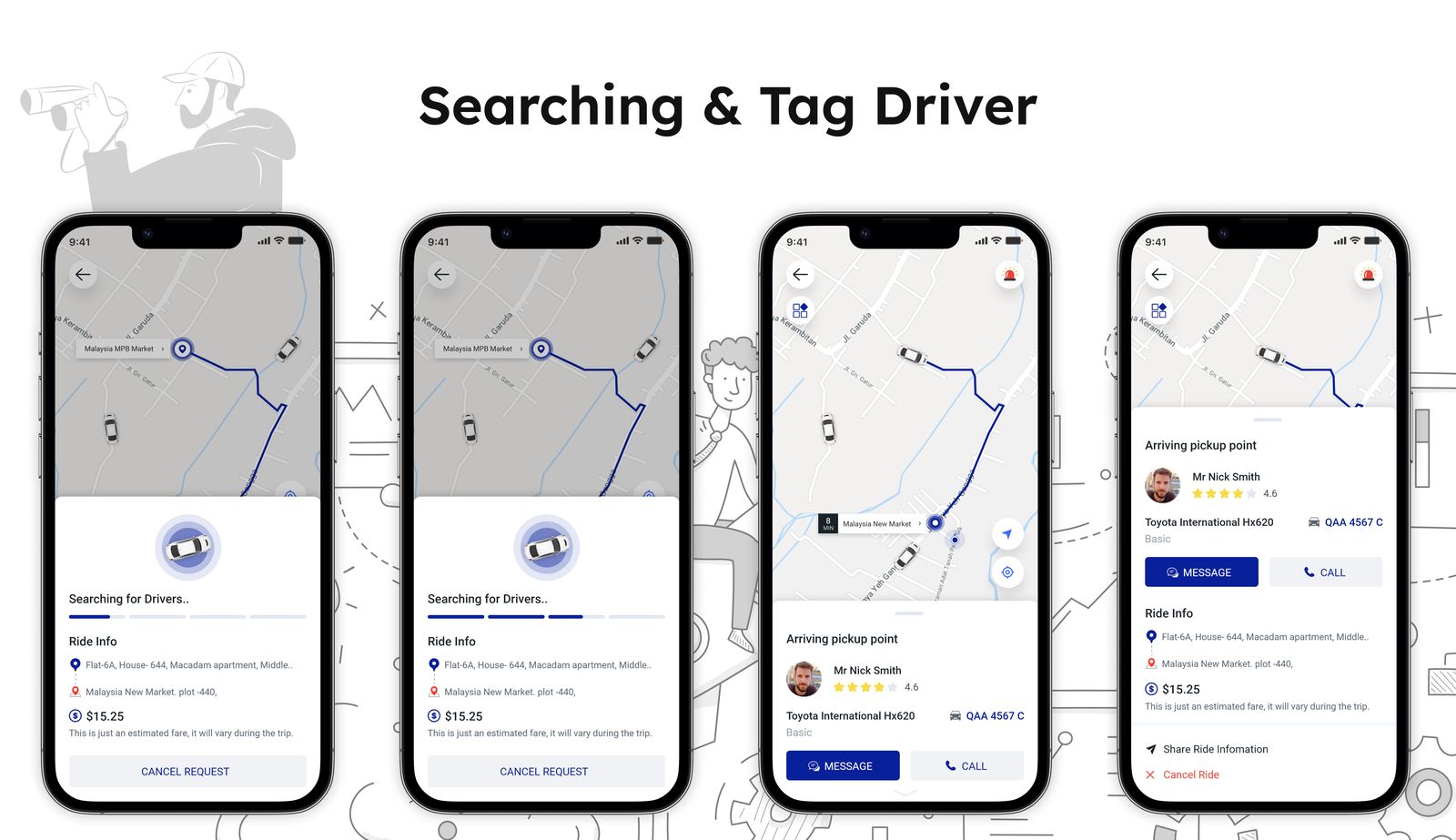
Communicating with the tagged driver is a crucial aspect of a ride-sharing platform, ensuring a seamless experience for both riders and drivers.
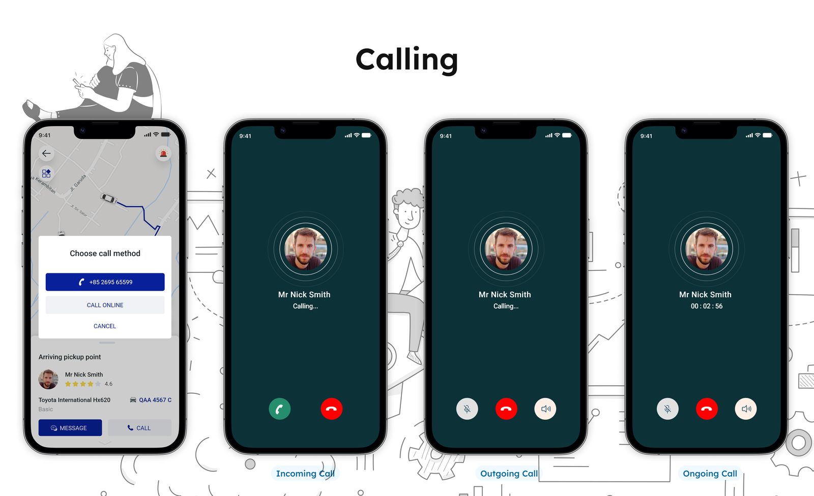
Communication Options for Seamless Interaction:
On our platform, effective communication between users and drivers is vital. I provide two main methods for this purpose: calls and in-app messaging.
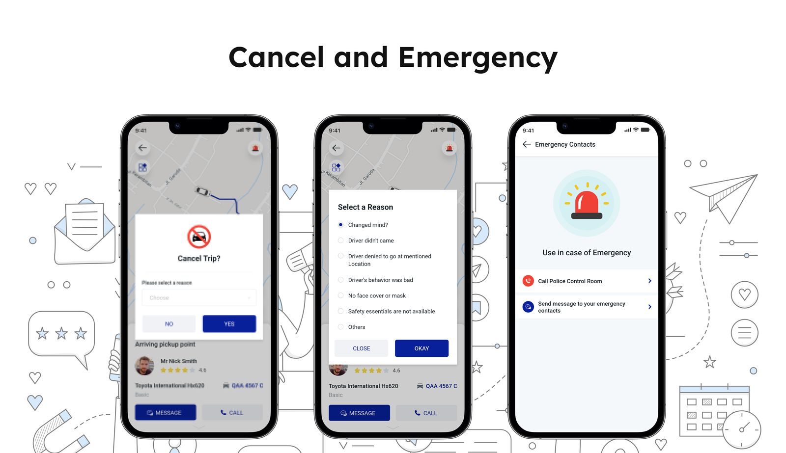
Providing users with the option to exit from any situation at all times is a fundamental user need. Additionally, ensuring safety measures are in place becomes crucial, especially when interacting with others on the road, as unforeseen emergencies can arise.
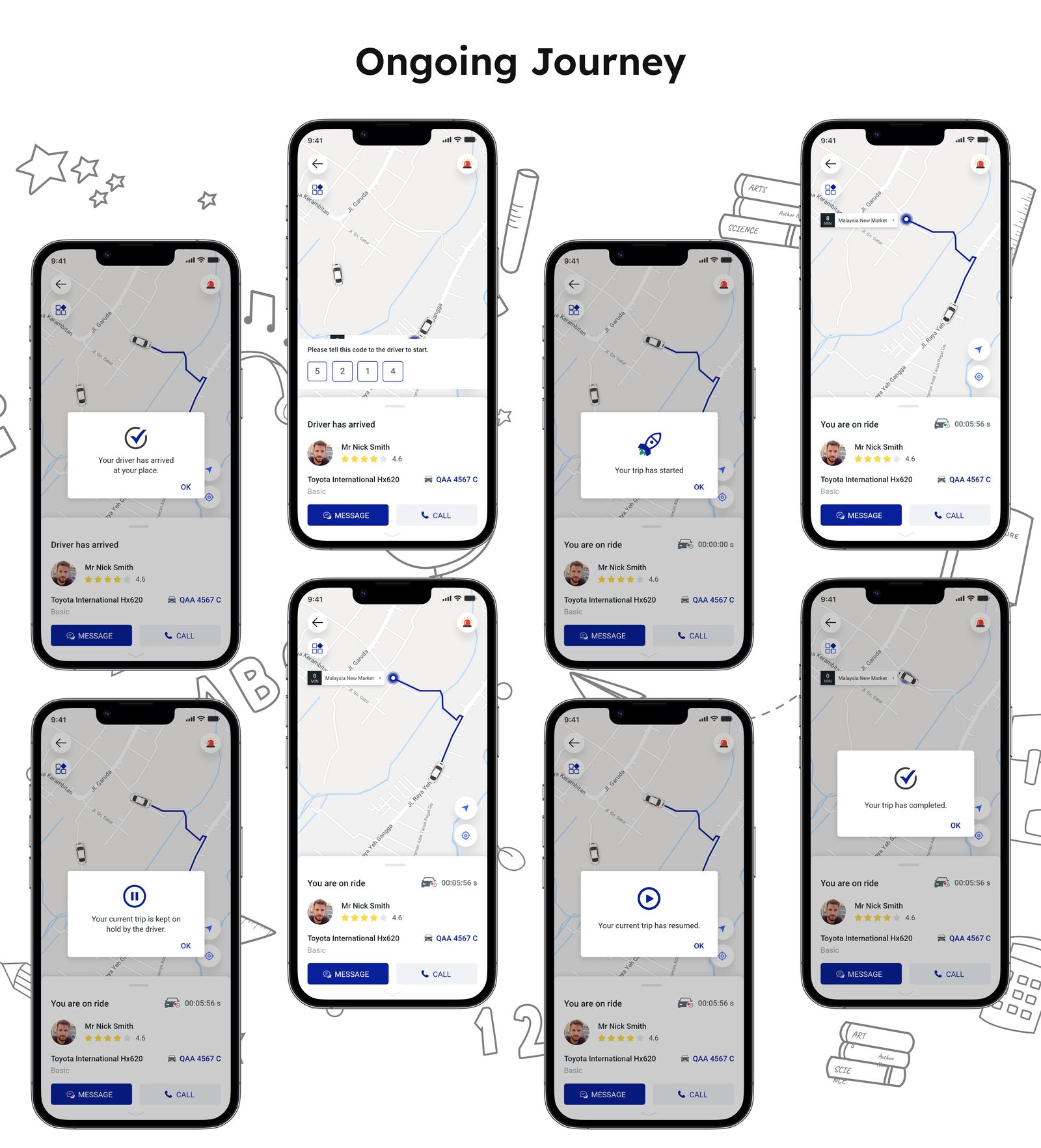
For a smooth ride journey, users need to consider several aspects. These include how to validate or start the journey, and what types of interactions to expect throughout the process.
We have determined fixed prices for certain routes based on the balance between demand and supply. This approach considers the needs of users and is a result of thorough our market research.
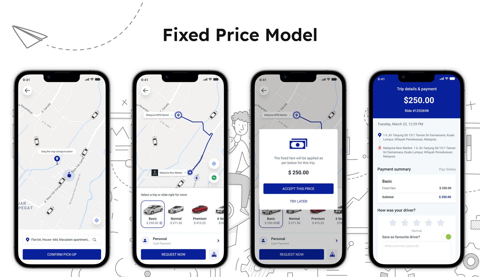
Many local users have specific locations they frequently travel between, such as from a rail station to an airport, which require consistent trips. To accommodate this, I've implemented a new pricing model that offers a fixed price for these specific routes.
This way, users can benefit from a consistent cost when traveling between these important locations, without being affected by variable pricing based on demand and supply fluctuations.
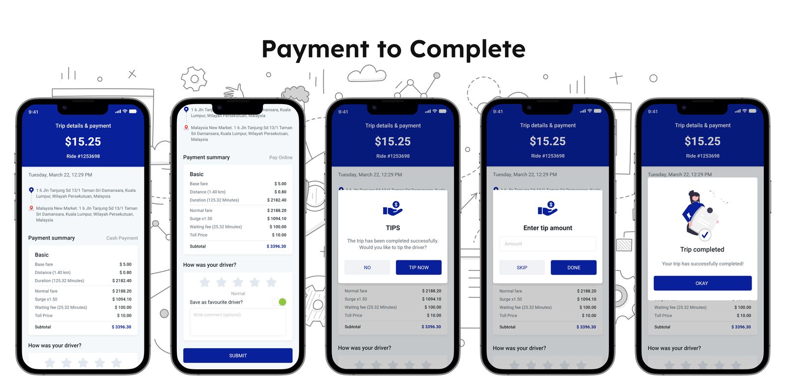
After the trip concludes, the payment becomes a primary concern for both the rider and the driver. Understanding how the bill is calculated and why it is set at a particular amount is crucial for both parties to ensure transparency and a smooth user experience.
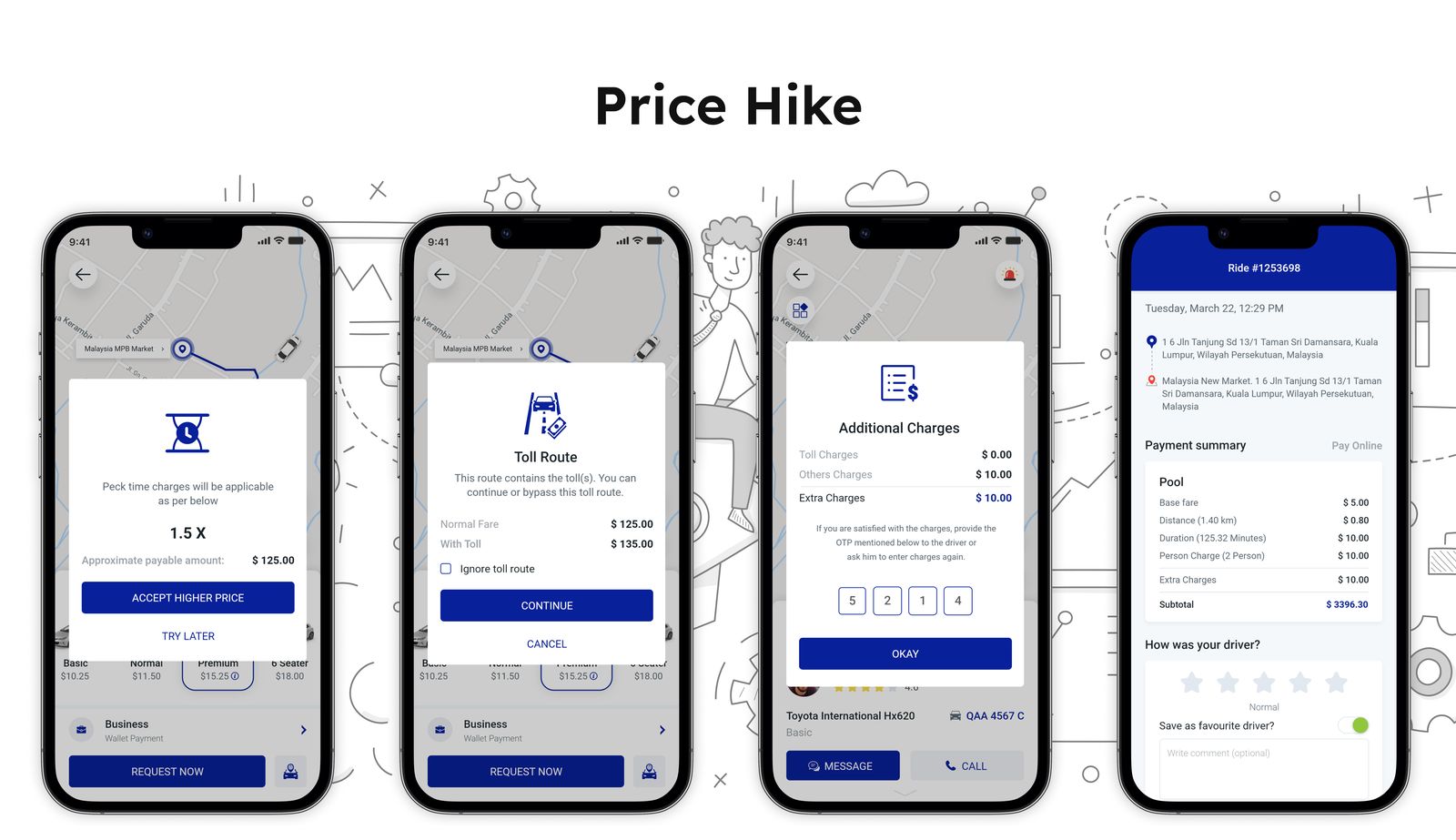
It's a common occurrence that rates might be higher than usual due to increased demand or additional charges for specific reasons. How does the platform inform users about such price hikes or extra charges?
When multiple riders travel together along the same route, the pool or ride-share option becomes a cost-effective and efficient feature.
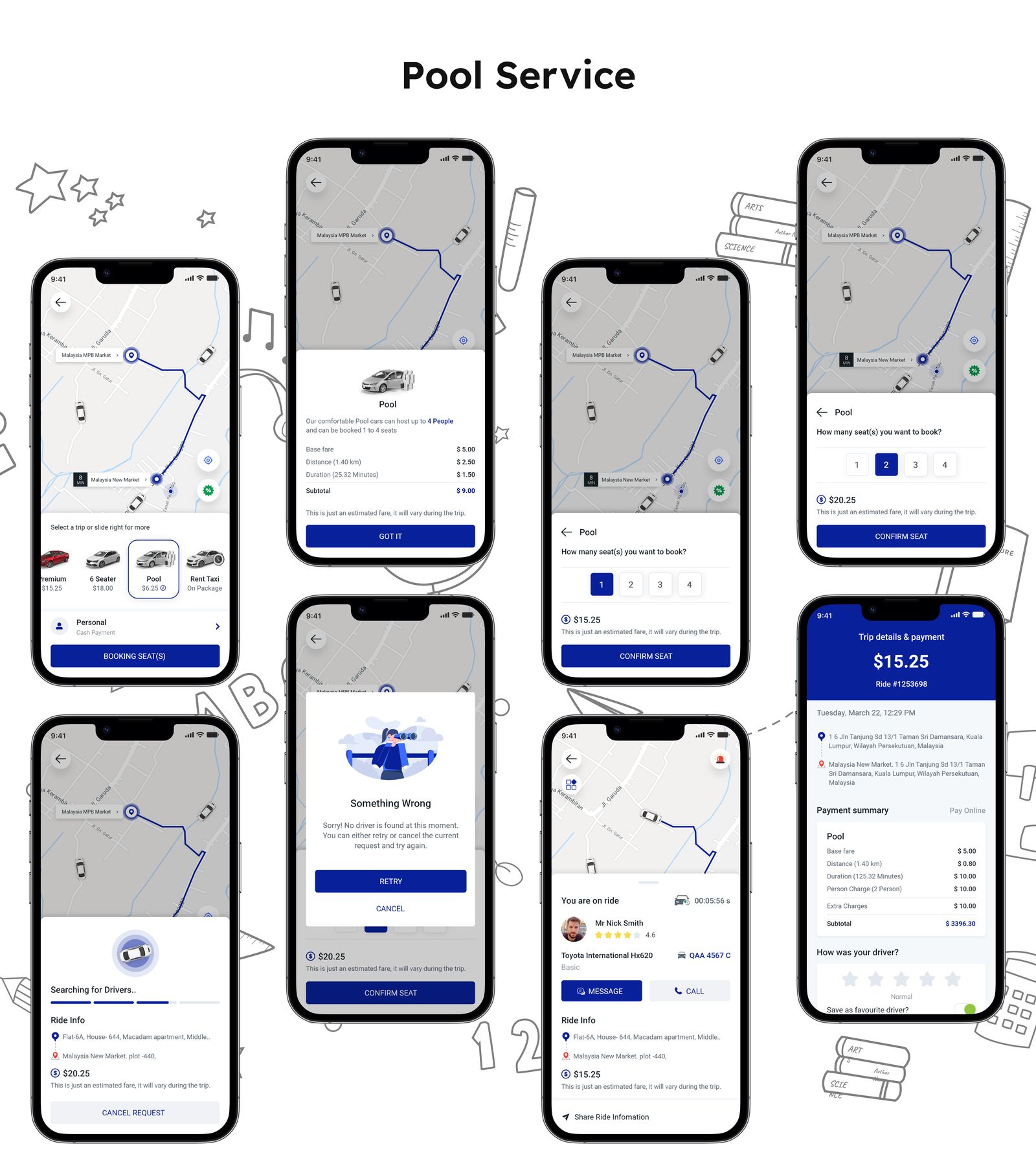
This Pool service is designed to optimize ride-sharing and fare distribution, providing a convenient and cost-effective experience:
1. Individual Seat Selection:
Drivers who offering the Pool service allow riders to choose the number of seats they require in the cab. If a rider needs only one seat, the app will assign them accordingly.
2. Efficient Seat Allocation:
When riders with similar destinations share the same route, the service ensures that available seats are effectively utilized. This minimizes any empty seats and maximizes the efficiency of the ride.
3. Fare Splitting:
Riders who share the cab will have their fares split evenly. As a result, the cost is distributed among all riders, offering a more affordable option compared to traditional rides.
The presence of various local transport agencies in the market has expanded the competition for cab services. If these agencies were to join this platform, it could significantly enhance the platform's success prospects. They can rent out their cars on a time basis. Our market research indicated that such an inclusion could lead to substantial growth.
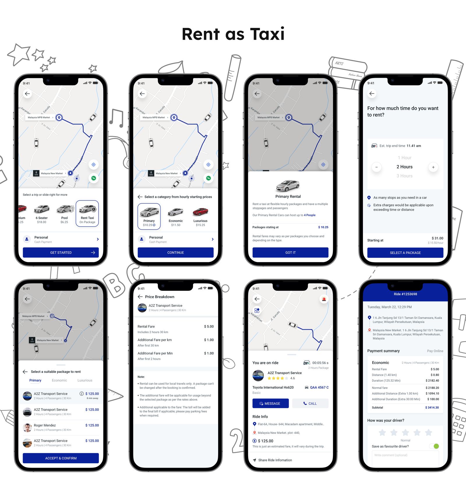
There are two rental options available for the Rent Taxi service:
To personalize and update various features and system preferences, you'll need to access the central hub known as "Account & Settings.”
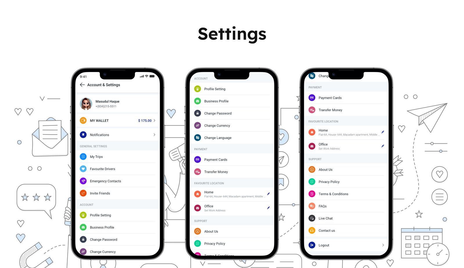
Certainly, the Account & Settings section is the user's central hub for customizing and updating a variety of features and preferences. This includes options like managing user’s Wallet, configuring Notifications, reviewing their Trip history, accessing information about Drivers, and much more.
The E-Wallet feature enhances the ease of online payments for trips, ensuring a smoother experience. Moreover, after the trip concludes, the system seamlessly processes the driver's payment from the wallet.
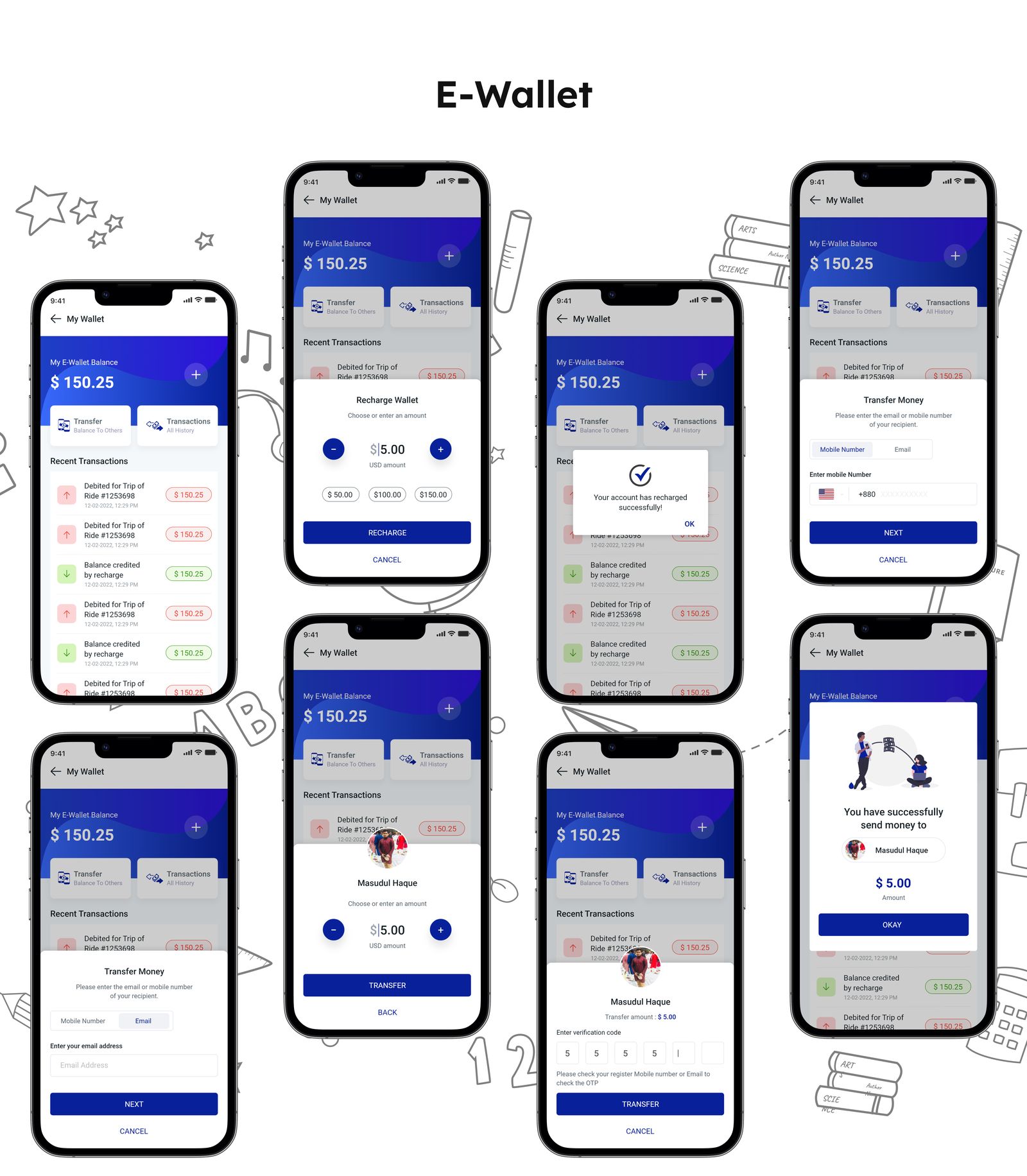
The E-Wallet feature operates in two primary parts:
Certainly, there should be a method for users to track and access their lifetime trip history, encompassing both completed trips and scheduled bookings, directly on the platform.
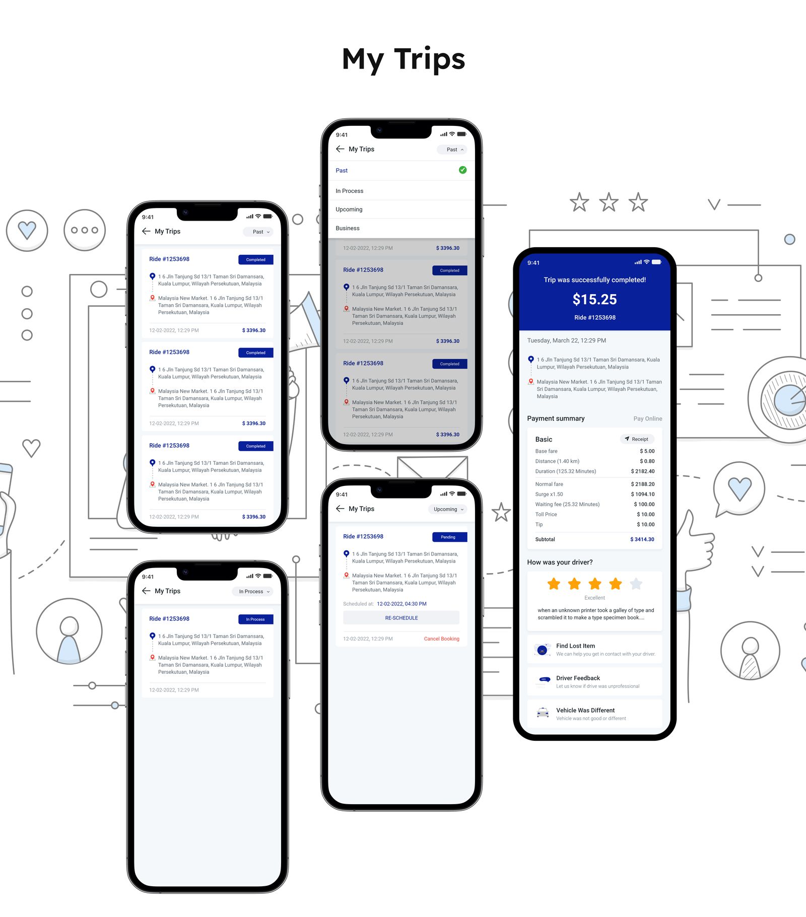
The page for tracking trip history is designed to facilitate user interaction with four distinct sections, accessed via a dropdown menu:
For official or business-related tasks, riders often need to book cabs multiple times. To manage this, riders have a distinct method for tracking these trips, along with a separate billing process.
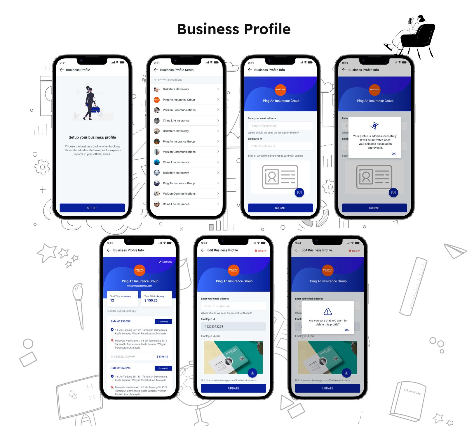
Here's how the Business Profile feature works:
There are many related screens that show various functionalities. Take a look at some examples here.
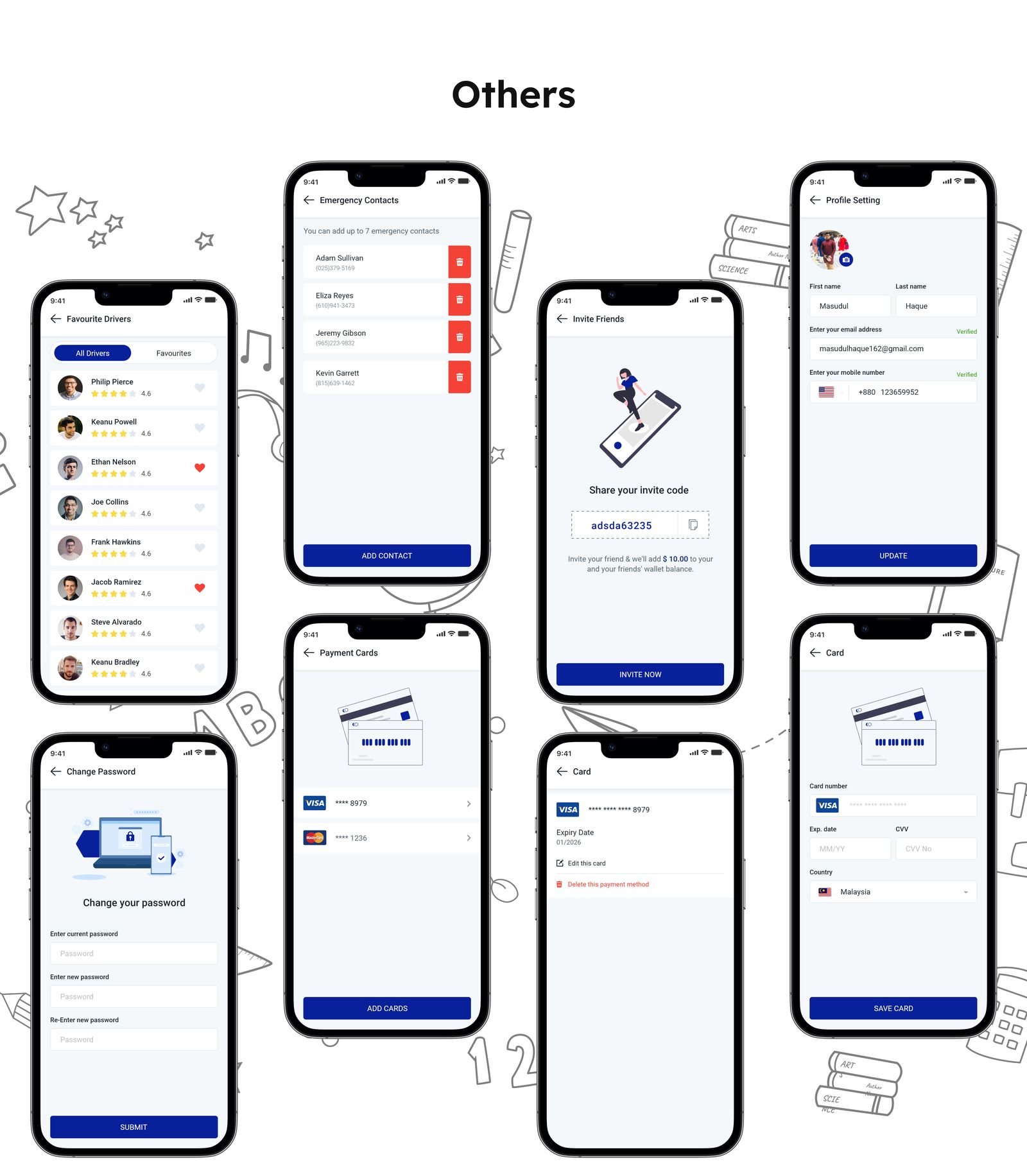
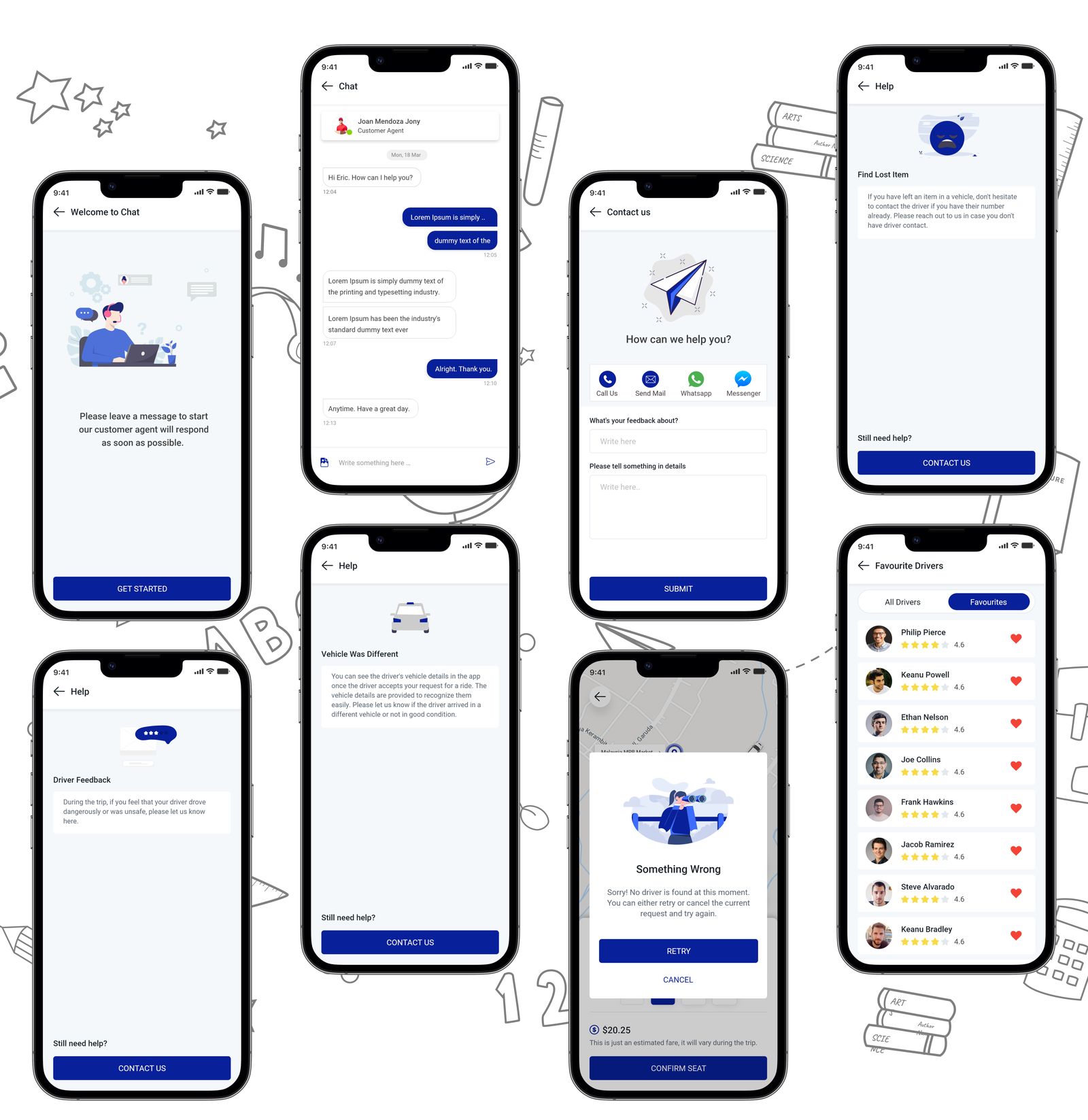
I had to go through multiple revisions when designing, and one lesson I learned from this was to never take the wireframes lightly. Due to the short deadline, I omitted the wireframes and immediately began designing. This caused a number of modifications where I may have accumulated some time. Nevertheless, it was a worthwhile lesson.
I think there's room for improving user experience in any product. I've also identified areas where design enhancements can be made.
This story covers the rider's part. I will be back with the driver's part soon!
This is my story for creating the White Label SaaS Software for ride-sharing service. A straightforward strategy with only the features that are essential. Hope you liked this story.
Happy Designing 😊
Md Masudul Haque
Let’s connect!
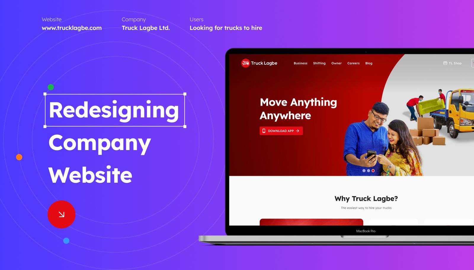
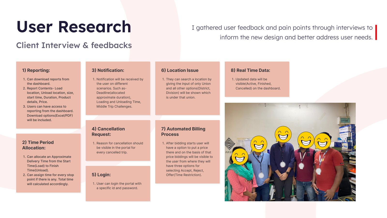
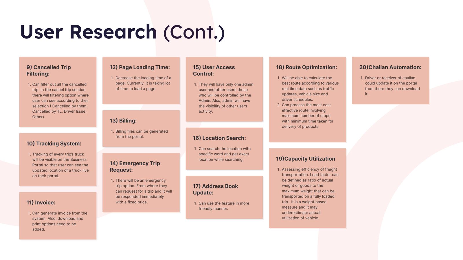
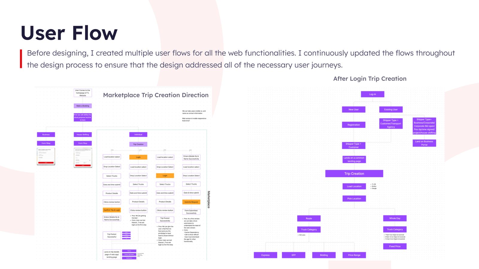
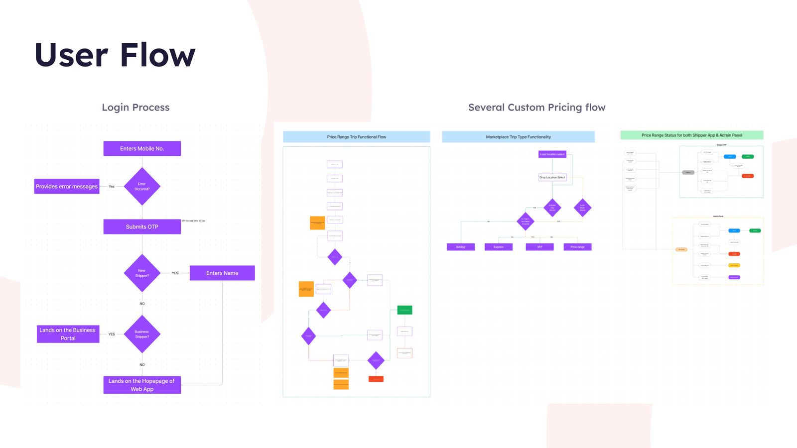
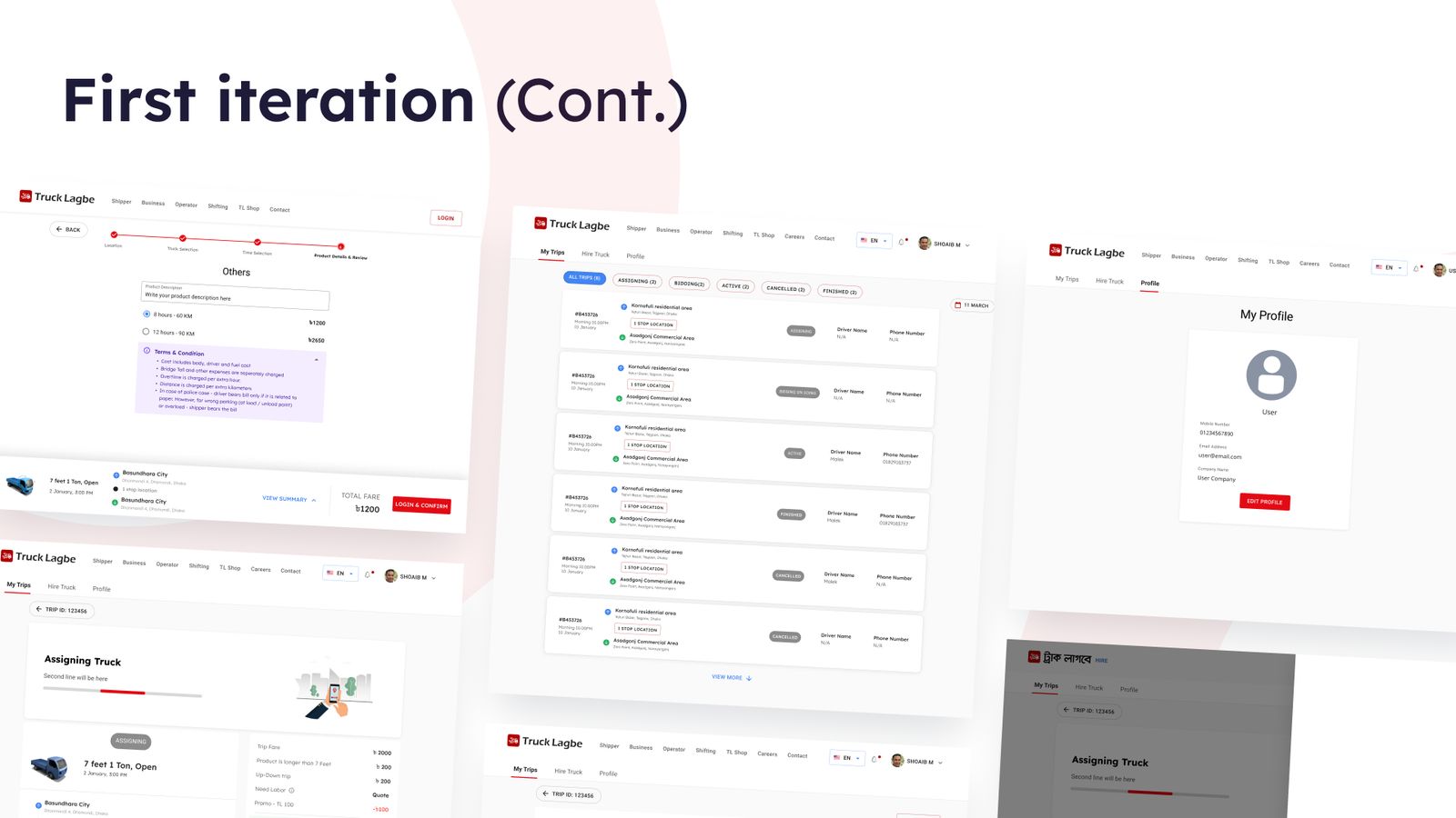
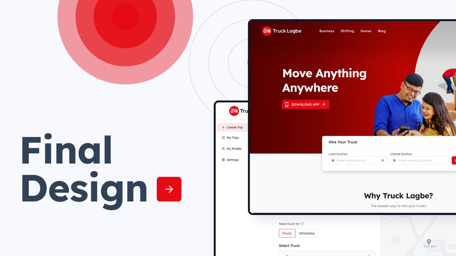
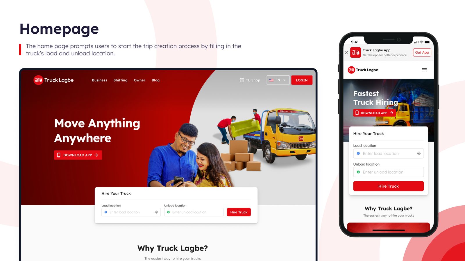
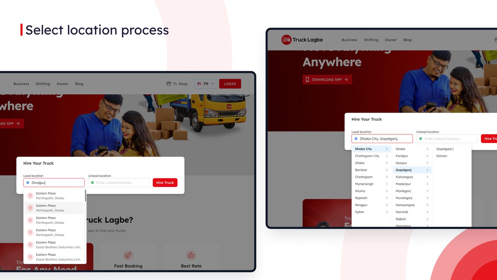
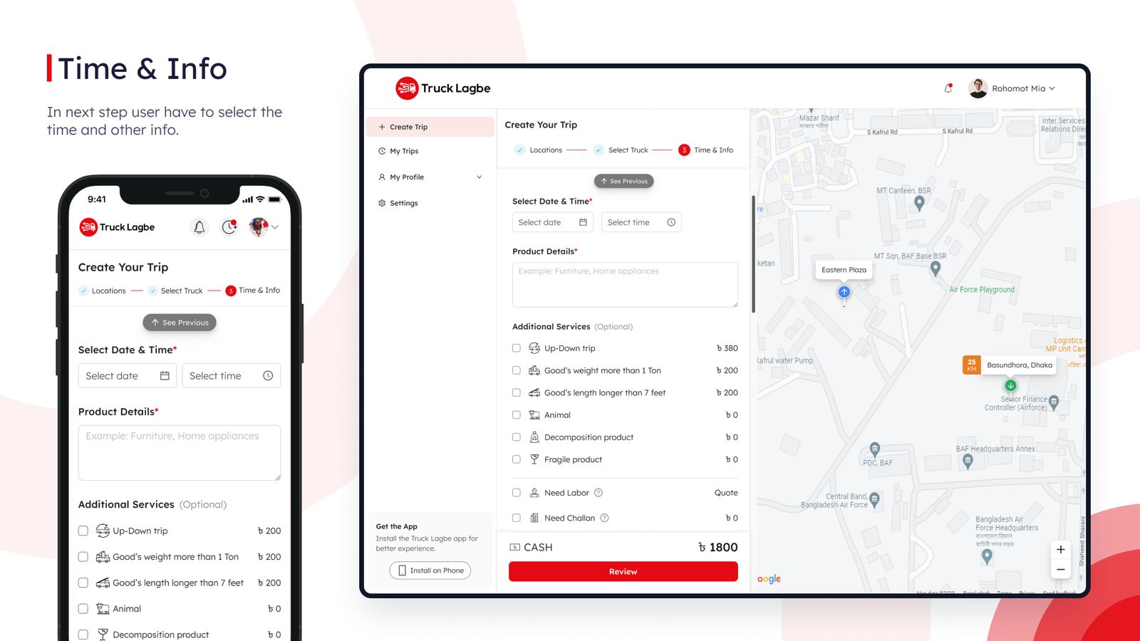
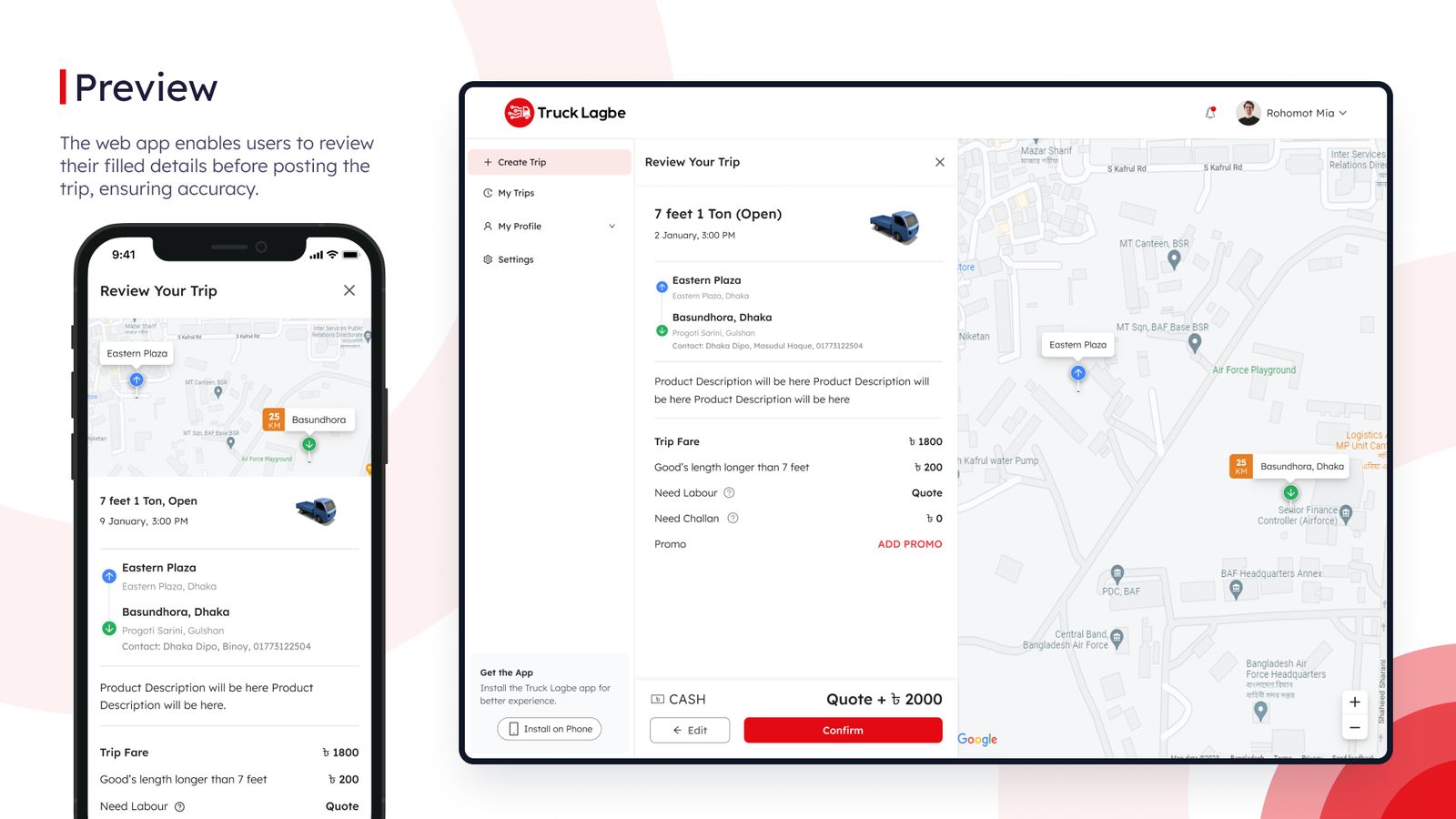
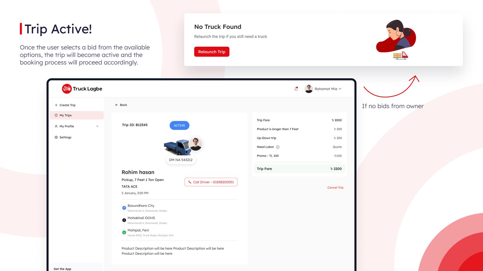
A ground-up redesign of Bangladesh's digital trucking platform with a truck-hiring flow built in. Monthly traffic grew by 55%.
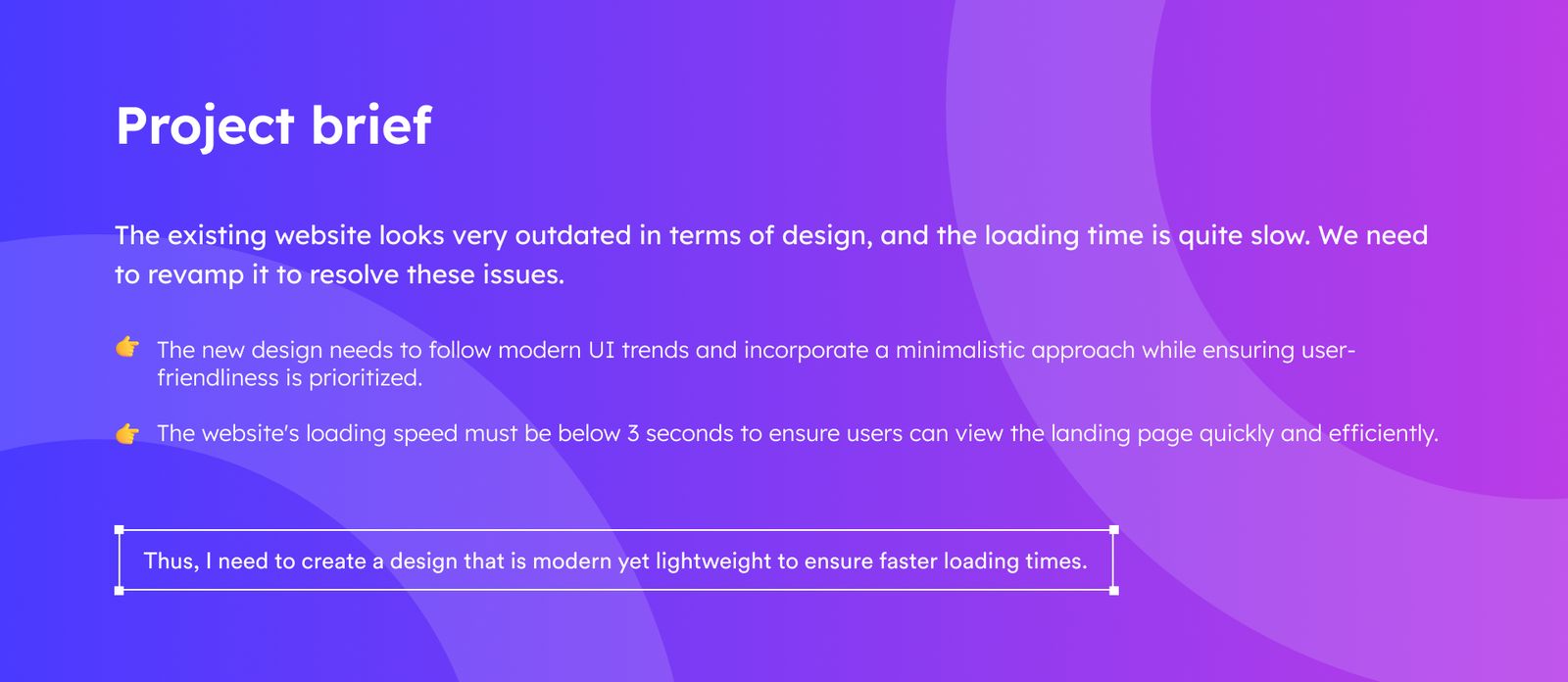
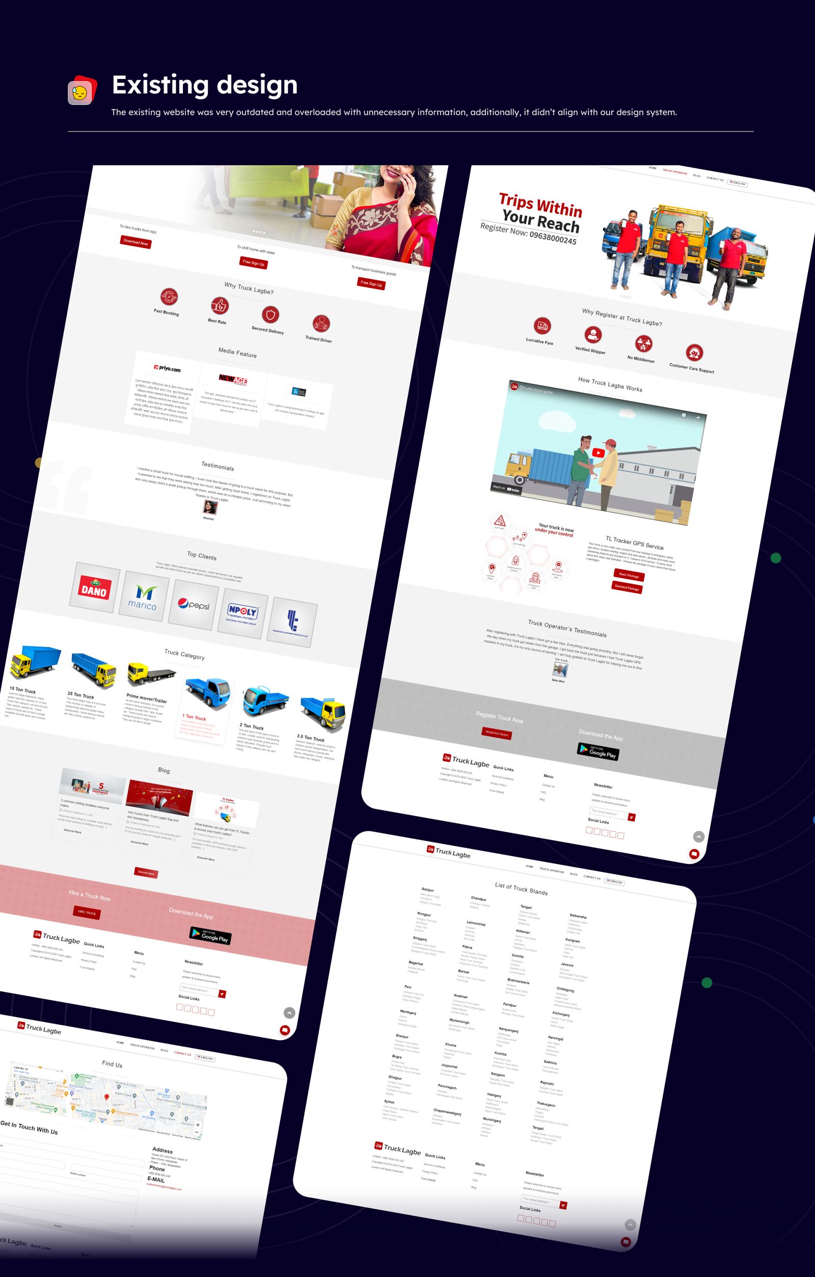

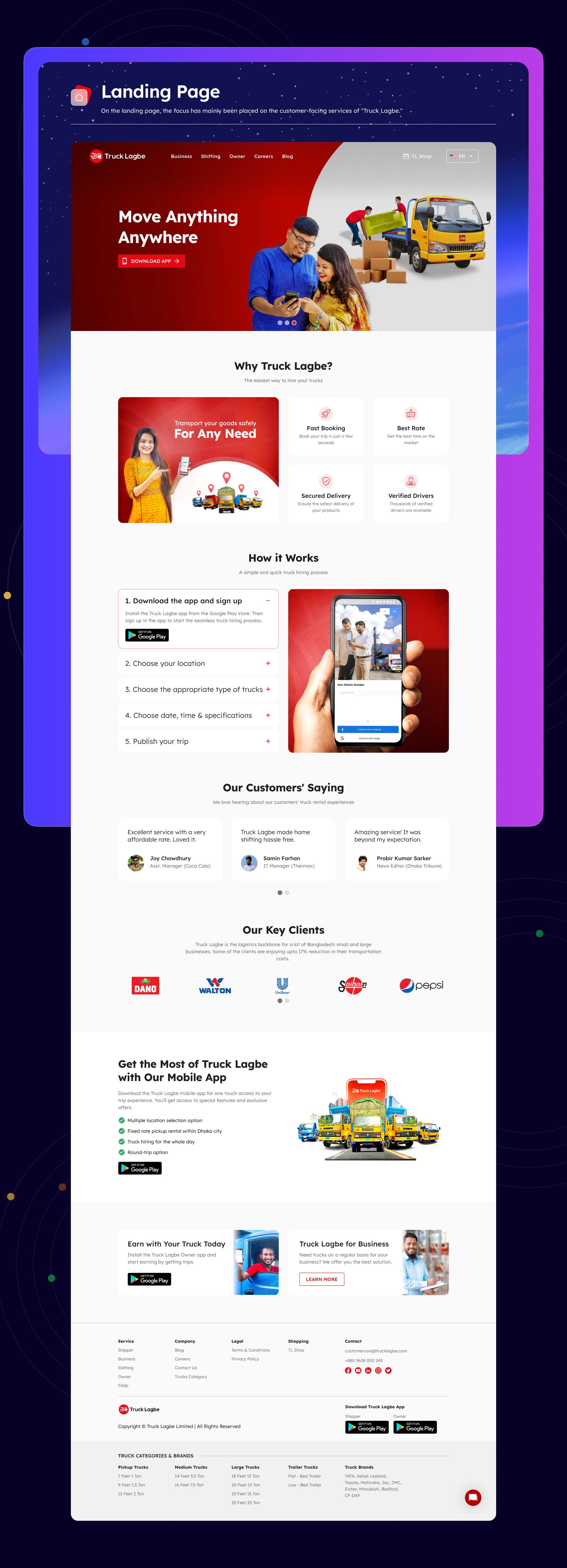
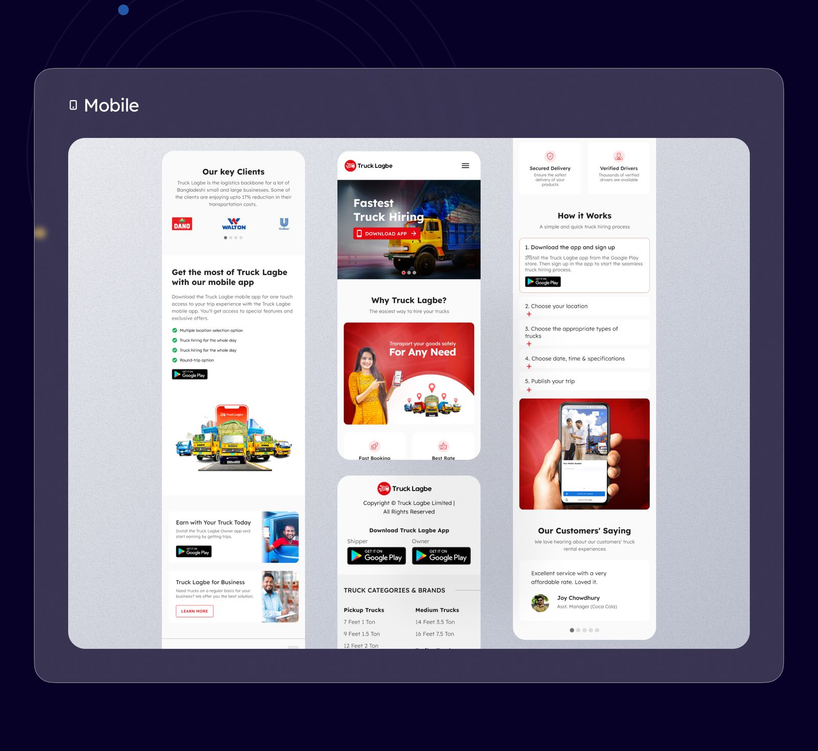
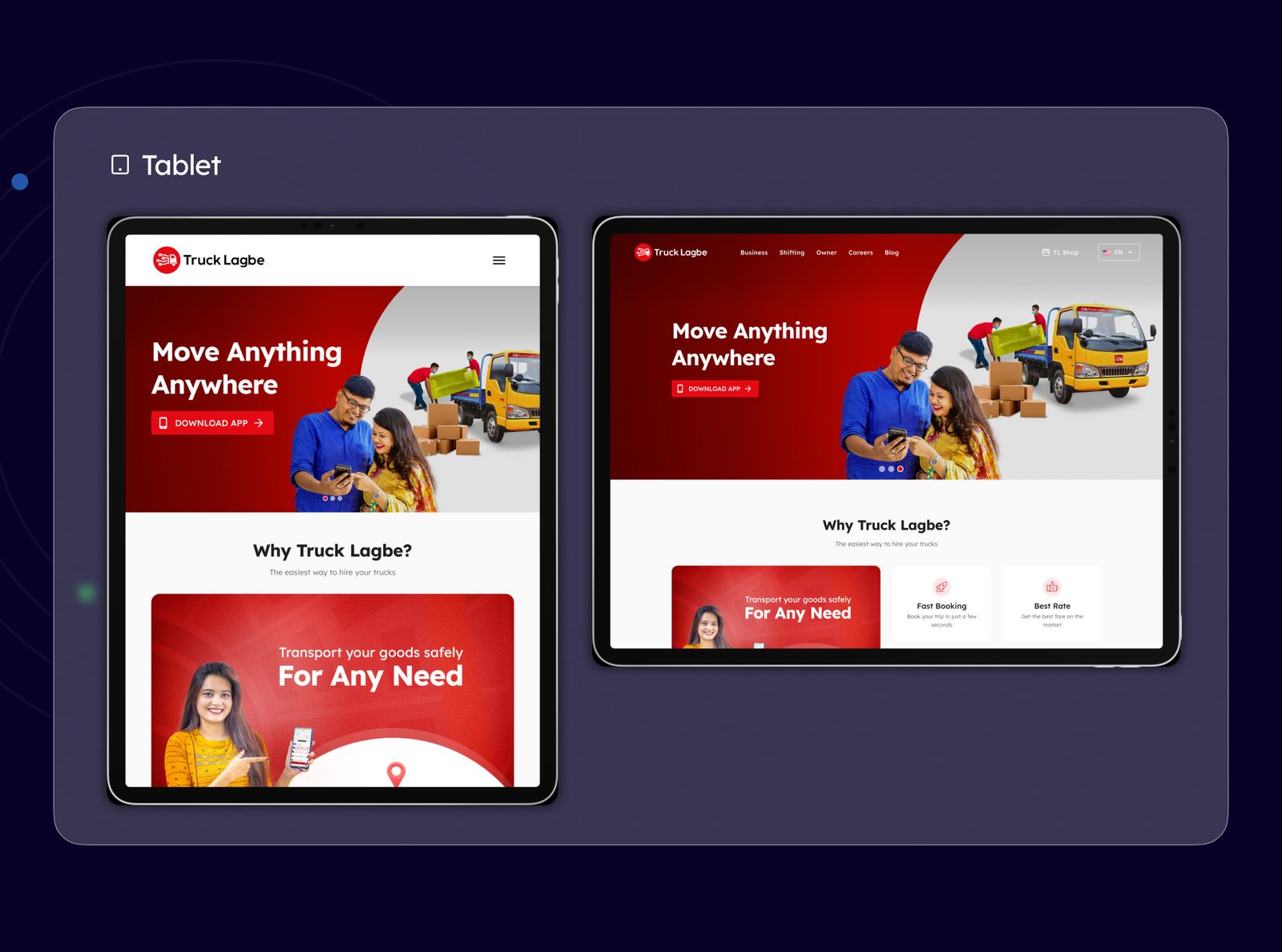
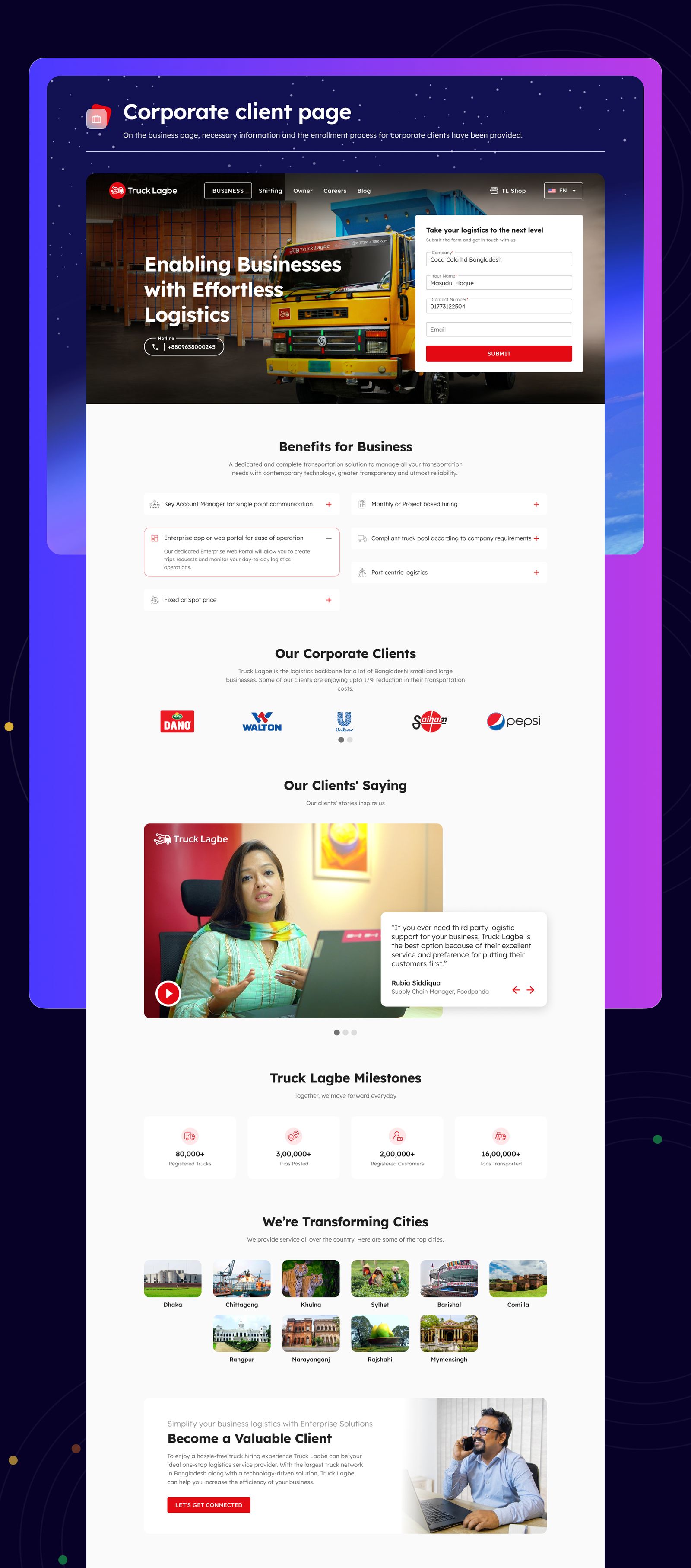
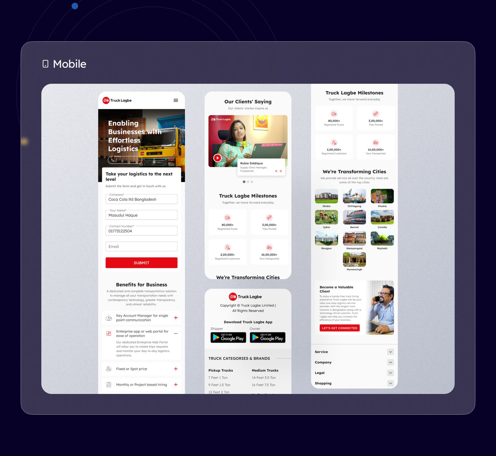
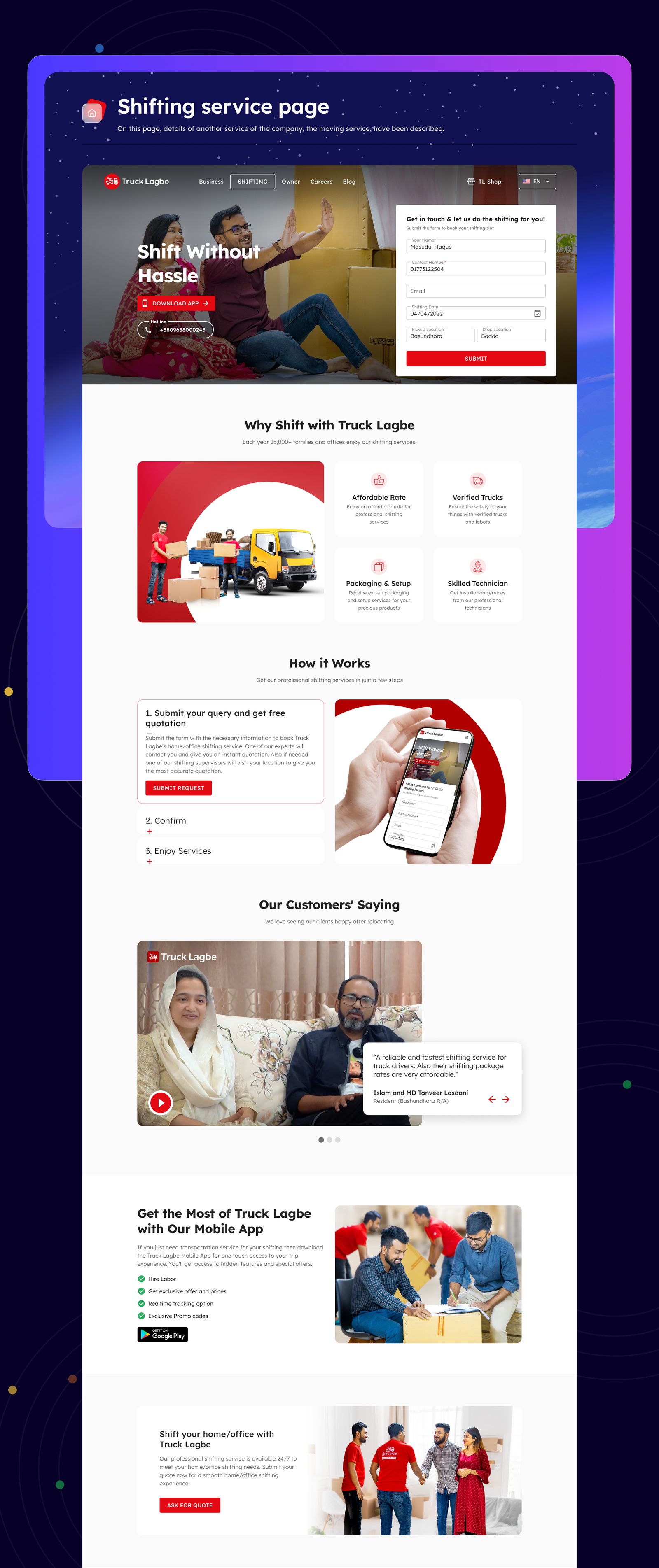
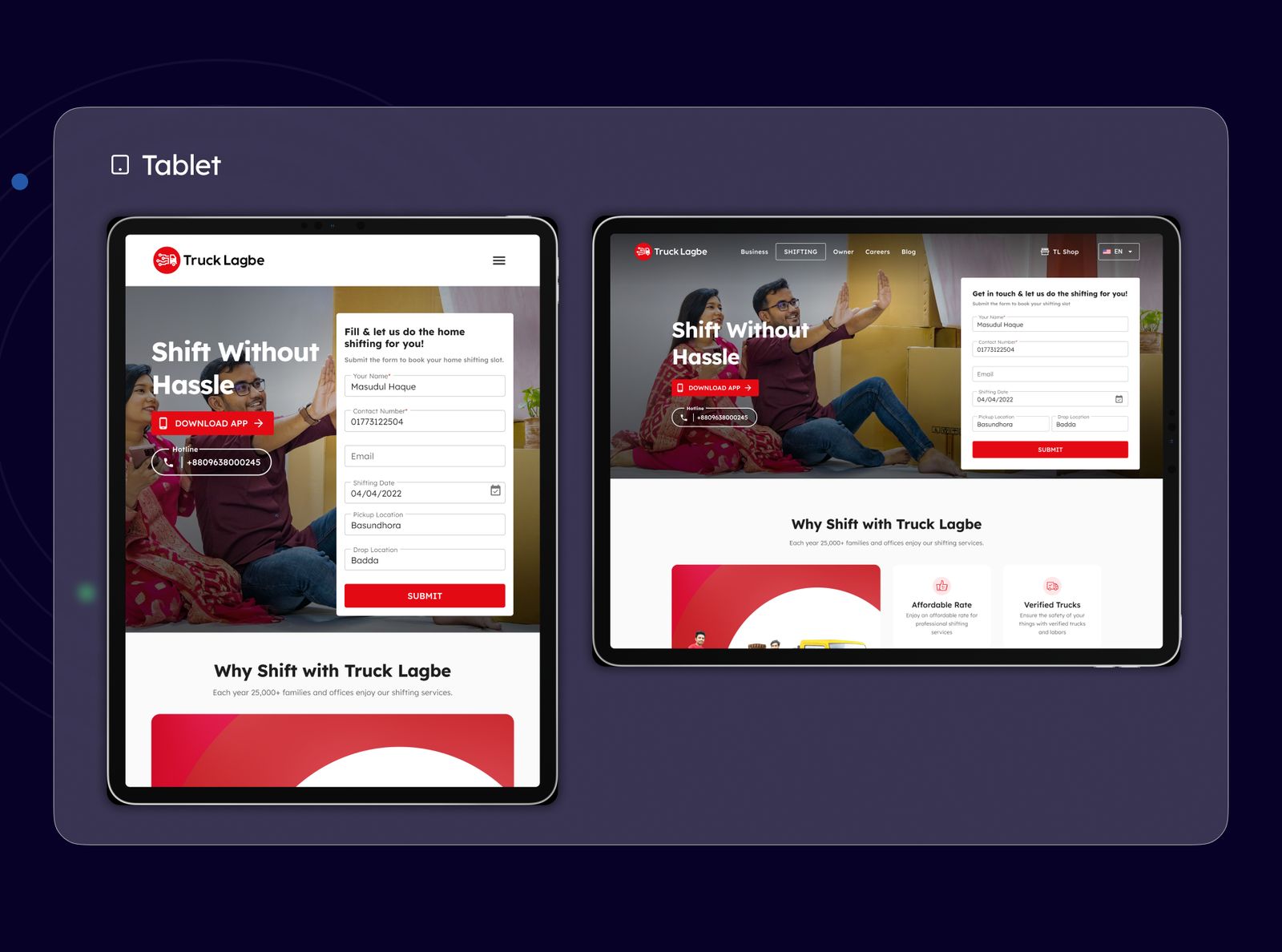
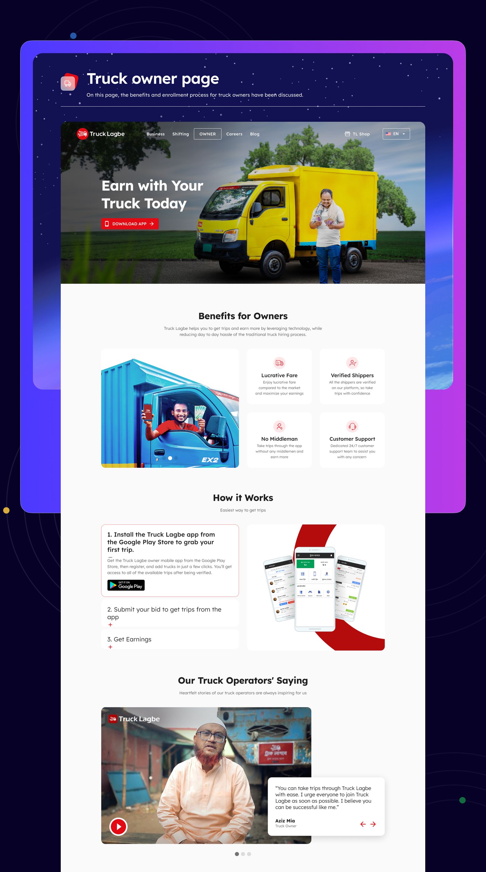
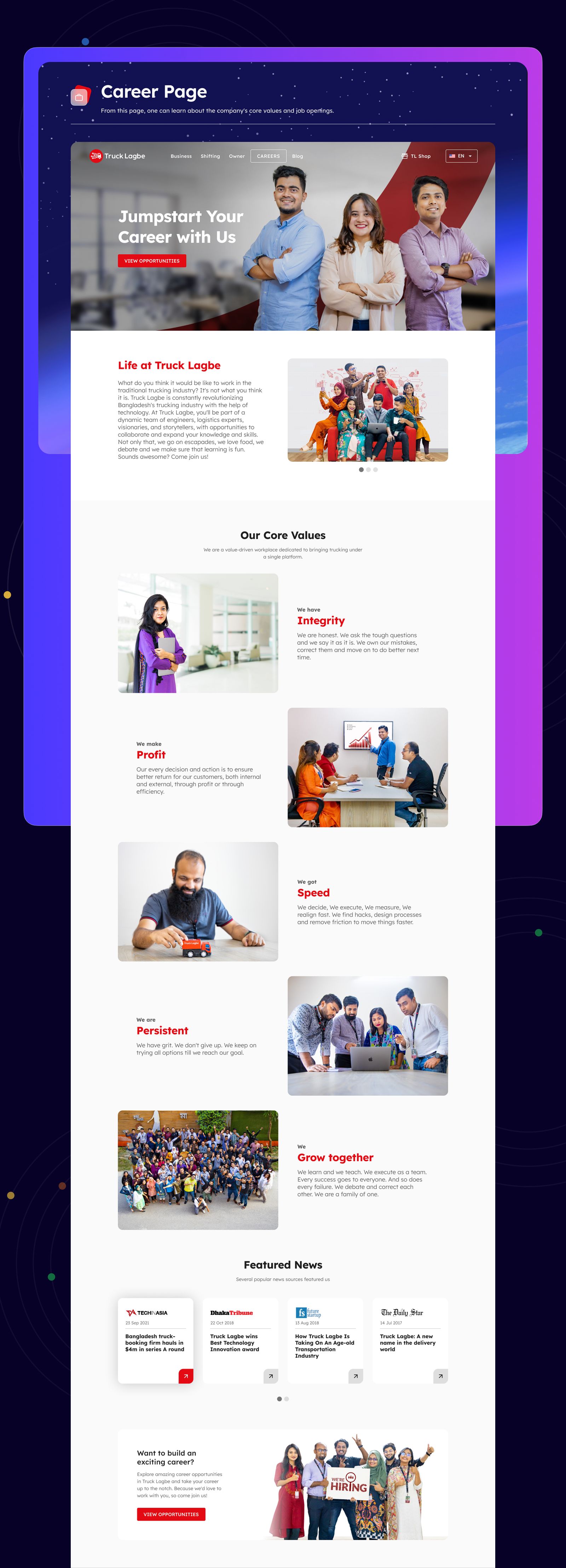
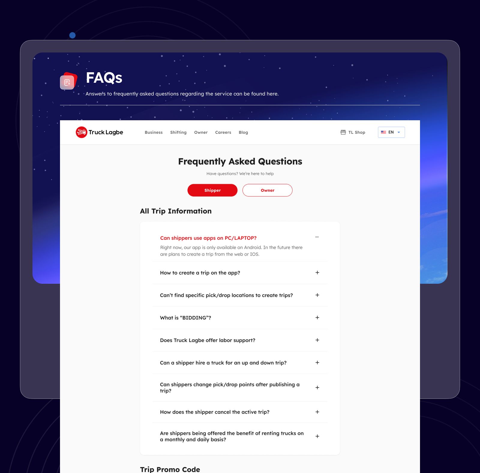
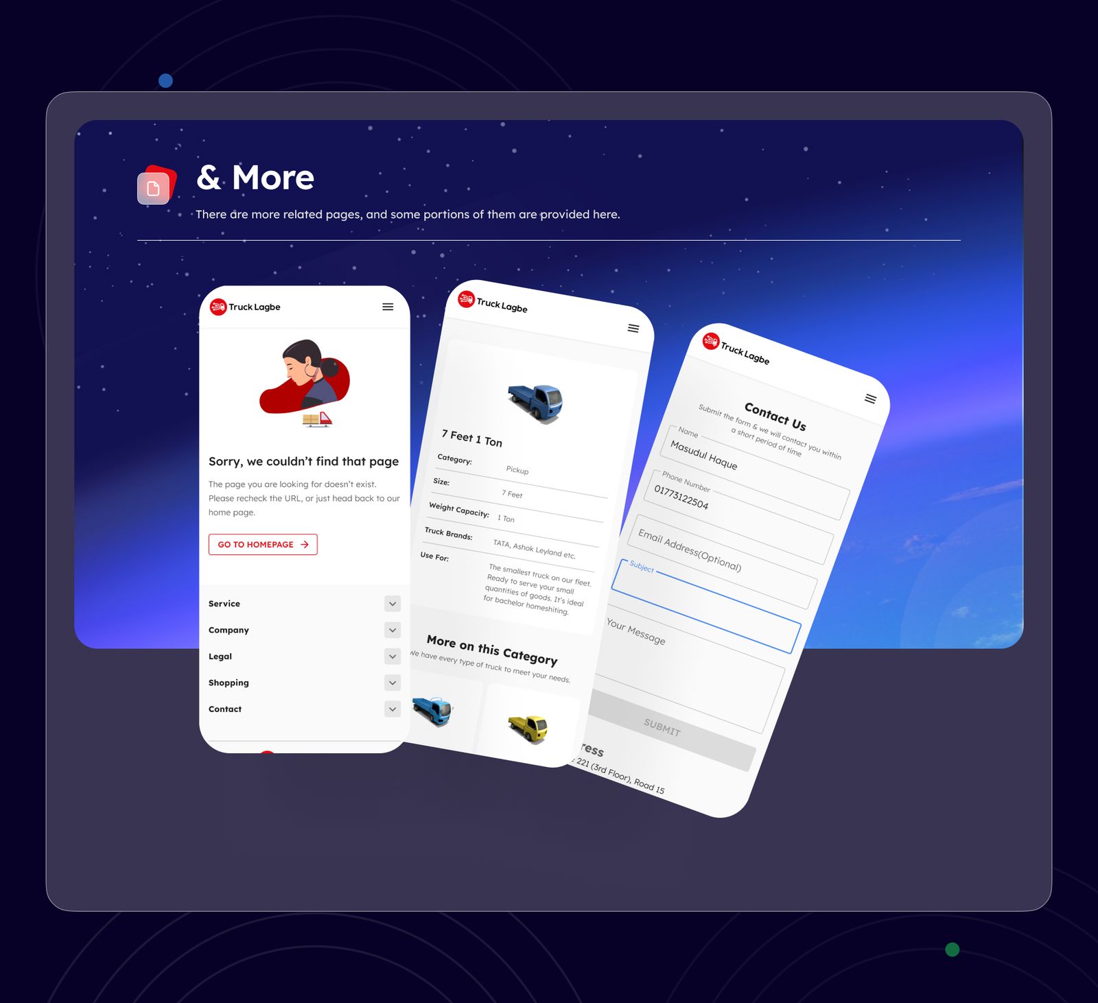

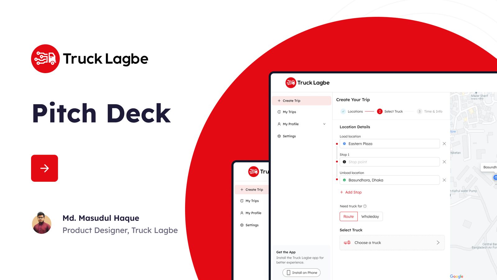
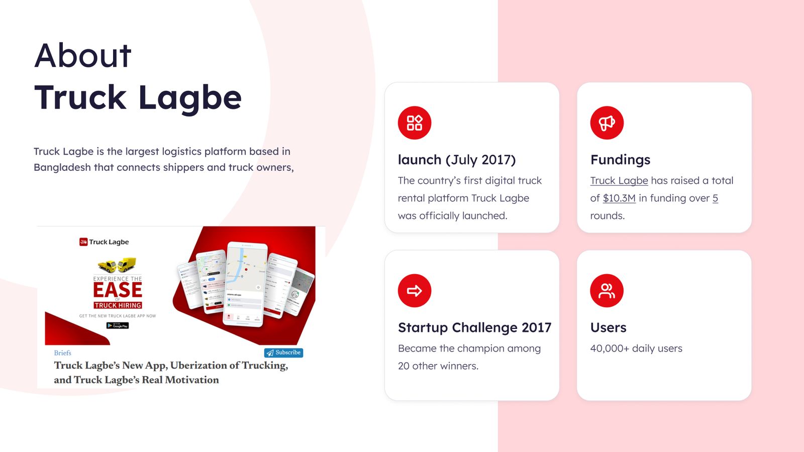
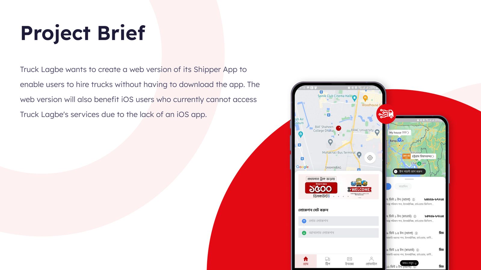
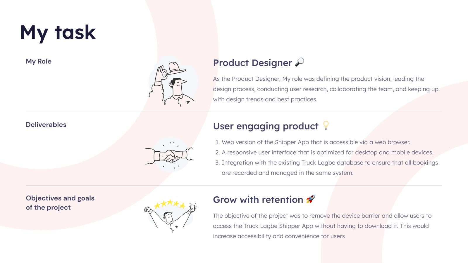
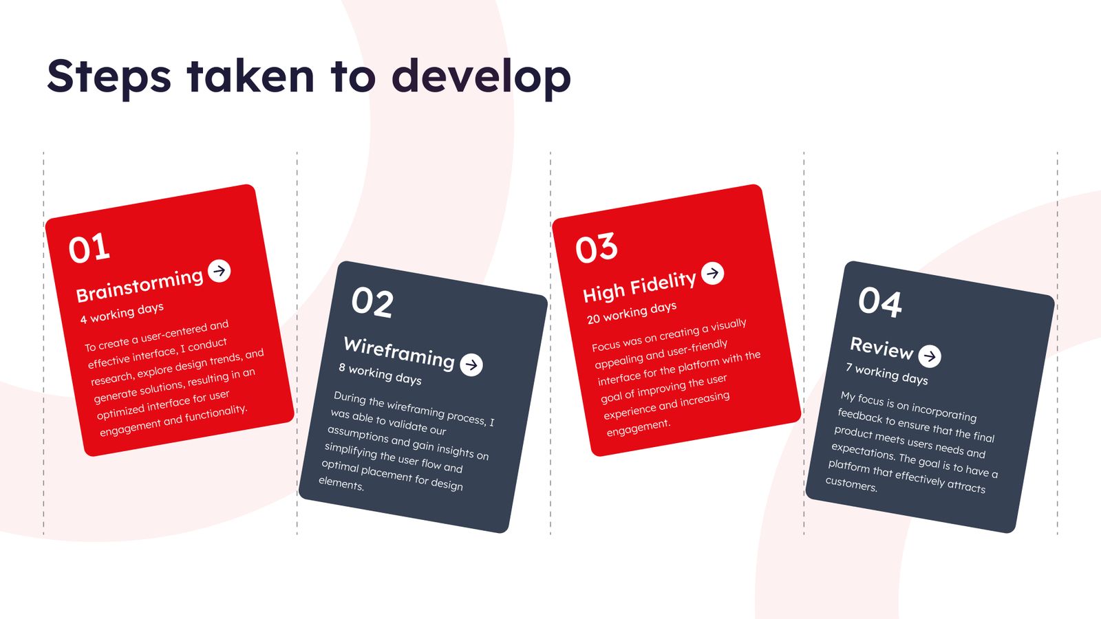
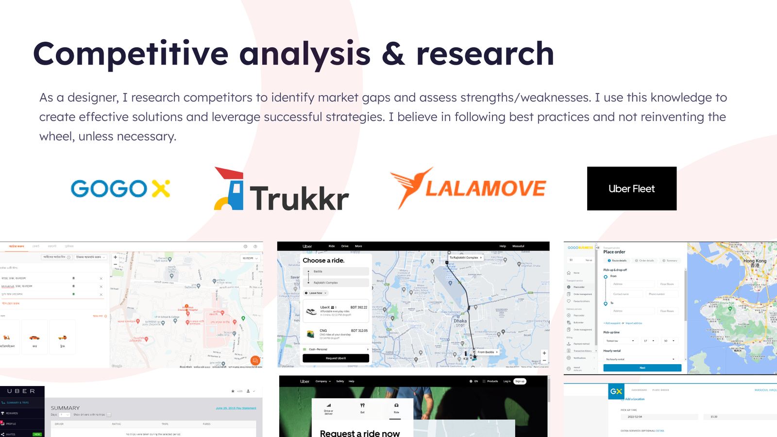
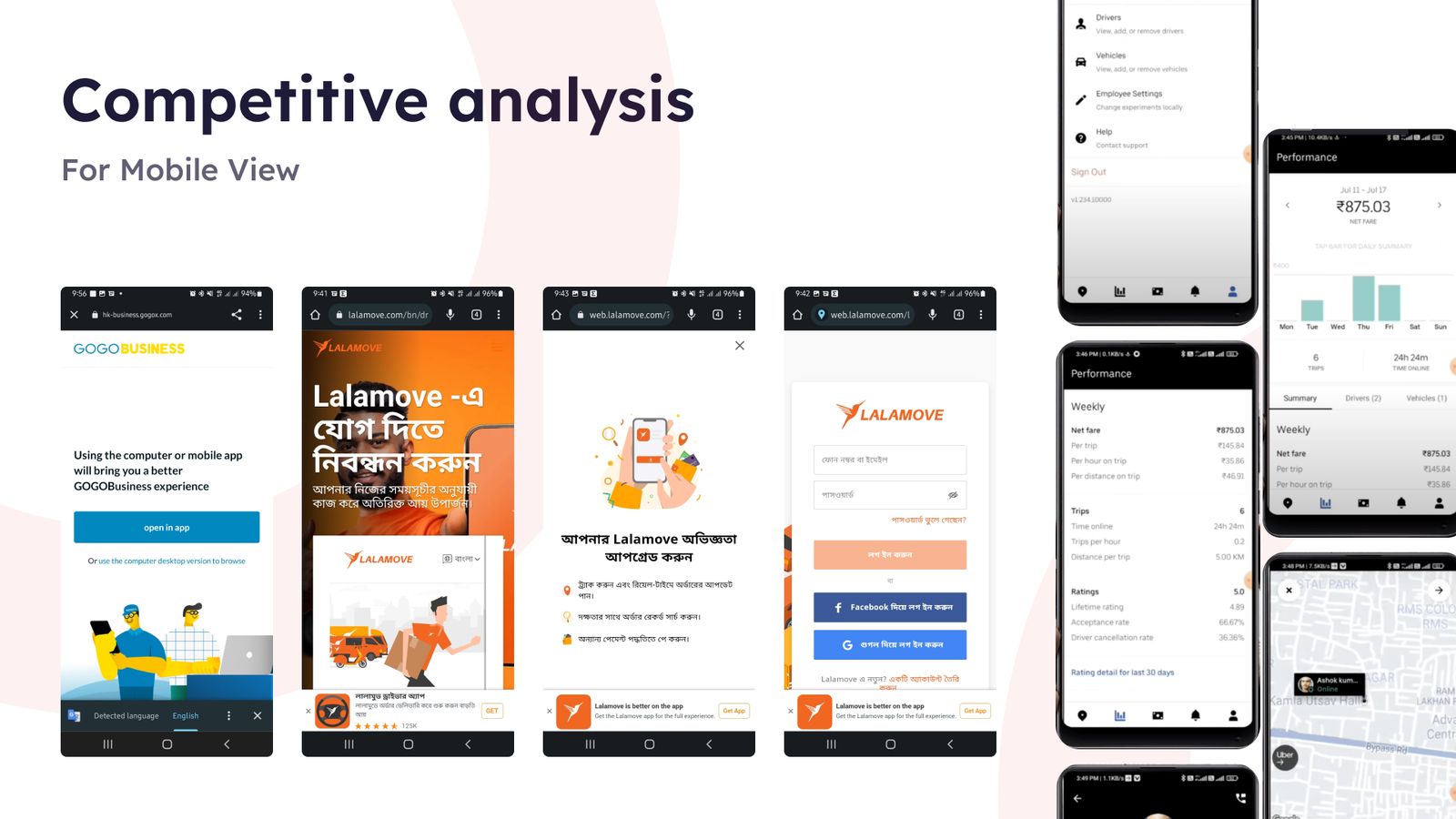
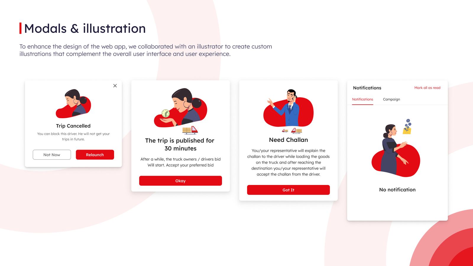
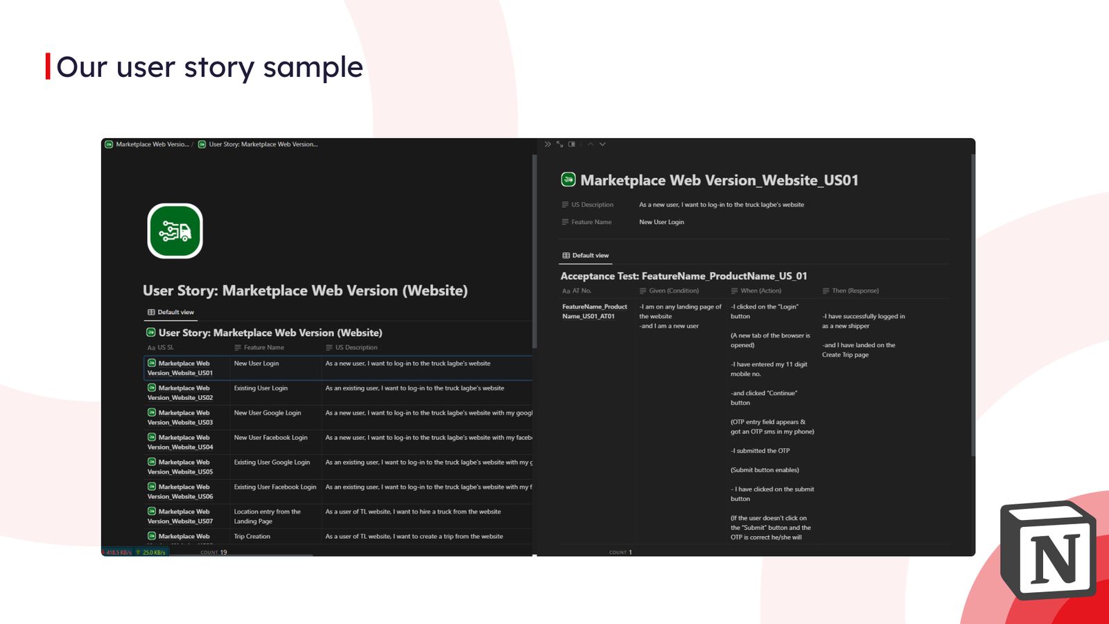
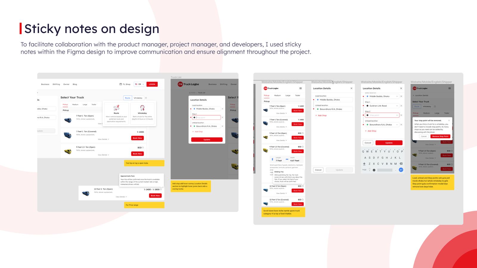
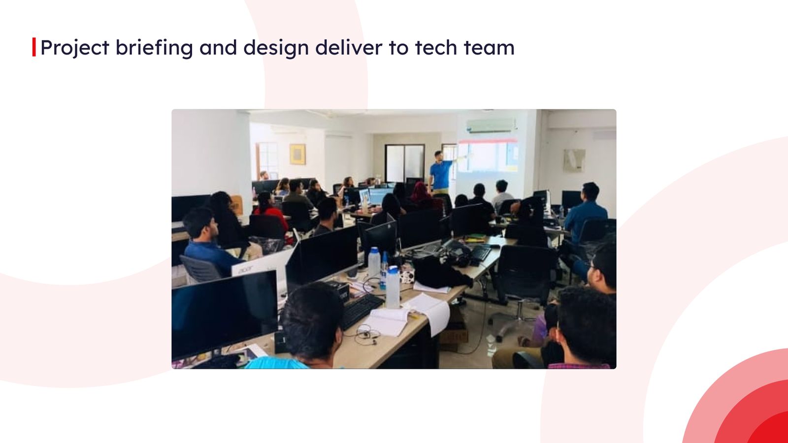
The deck I used to pitch a self-serve truck-hiring web platform for shippers: the problem, the journey and the screens, slide by slide.
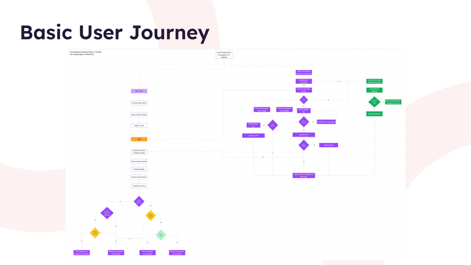
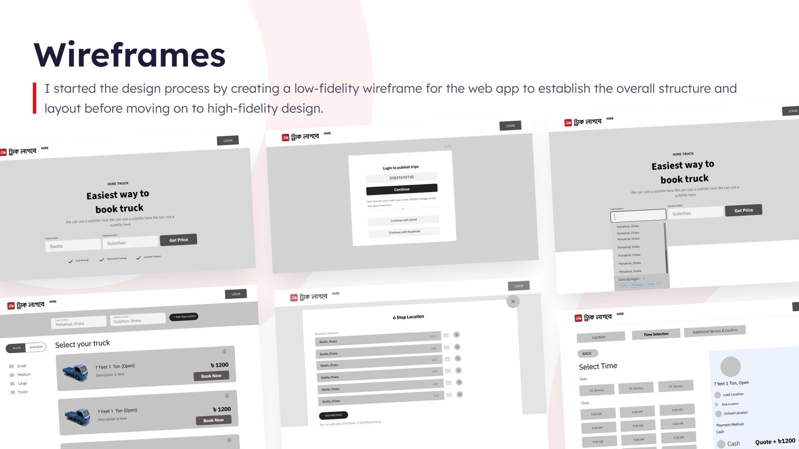
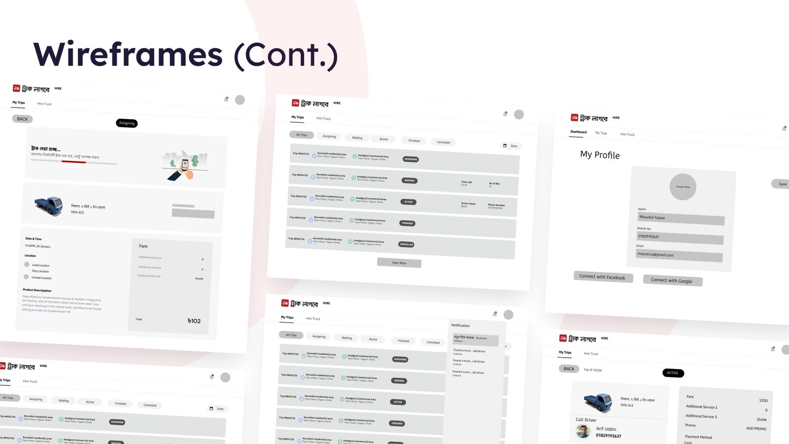
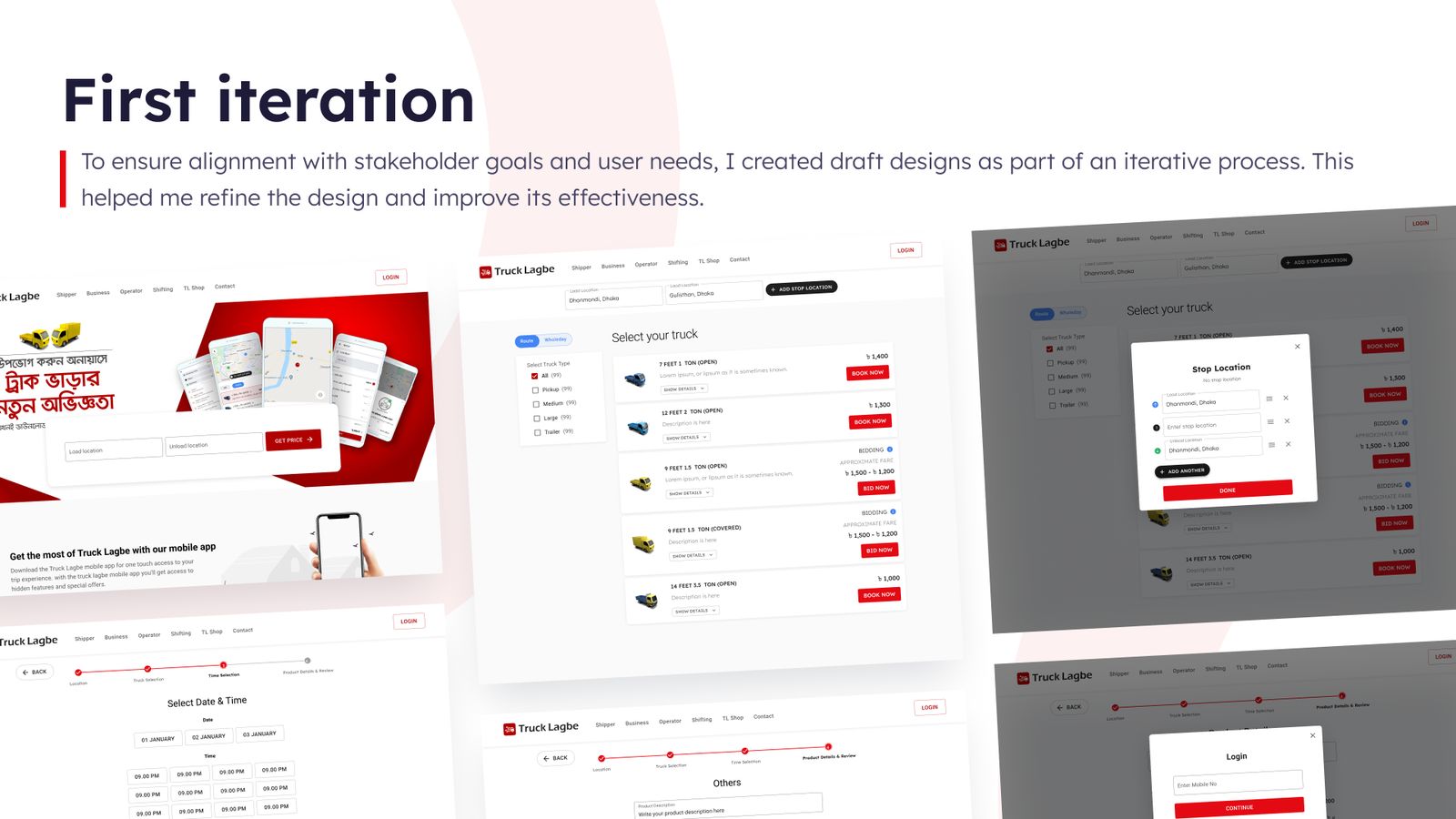
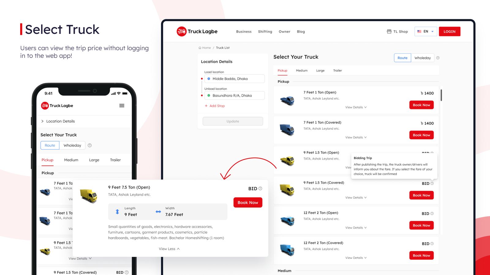
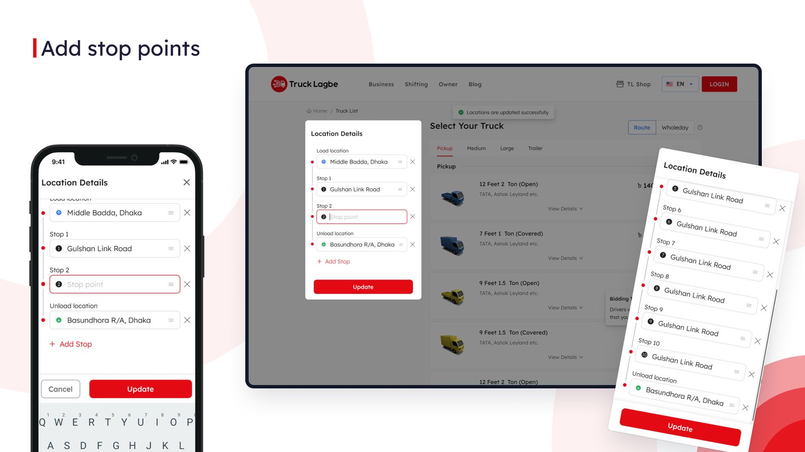
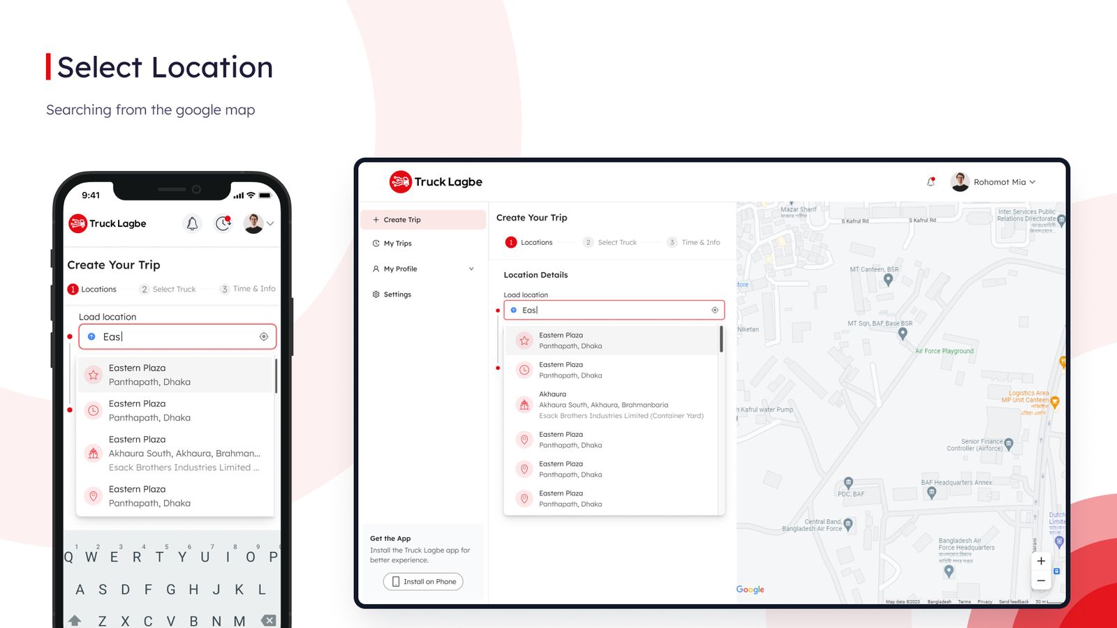
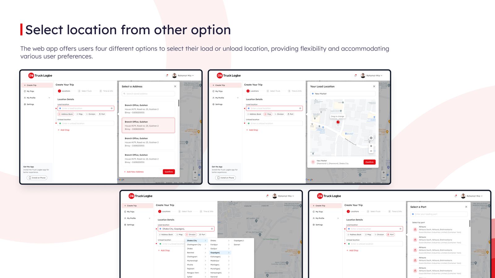
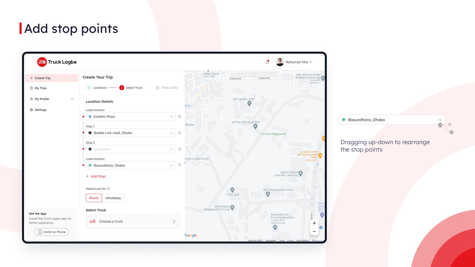
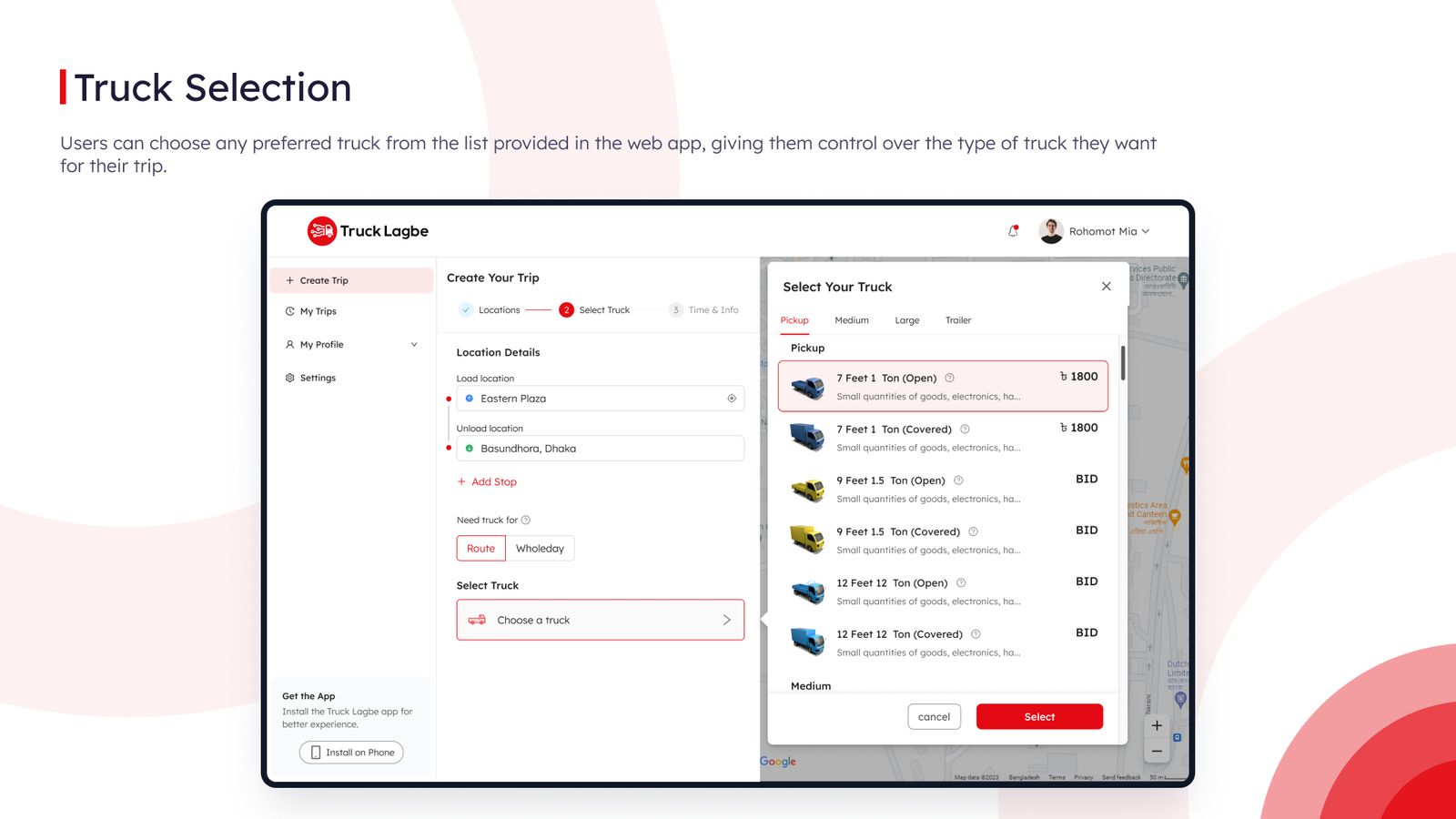
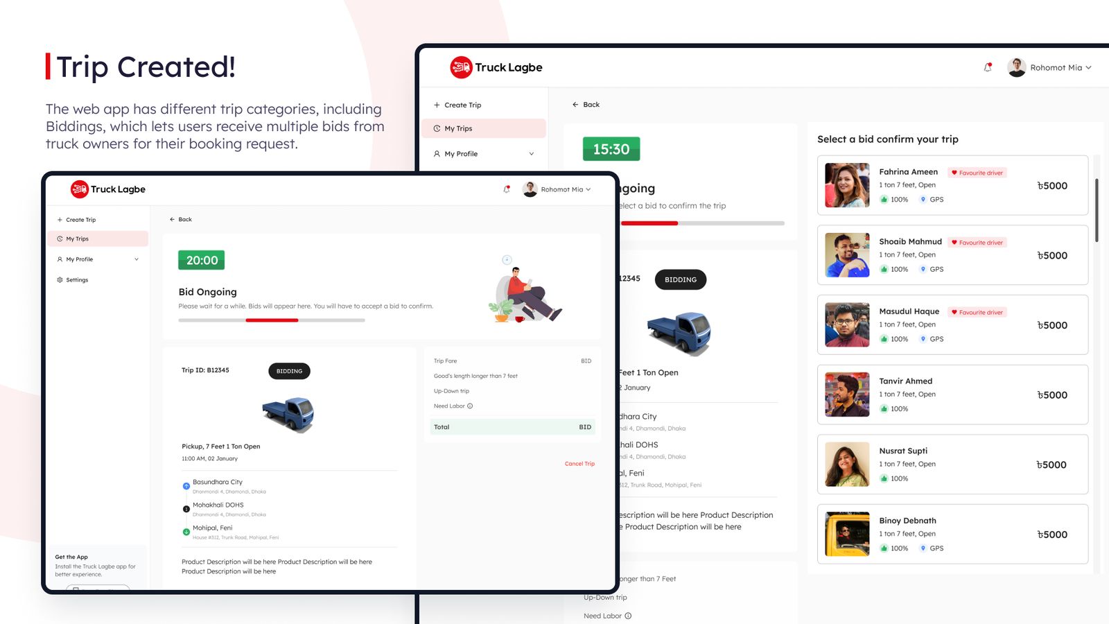
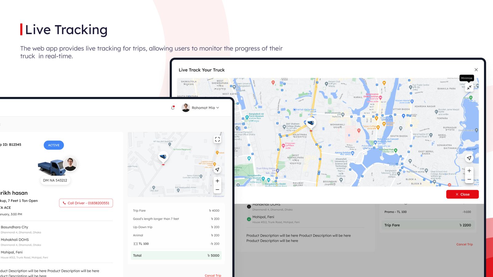
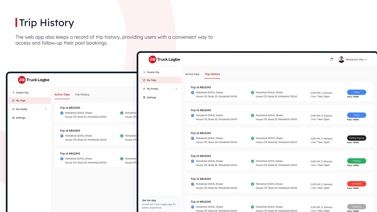
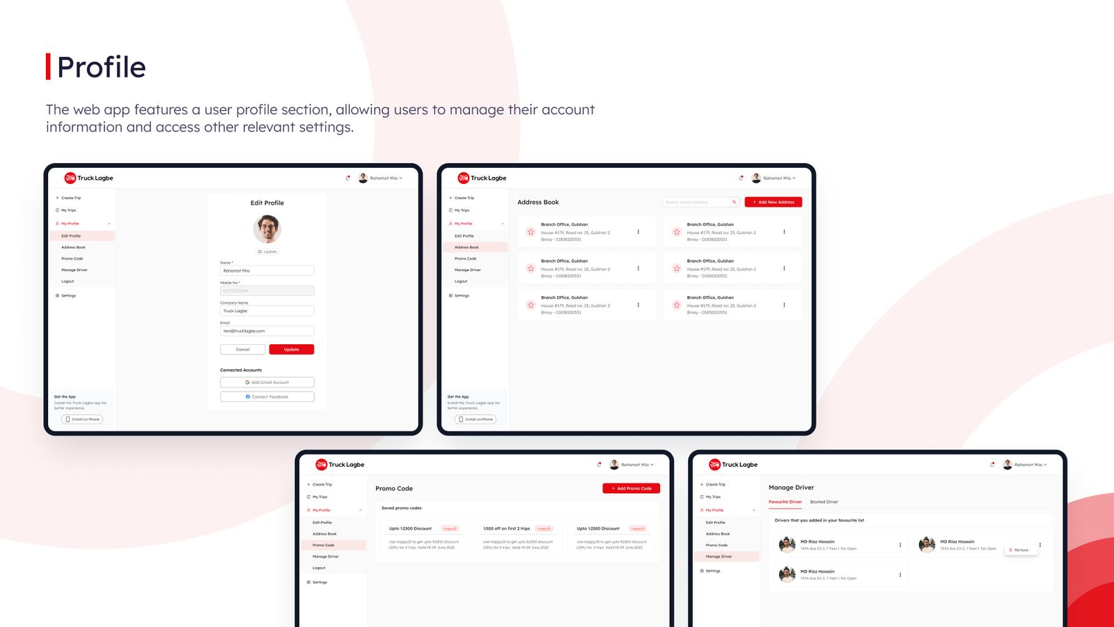
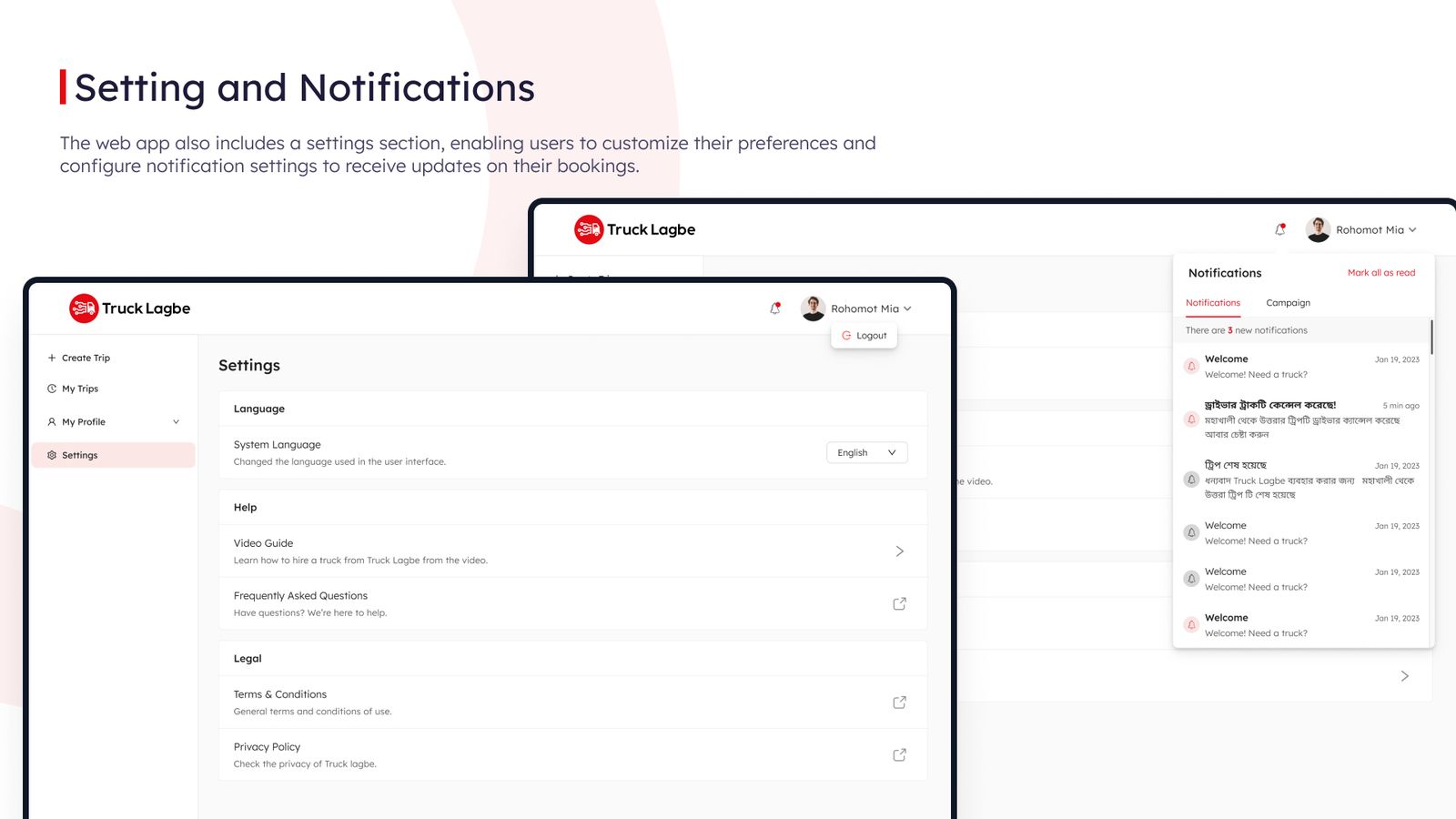


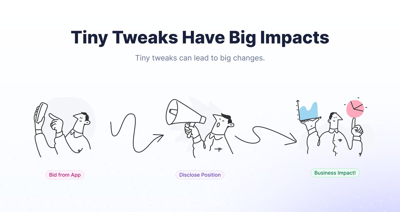
Showing truck owners where their bid ranks, without revealing amounts, and capping edits at five. Customer-care calls fell 47% and hiring requests rose 10%.
Today, I'll share an interesting story about how a single bidding position transformed the entire truck market pricing structure. This story unfolds within the operations of Truck Lagbe Ltd., a company specializing in truck hiring facilitated through a unique bidding process.
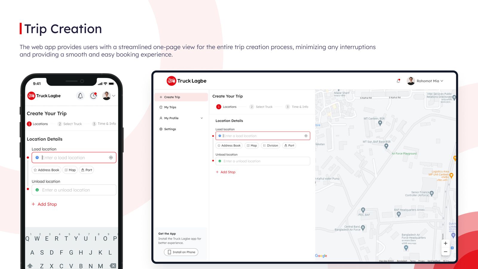
In the Truck Lagbe Ltd. system, users needing a truck submit a request via an app, specifying their location. Meanwhile, truck owners place bids, setting their desired trip fares. Customers then select a bid that suits their preference, often opting for the lowest offer.
However, this system presented two major challenges:
After much deliberation, we agreed upon a transformative solution.
Bidding Position
I have decided to display the position of a truck owner's bid in comparison to others while keeping the actual bid amounts (in BDT) hidden. This allowed truck owners to see how their bids ranked without knowing the exact figures placed by others.
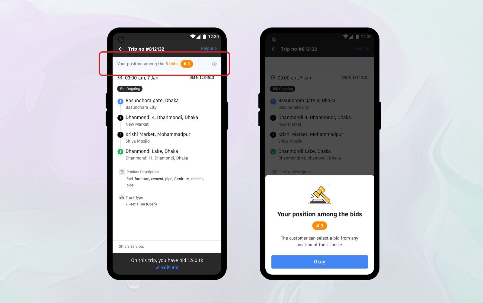
Bid Edit Restrictions
Additionally, I have implemented a minor but crucial tweak: truck owners could edit their bid to improve their position, but only up to five times. This limitation prevented excessive system strain and stopped owners from minutely adjusting bids to guess competitors' truck owner prices.
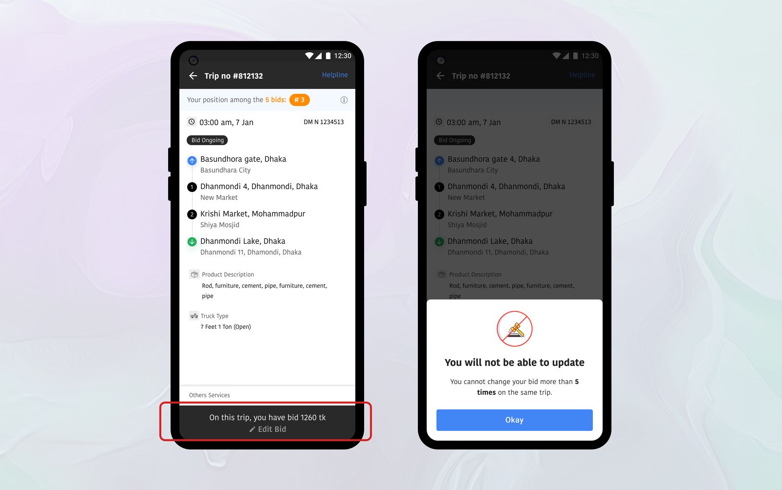
The outcomes of these seemingly minor adjustments were remarkable:
This case study demonstrates the power of strategic adjustments in digital platforms. By fine-tuning our bidding process, we not only enhanced operational efficiency but also fostered a more competitive and fair marketplace. It's a testament to how small changes can lead to significant impacts in the digital world of commerce.
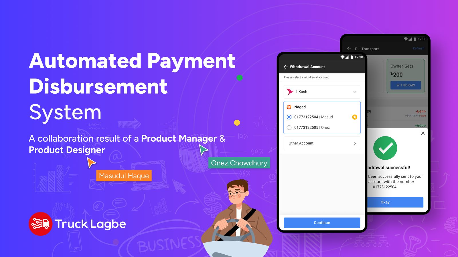
Truck owners can now withdraw their earnings to bKash or Nagad in three taps and under a minute, instead of waiting on a manual process. App engagement rose 45%.
In the ever-evolving landscape of financial transactions, efficiency is paramount. The disbursement process for Suppliers (Owner App Users) and Admin Panel Users(Internal Panel) currently stands as a manual and time-consuming endeavor. Recognizing the need for a more streamlined approach, our Payment Disbursement project aims to empower Owner App Users and Admin Panel Users alike, revolutionizing the way payments are disbursed.
The existing disbursement process for both Owner App Users and Admin Panel Users is marred by manual interventions, leading to inefficiencies and prolonged processing times. This not only hampers productivity but also introduces the potential for errors and delays in financial transactions.
Suppliers experience a lack of transparency, making it challenging to track and reconcile disbursements promptly.
This complexity in the disbursement process not only diminishes user satisfaction but also hampers the agility and autonomy of our suppliers in managing their financial transactions.
Waiting on external entities for disbursement not only prolongs the processing time but also subjects our operations to the varying timelines and potential bottlenecks of these third-party services. The lack of control hampers our ability to provide timely disbursements, impacting user satisfaction and the overall reliability of our disbursement processes.
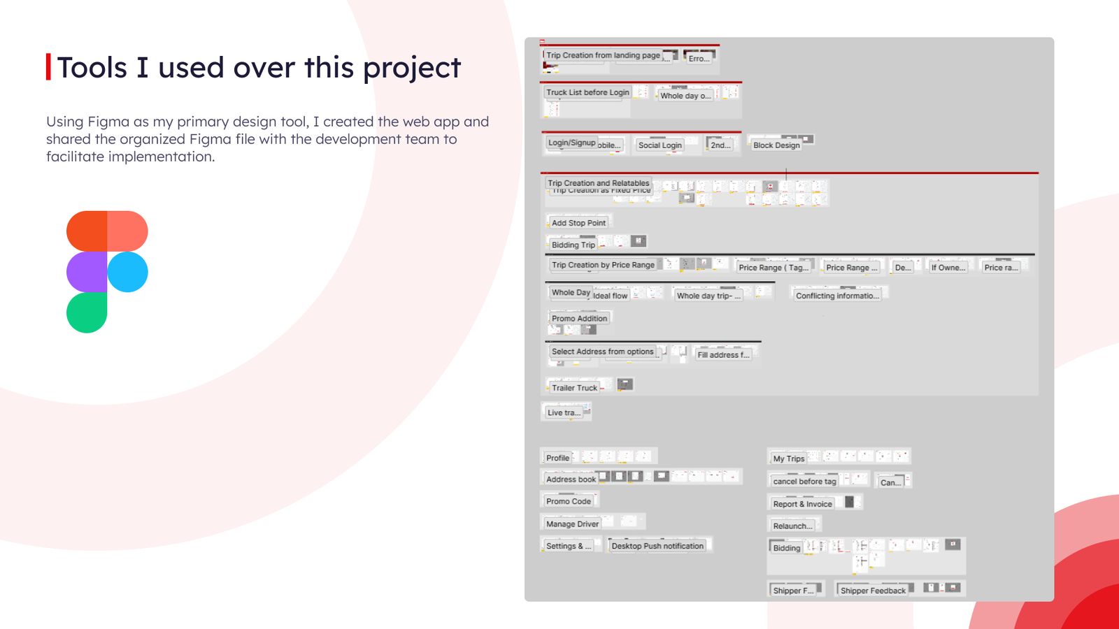
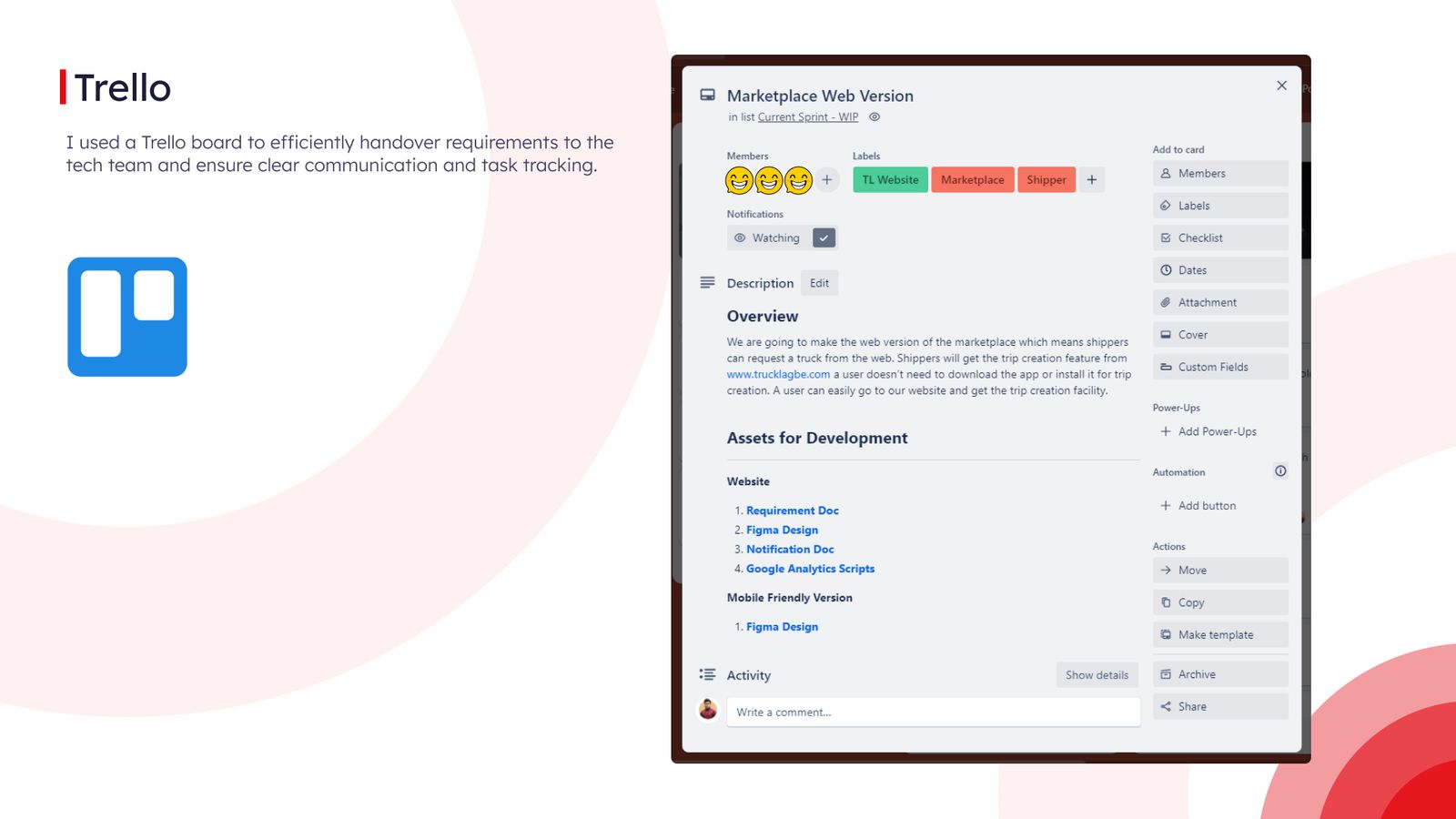
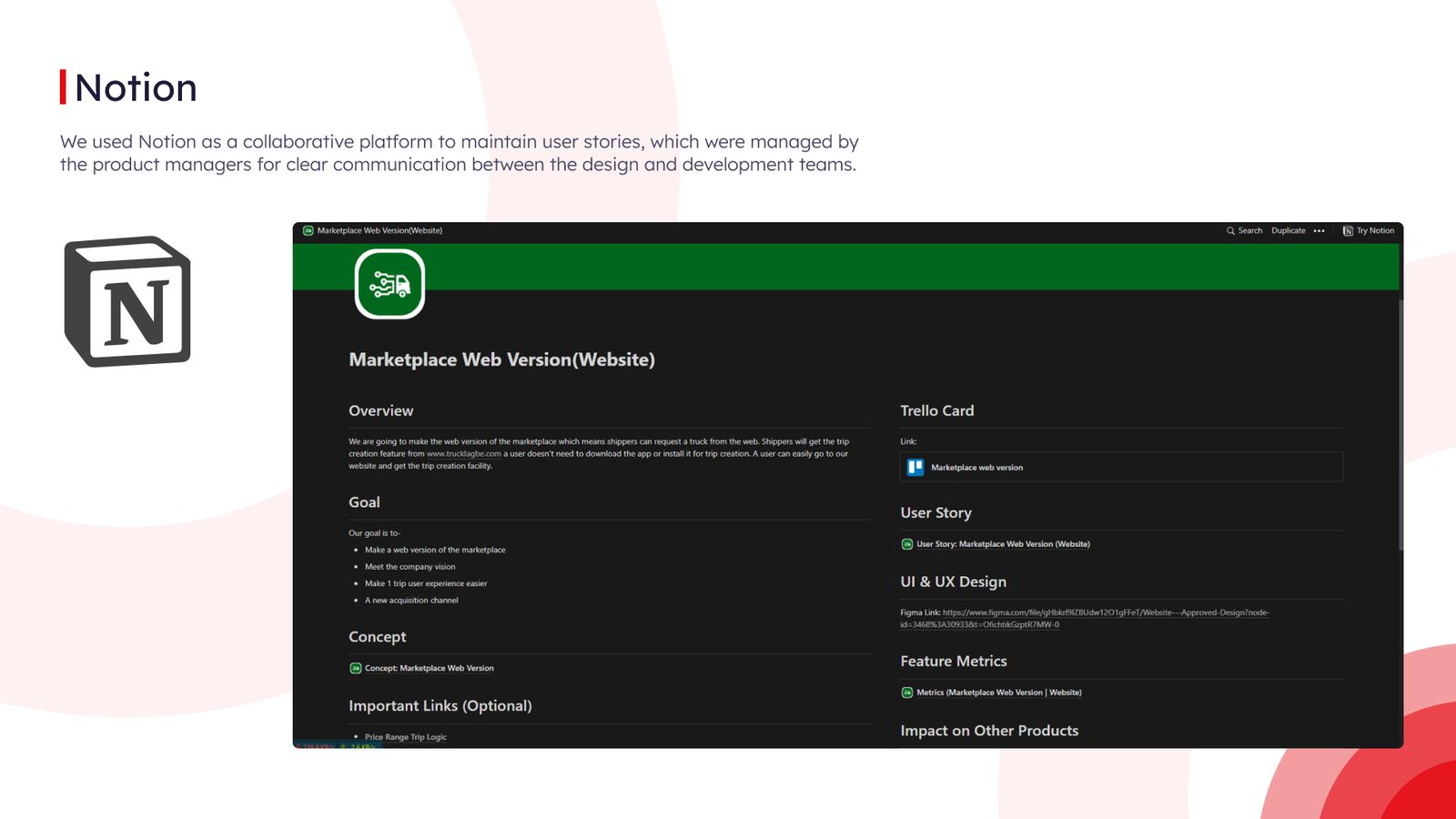
Figma, Notion, Trello, FigJam, Mixpanel
Research:
Existing Process:
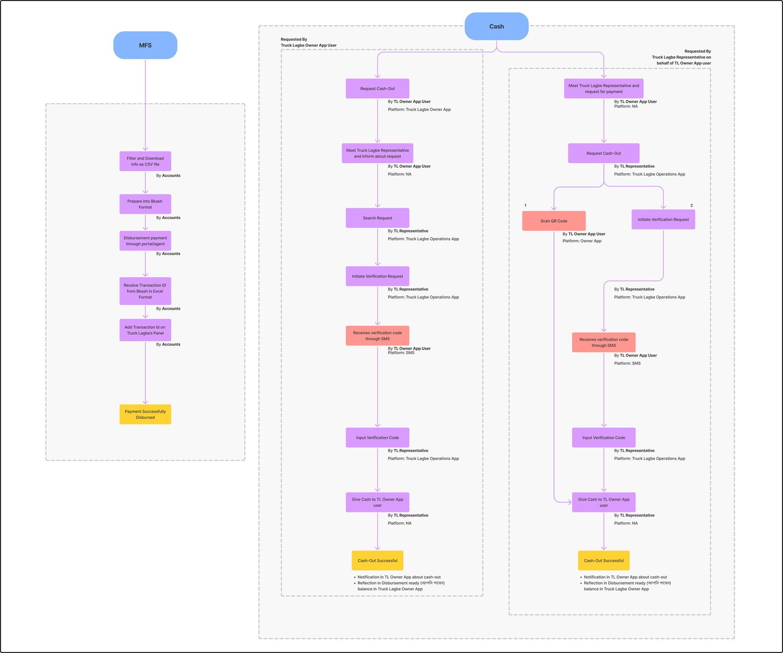
High-Level Plan:
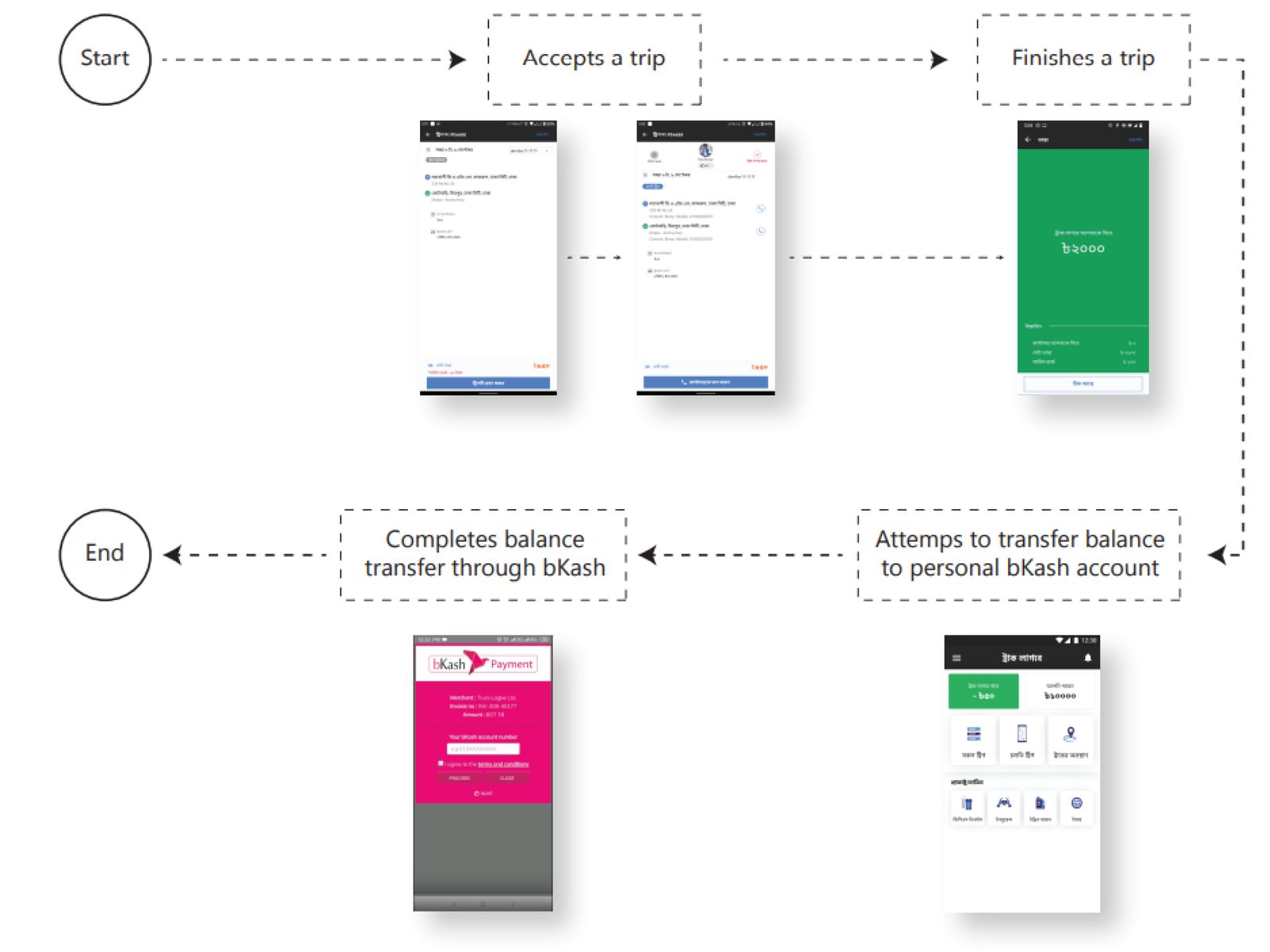
Pathao Driver App:
Digital Credit → Withdraw Request → Enter Amount → Desired Method (Bkash/ Bank) → Successfully Disbursed
In our drive to streamline disbursement processes, we are actively pursuing strategic partnerships with leading Mobile Financial Services (MFS) companies. Our approach prioritizes open communication channels, customization for unique requirements, robust API integration, and a commitment to a user-centric experience.
By ensuring continuous testing, and quality assurance, and embracing an agile development methodology, we aim to forge seamless collaborations. This approach not only adheres to industry standards but also exceeds user expectations, setting new benchmarks in the realm of payment disbursement.
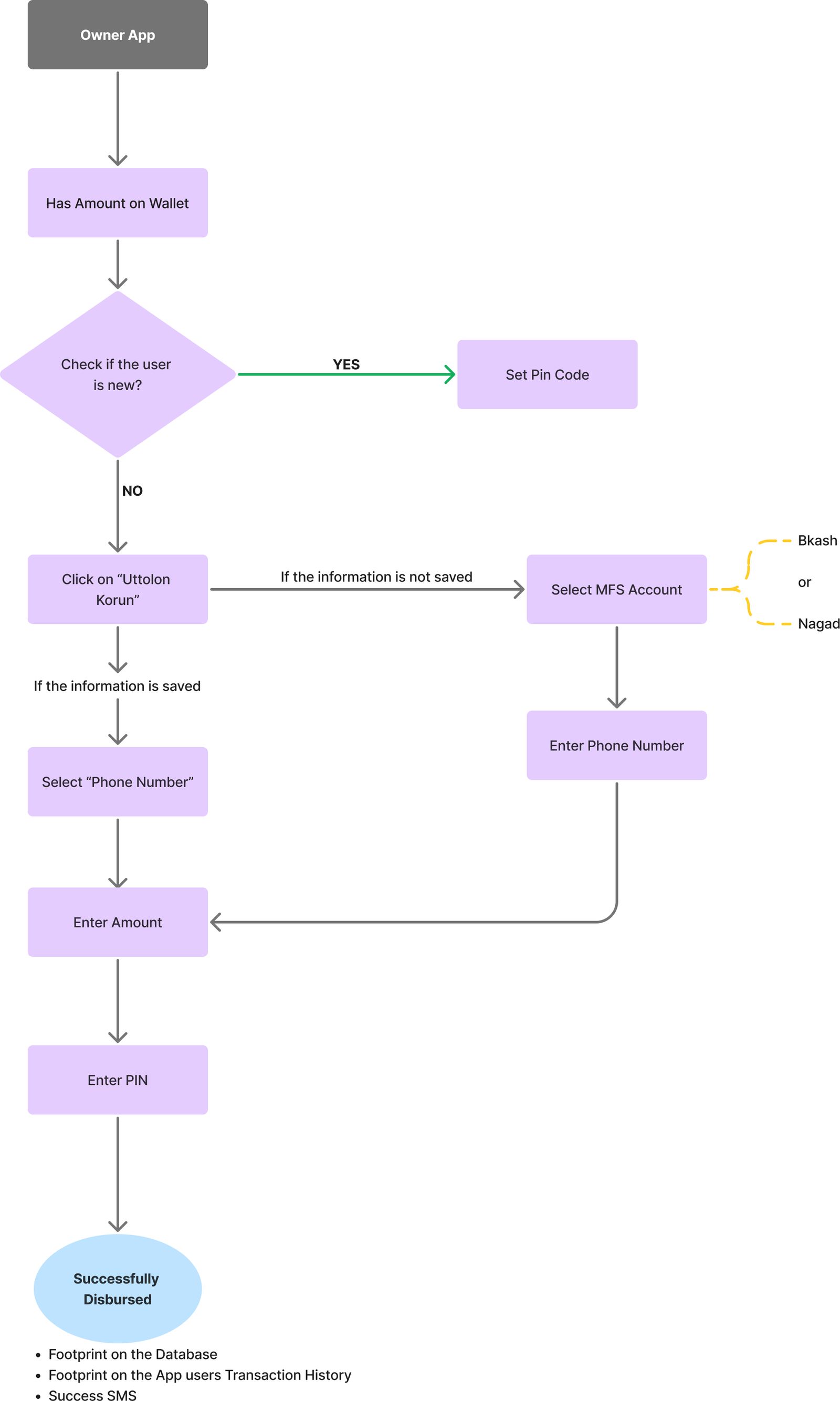
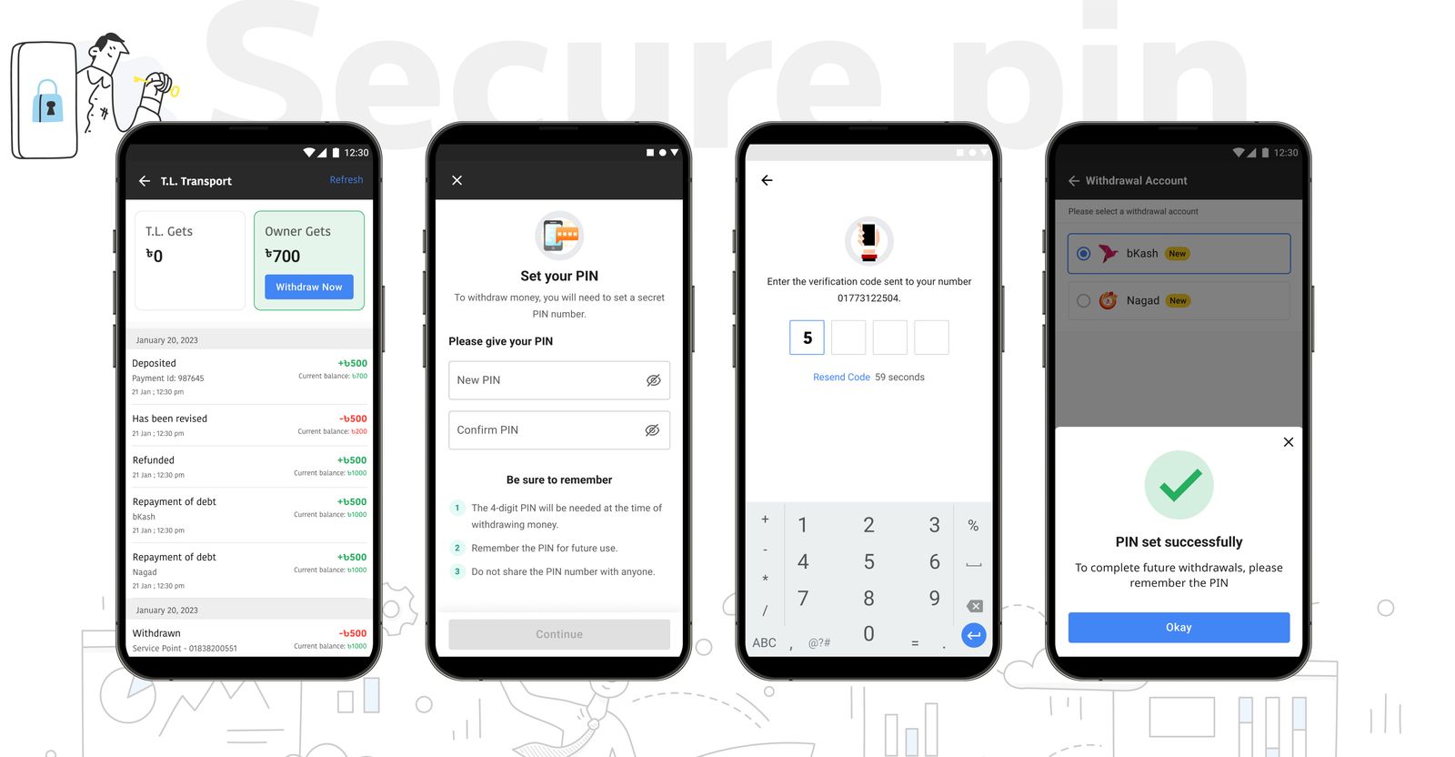
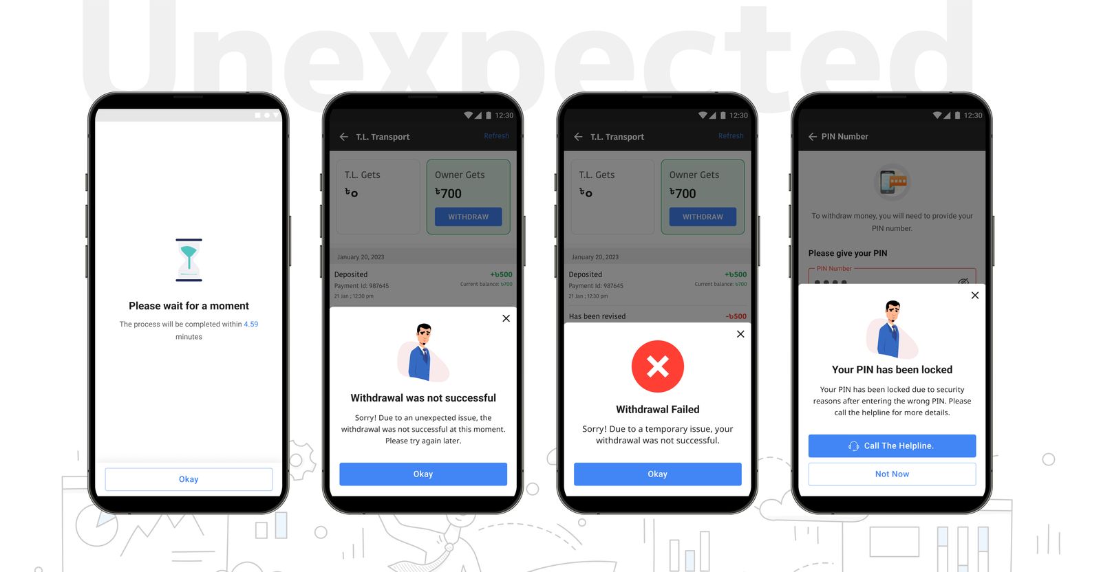
Upon first opening the app, a user sets a 4-digit PIN, verified through a one-time password (OTP) sent via SMS on their account mobile number. Successful OTP validation confirms the PIN, granting app access. In case of OTP issues, options to retry or request a new OTP are available. The process ensures secure first-time user access.
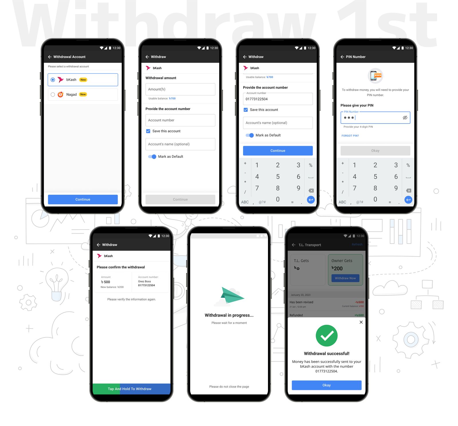
For the "Withdrawal First-Time Journey":
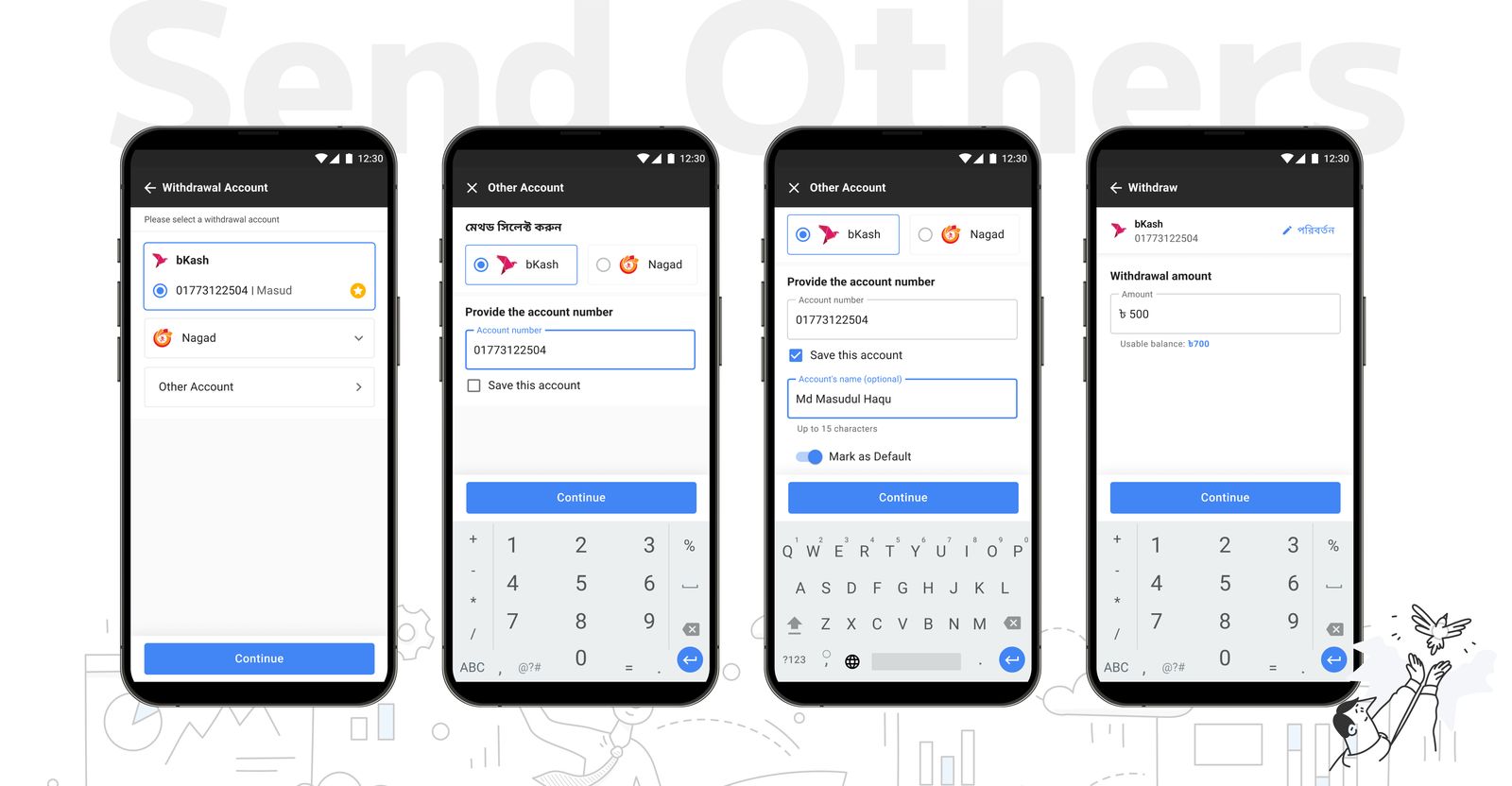
In this flow, a user selects their preferred Mobile Financial Service (MFS) account for the first-time withdrawal process. They then input the withdrawal amount and the account number to which the funds will be transferred. The user has the option to save this account number for future transactions. After entering their PIN, the amount is transferred to the chosen MFS account. If the entered phone number isn't linked to the specified MFS account, the process will display an error, indicating the mismatch. This flow streamlines the withdrawal process for first-time users, ensuring convenience and security.
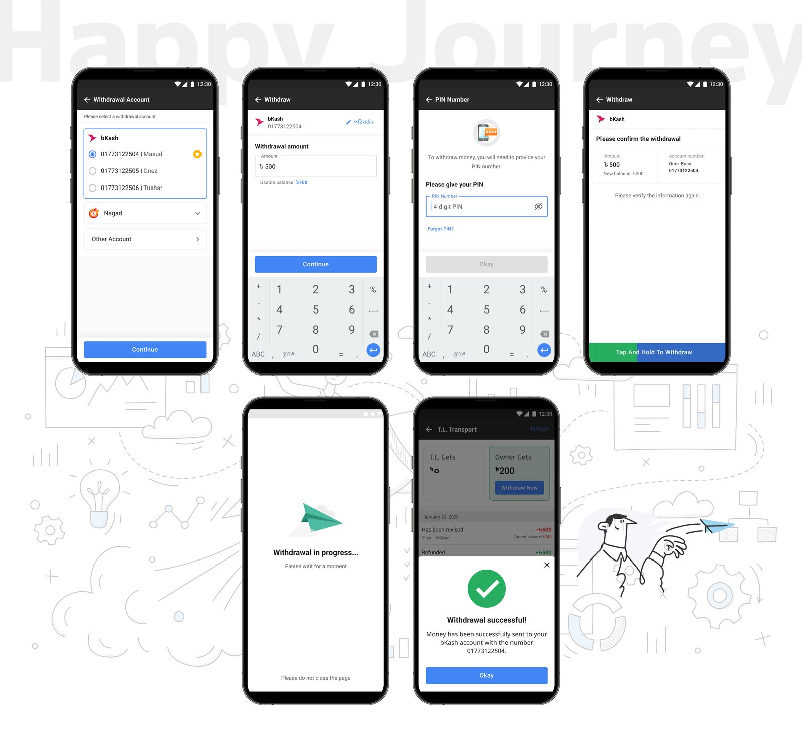
For the "Withdrawal for Saved Numbers":
This streamlined process begins when a user opts to withdraw funds using a previously saved account number. The user simply selects the saved account from the list, eliminating the need to re-enter account details. Next, the user inputs the desired withdrawal amount. The final step involves entering their PIN to authenticate and approve the transaction. This efficient flow facilitates quick and secure withdrawals for users who have saved their account details, enhancing the overall user experience.
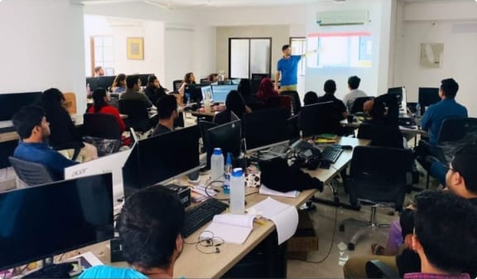
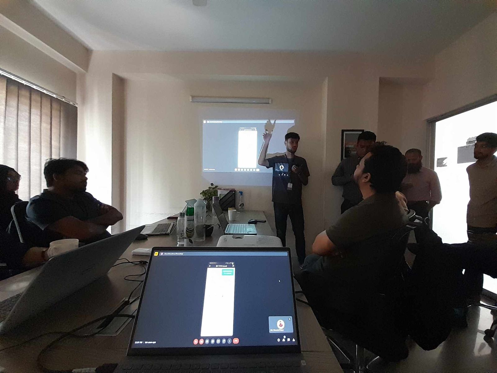
The Payment Disbursement project undergoes User Acceptance Testing (UAT), involving representatives from relevant teams. Supply Team receives training to engage directly with suppliers and Owner App Users. The CX Team is integrated for full-time user support. The Accounts Team collaborates on understanding the process, and post-UAT, decisions on accounting entries and control measures are implemented. This ensures a robust system, user satisfaction, and accountability in financial processes for a successful rollout.
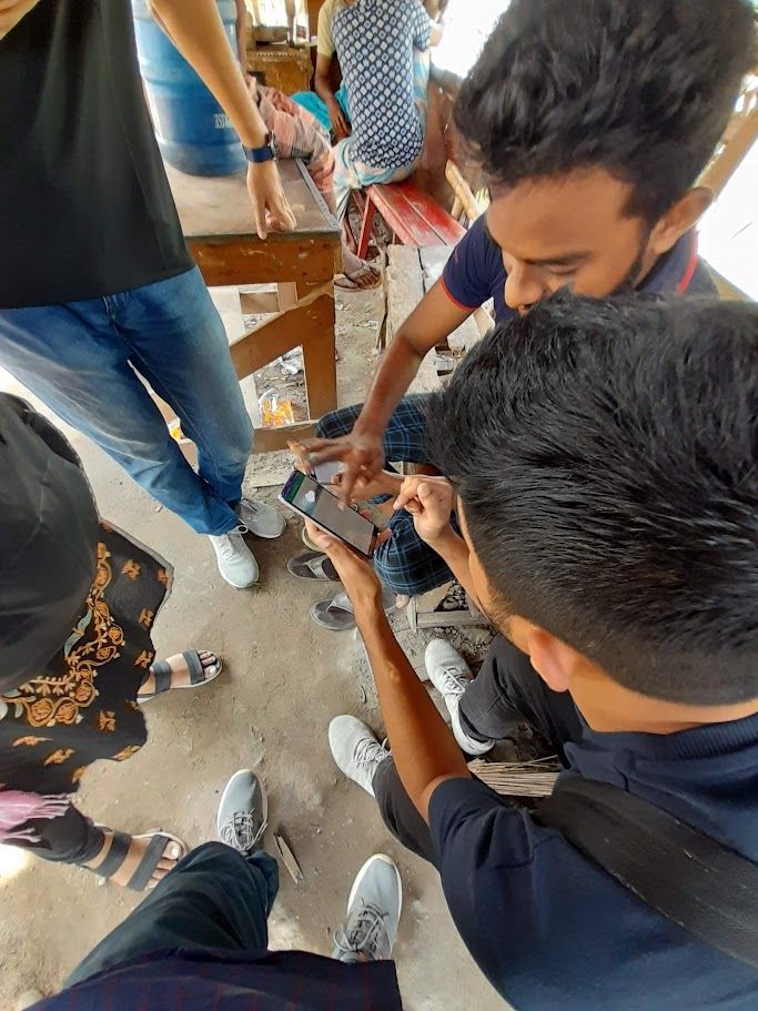
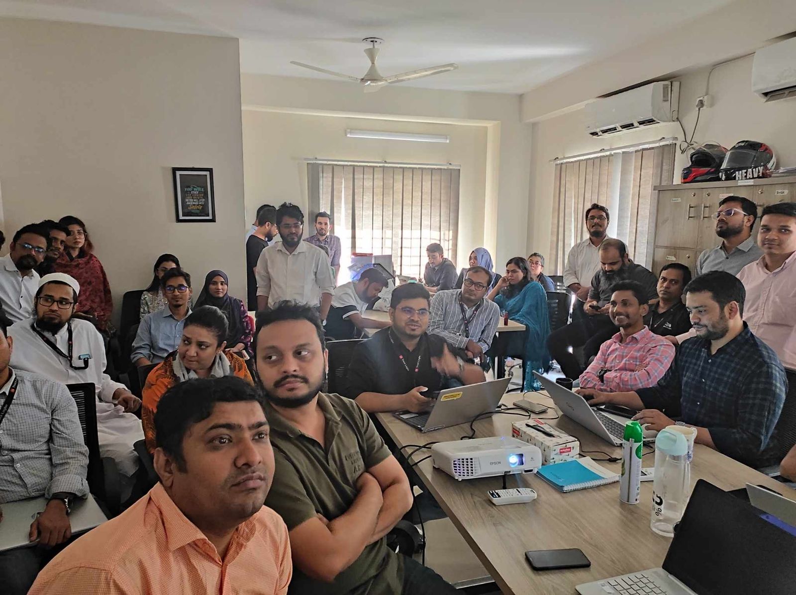
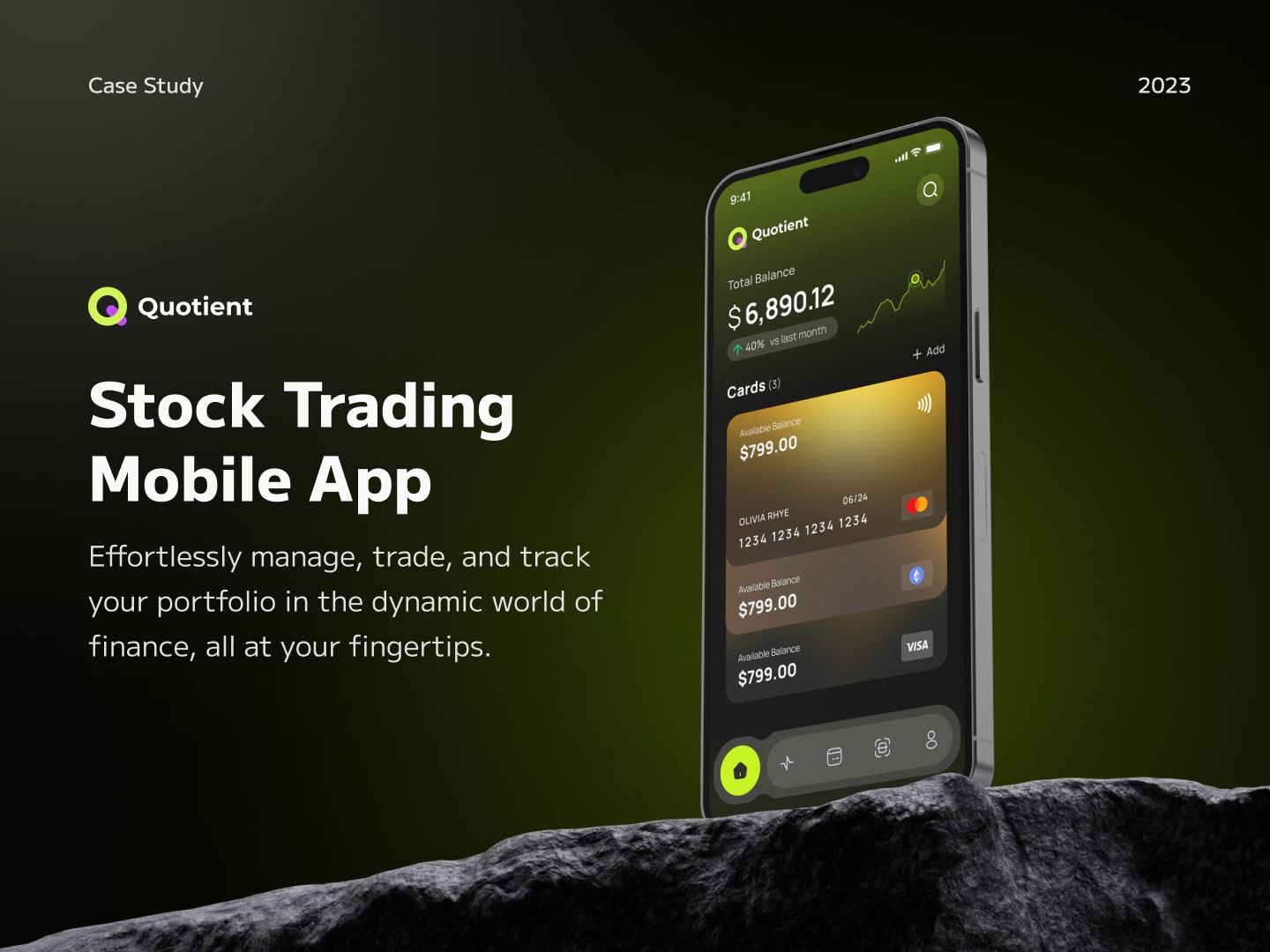
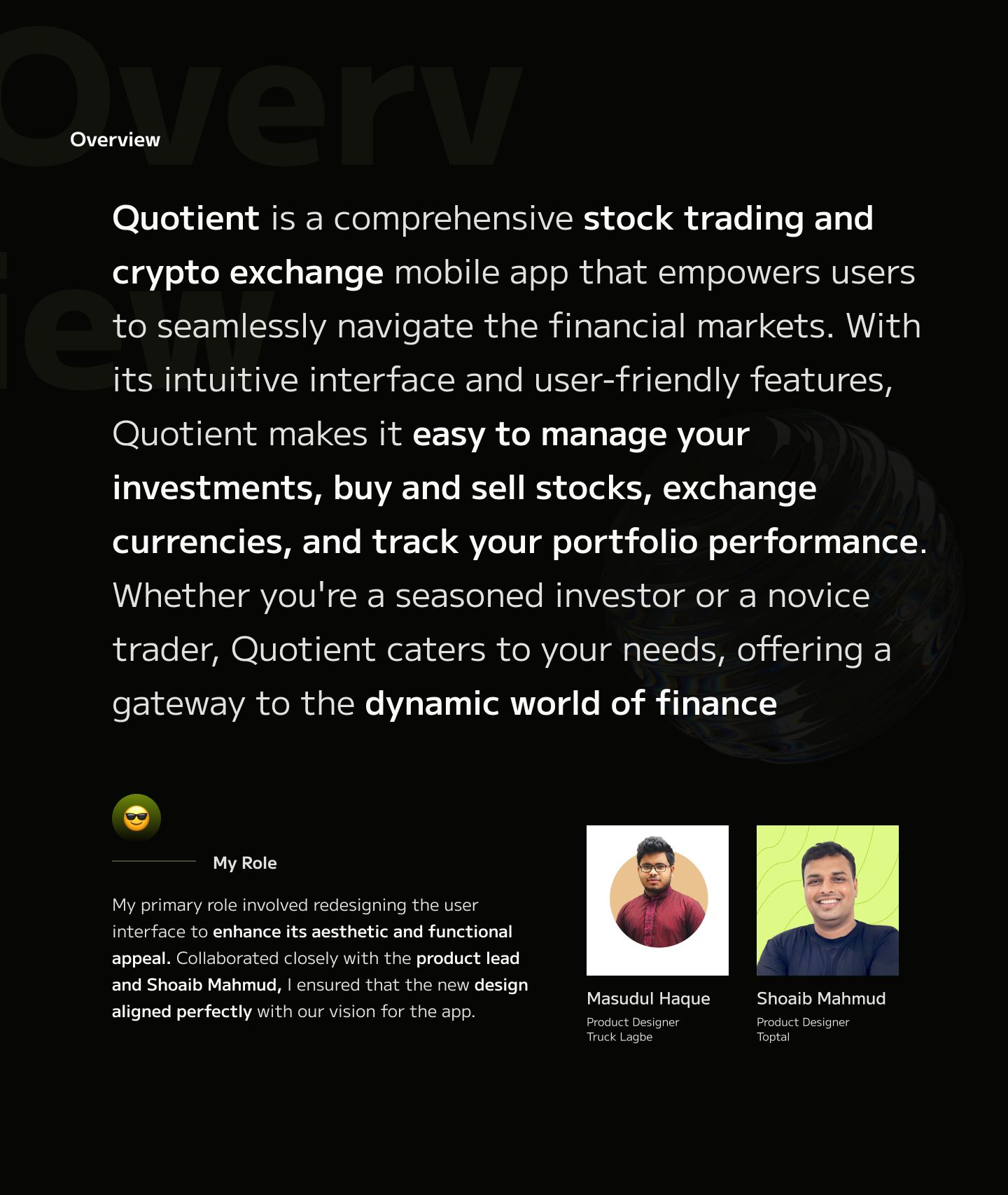
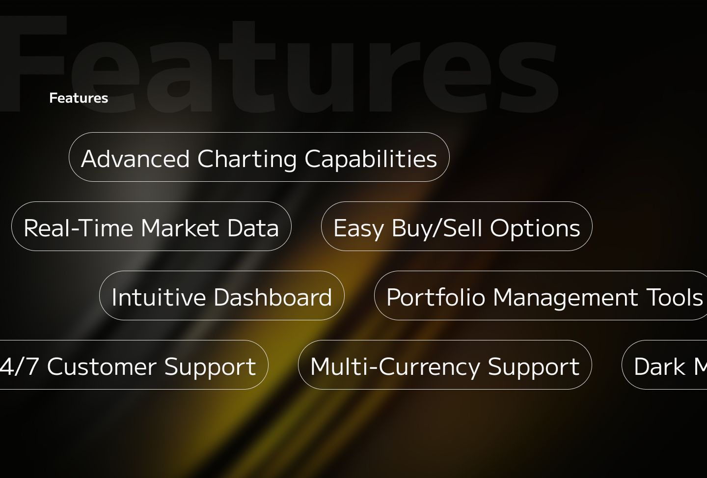
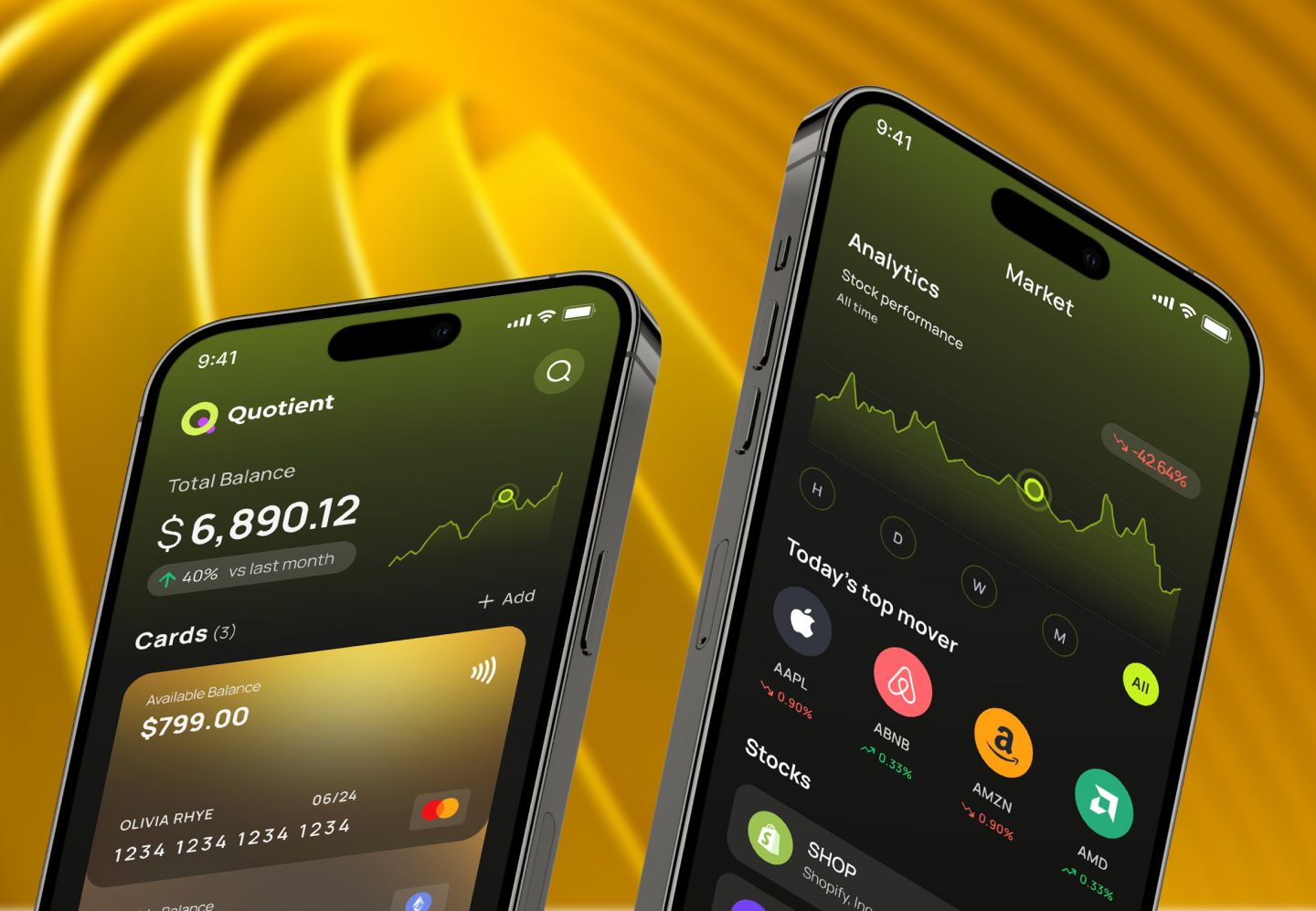
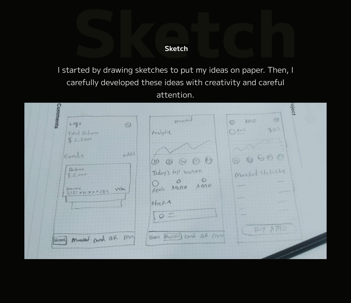
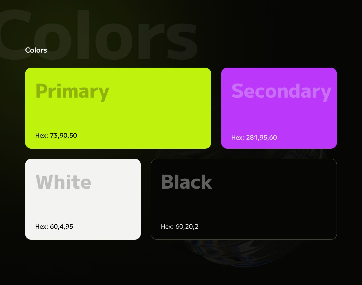
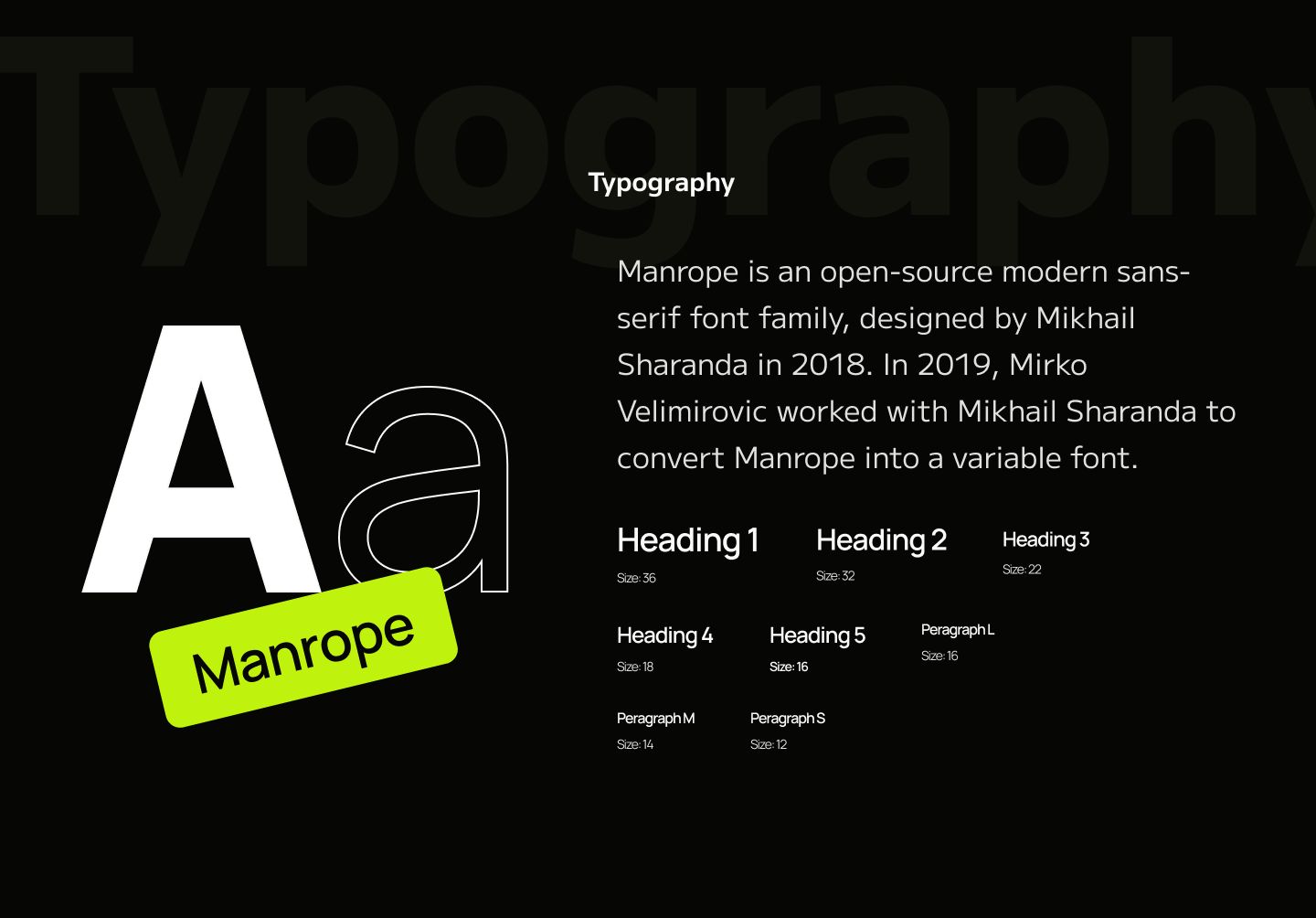
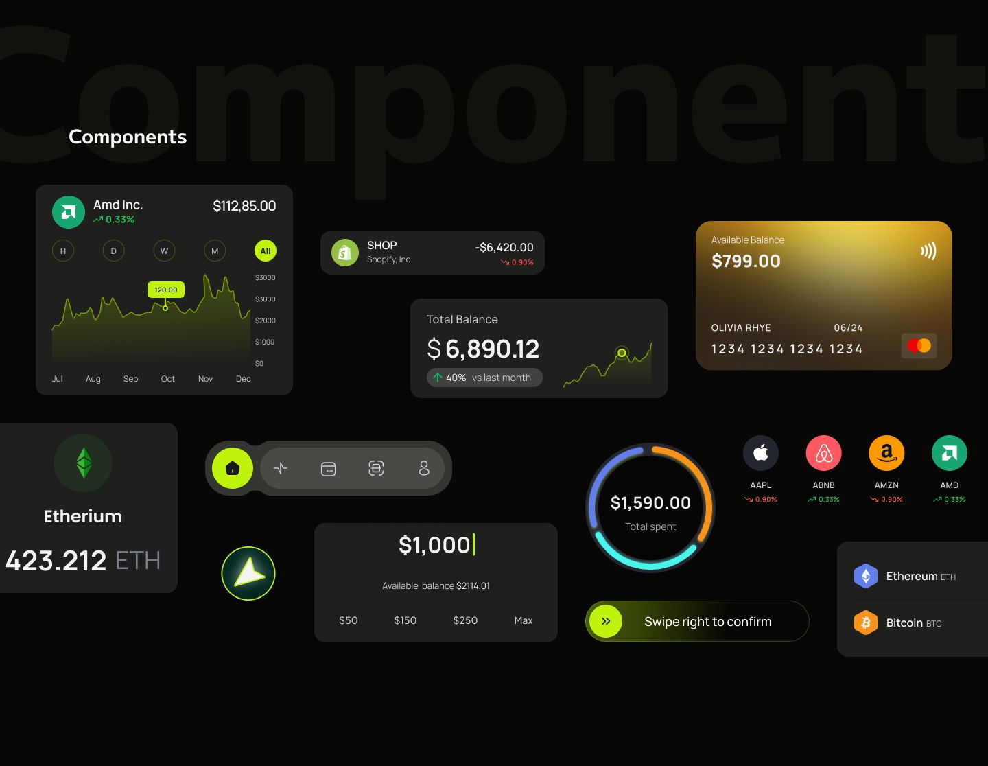
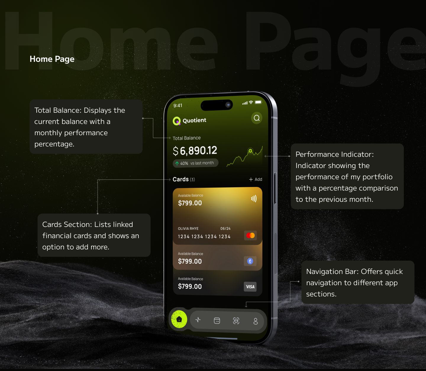
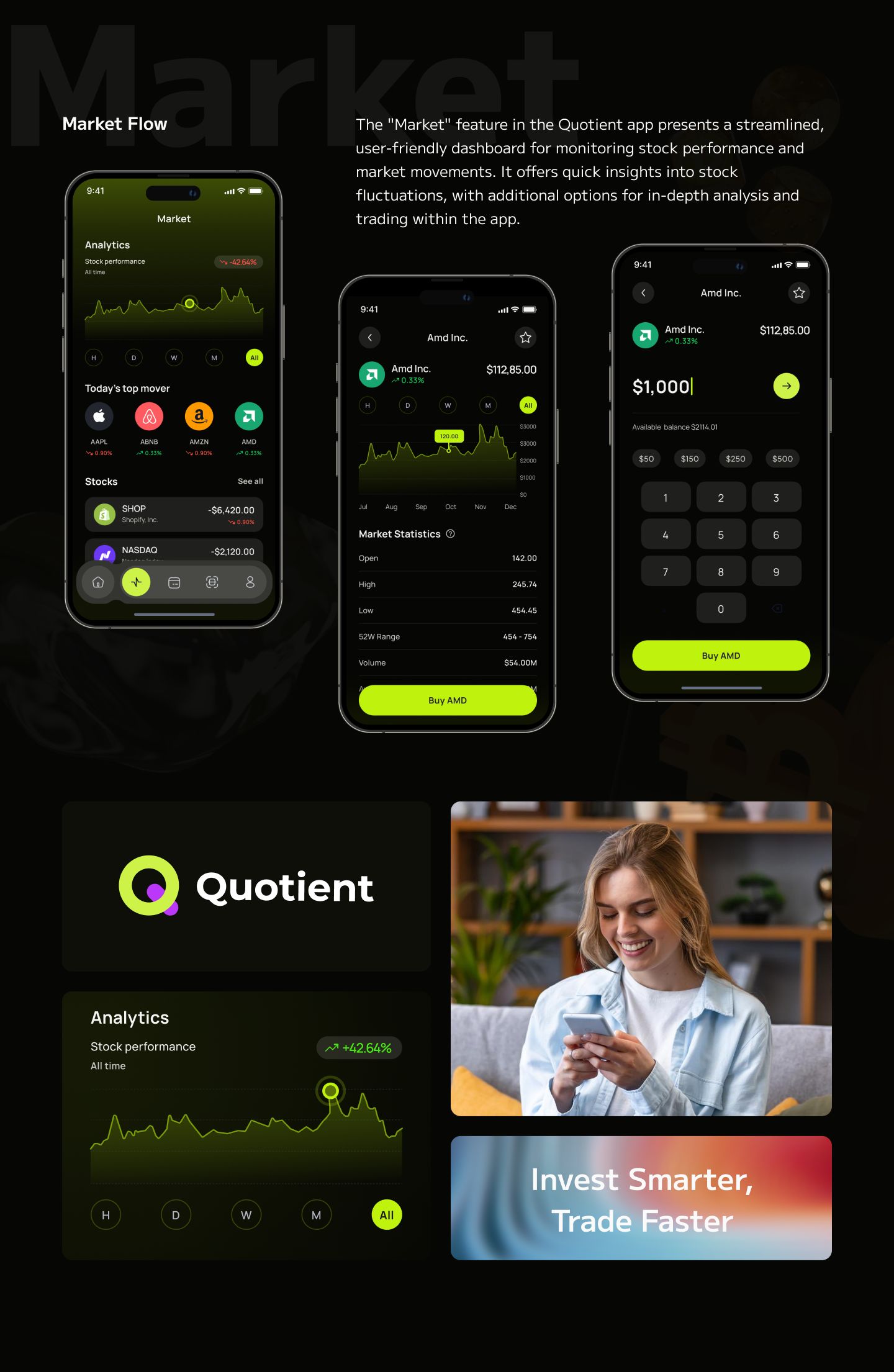
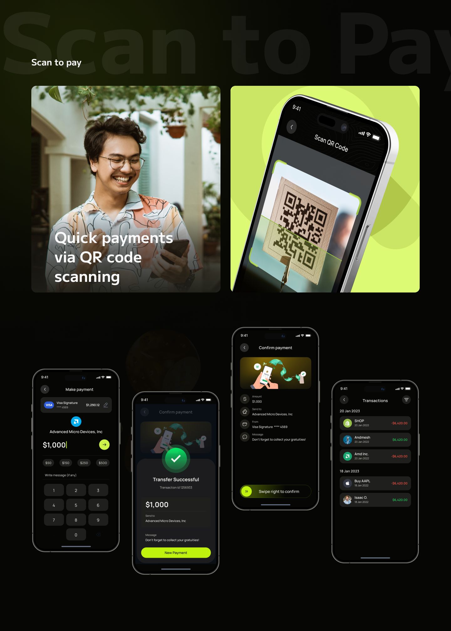
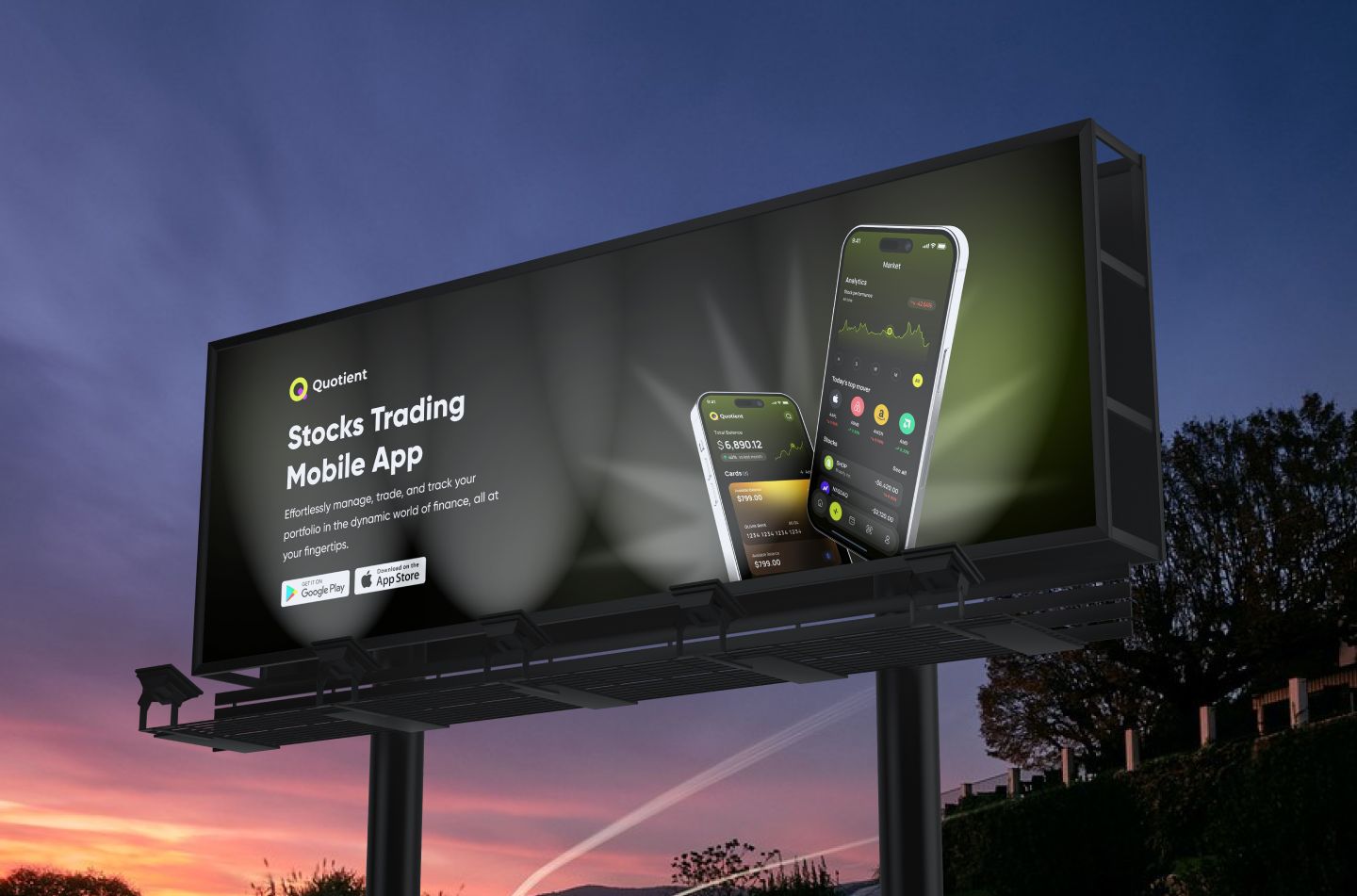
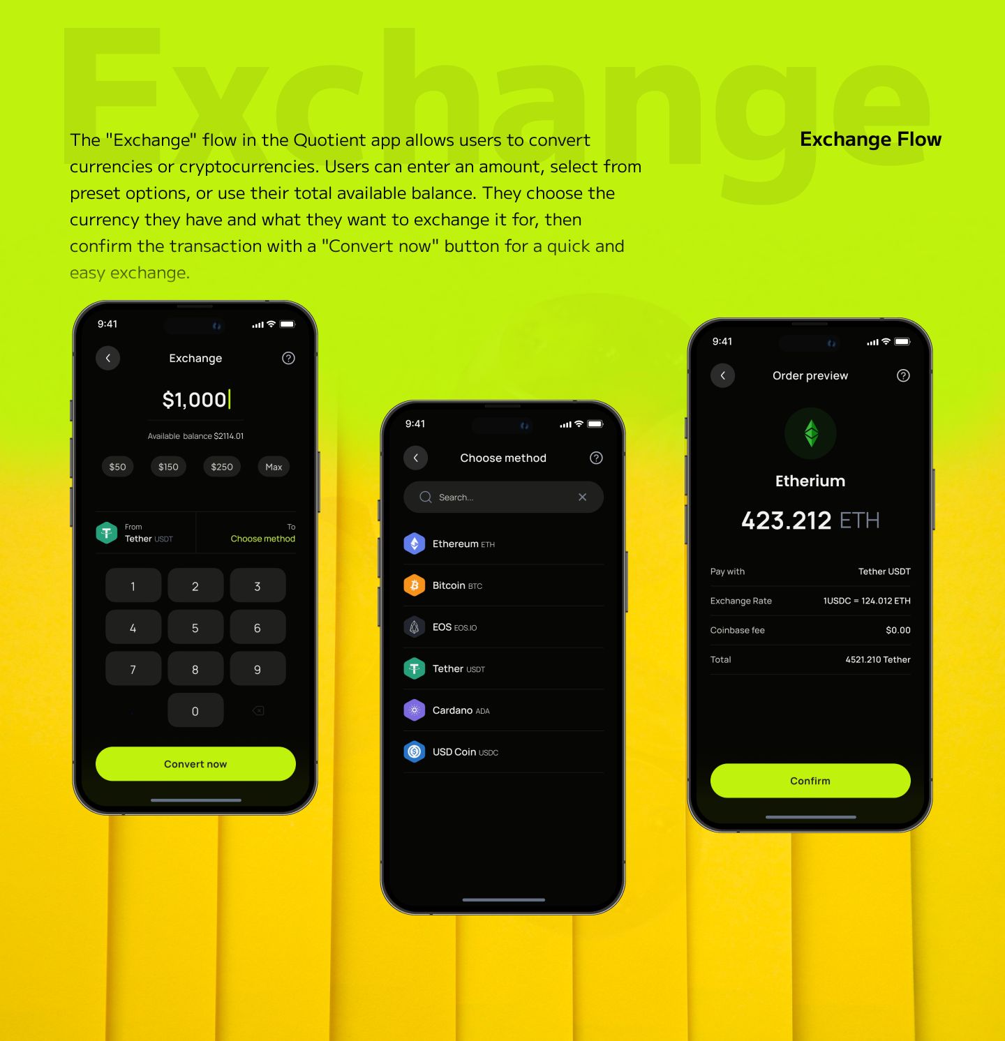
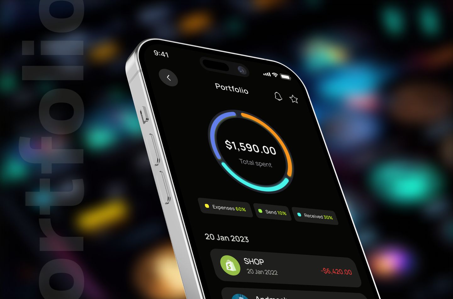
A mobile trading app that makes watchlists, charts and placing an order feel calm and clear for everyday investors.

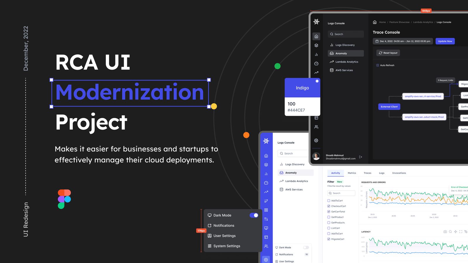
Modernizing a root-cause-analysis interface into a clearer, faster tool for the teams who use it every day.
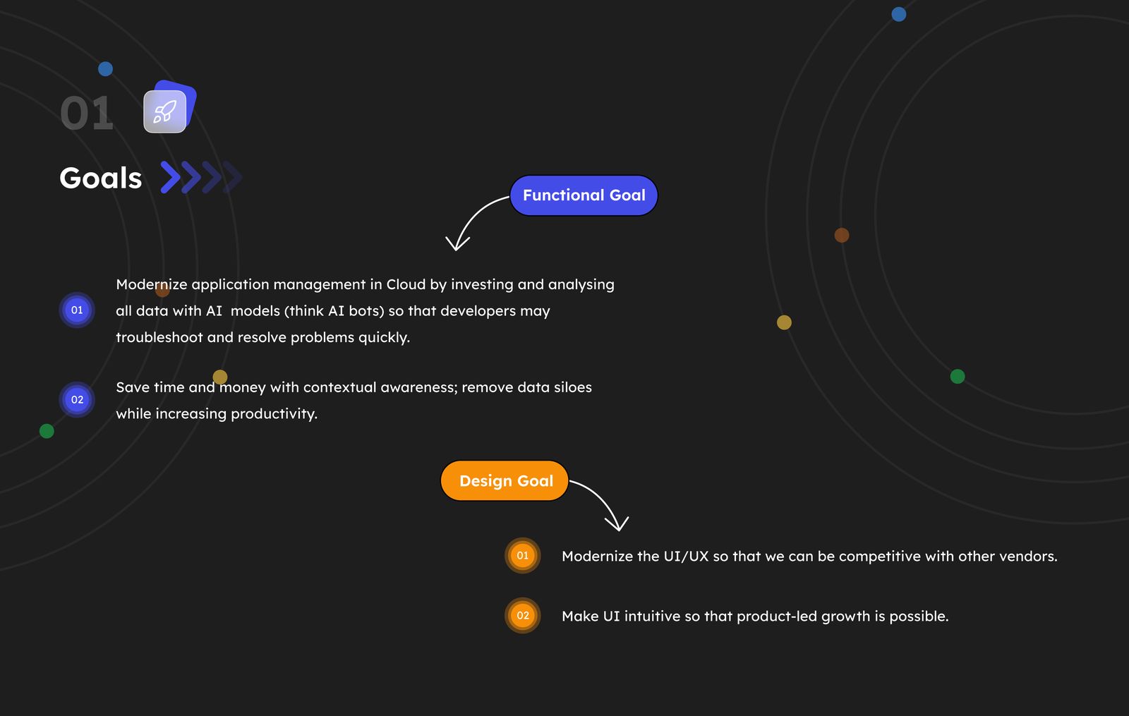
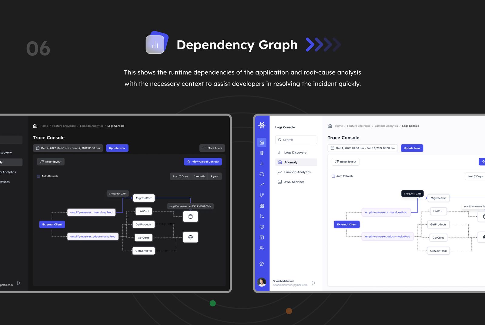
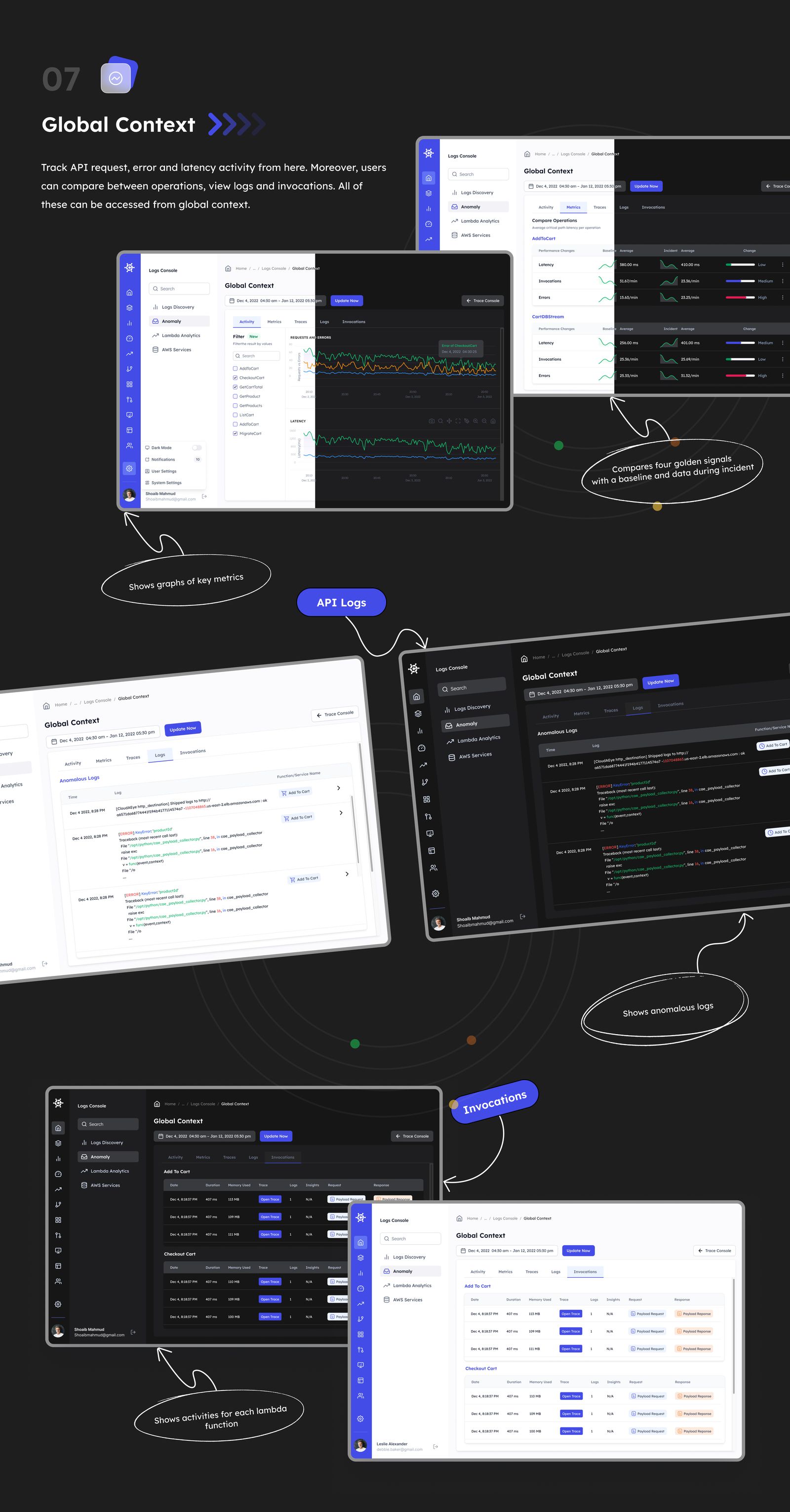
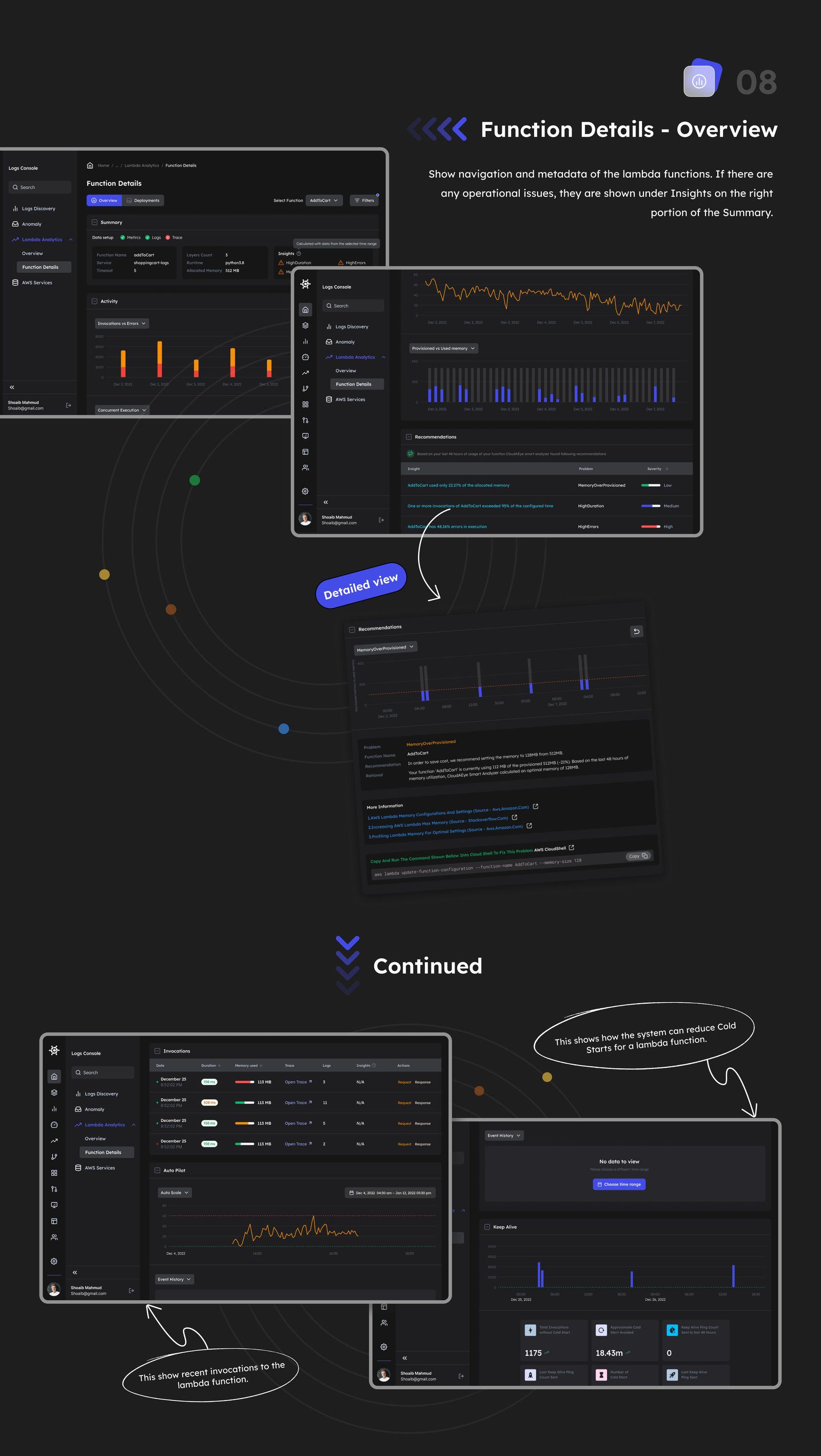
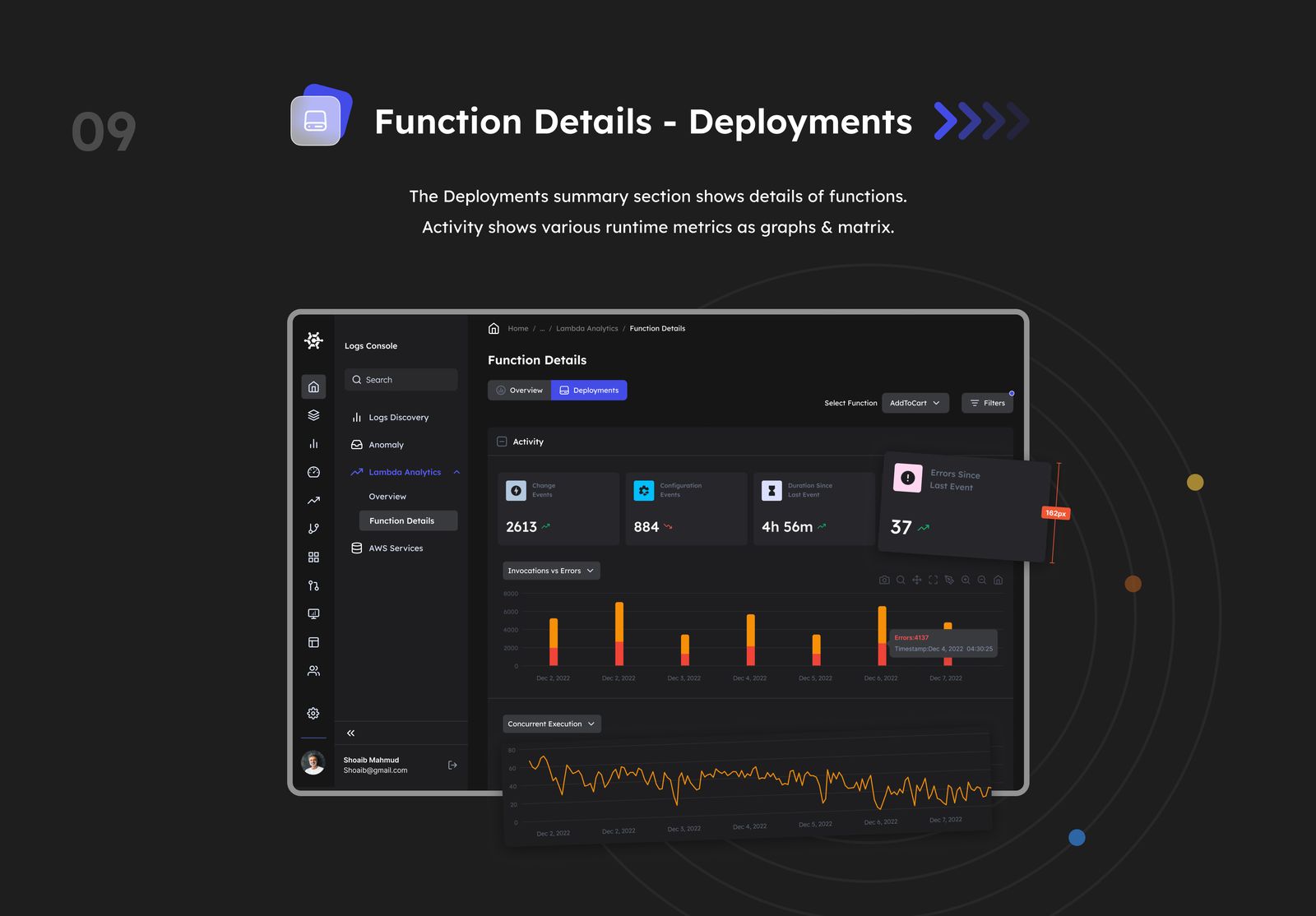
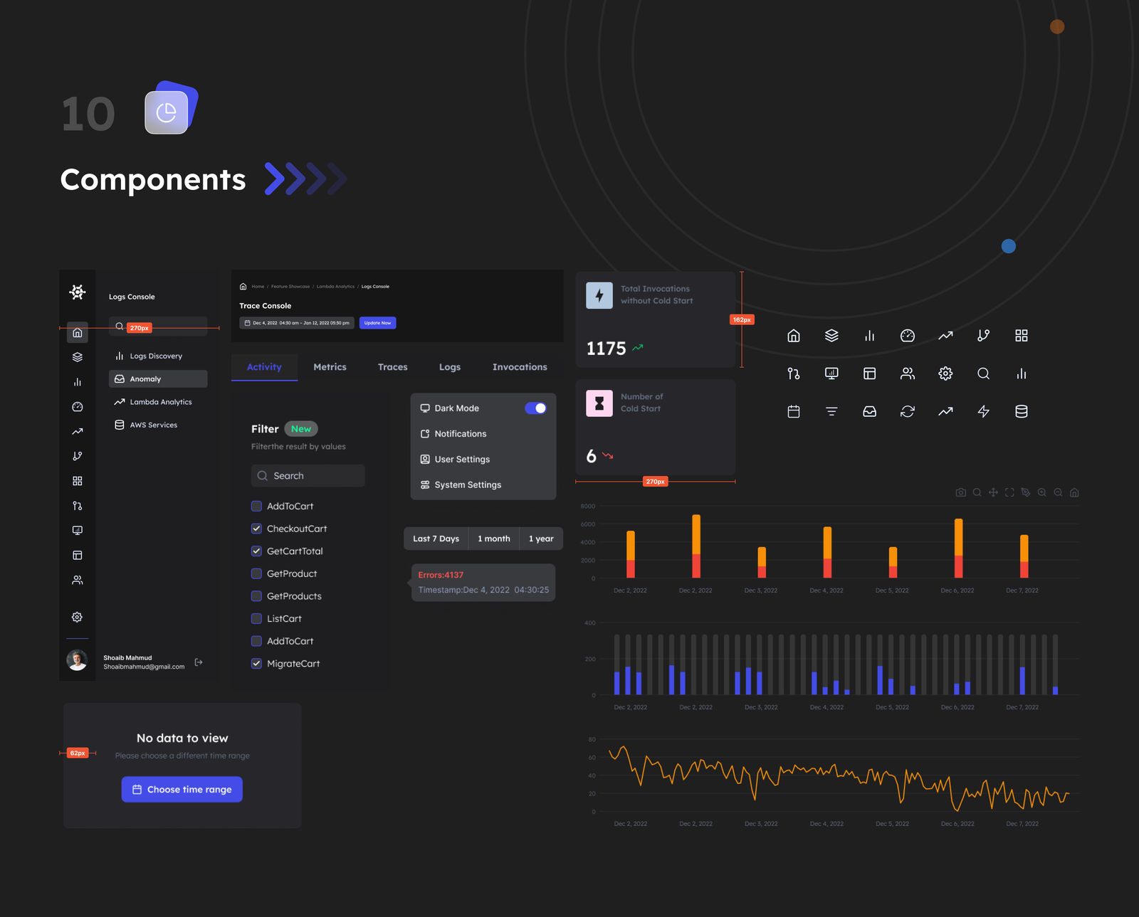

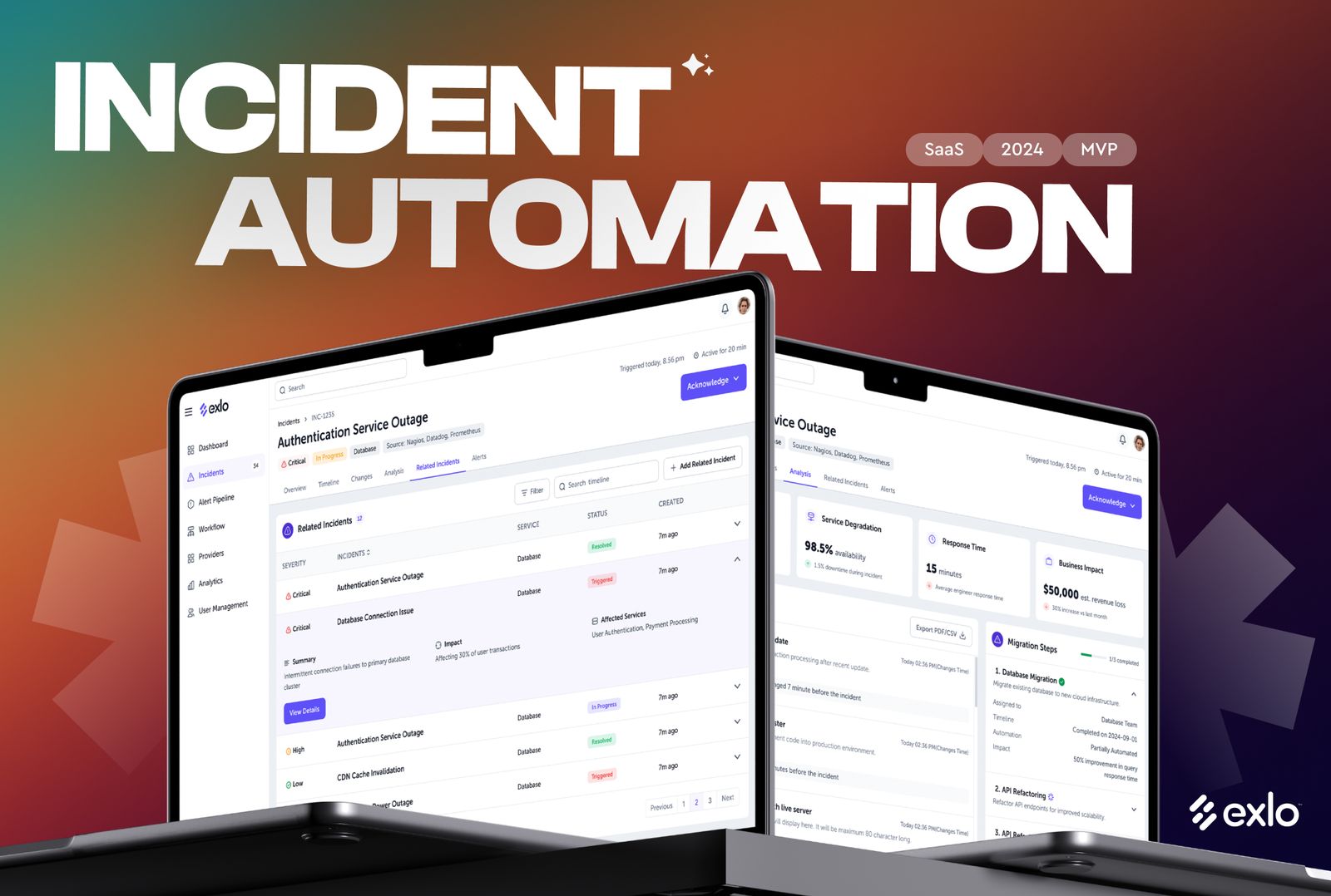
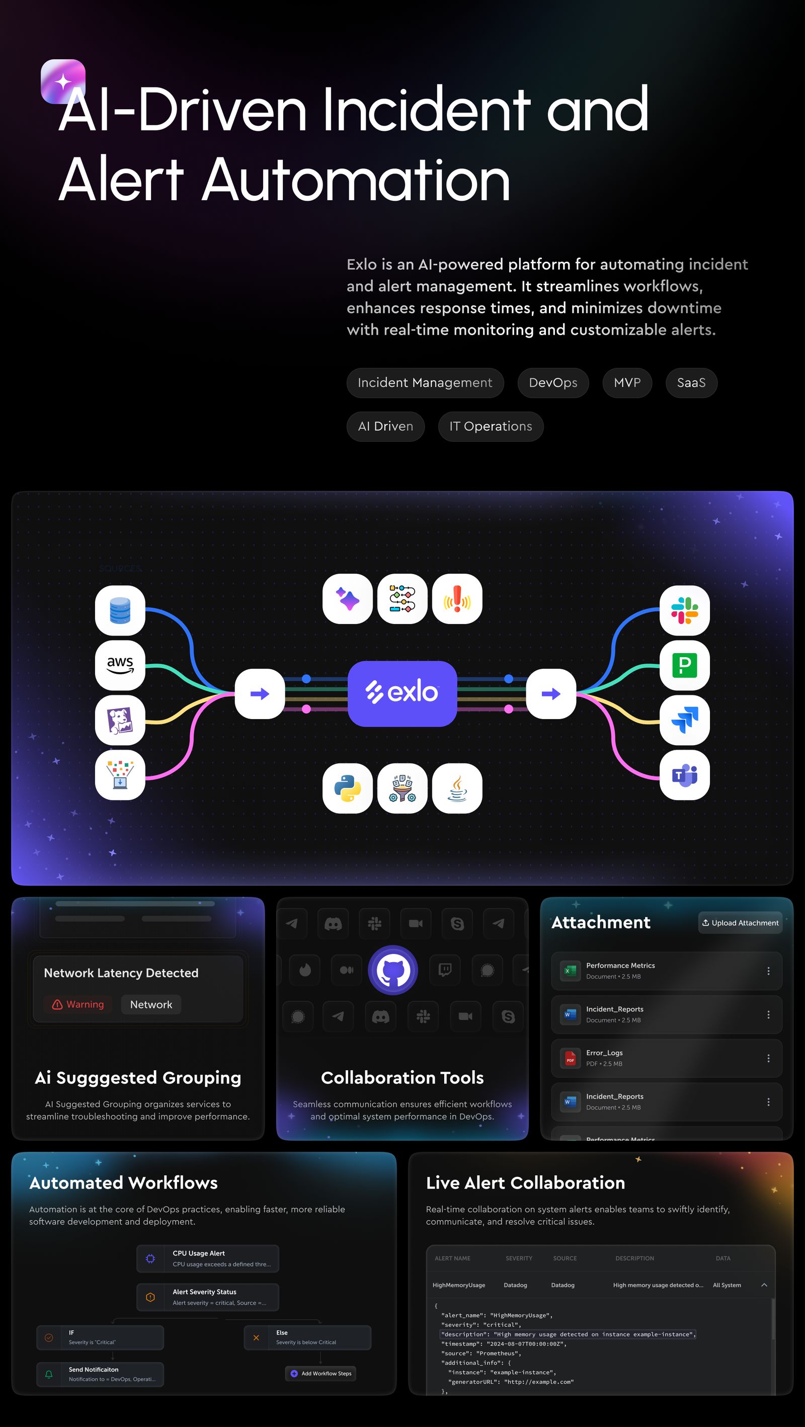
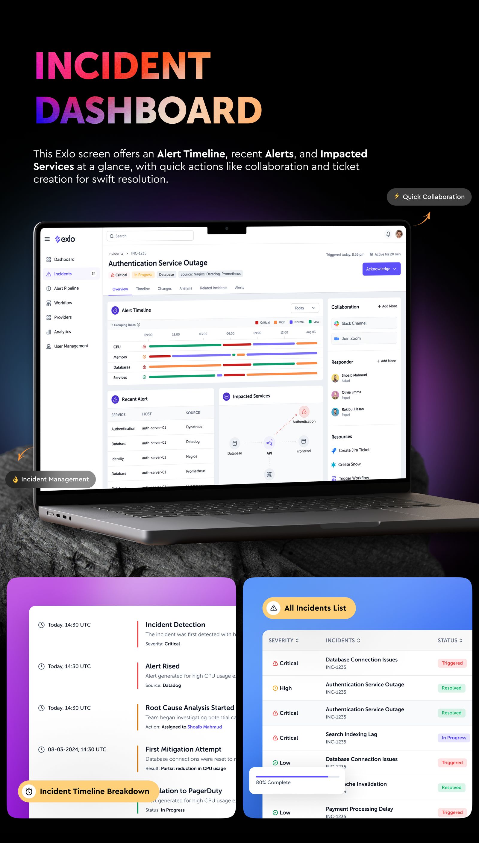
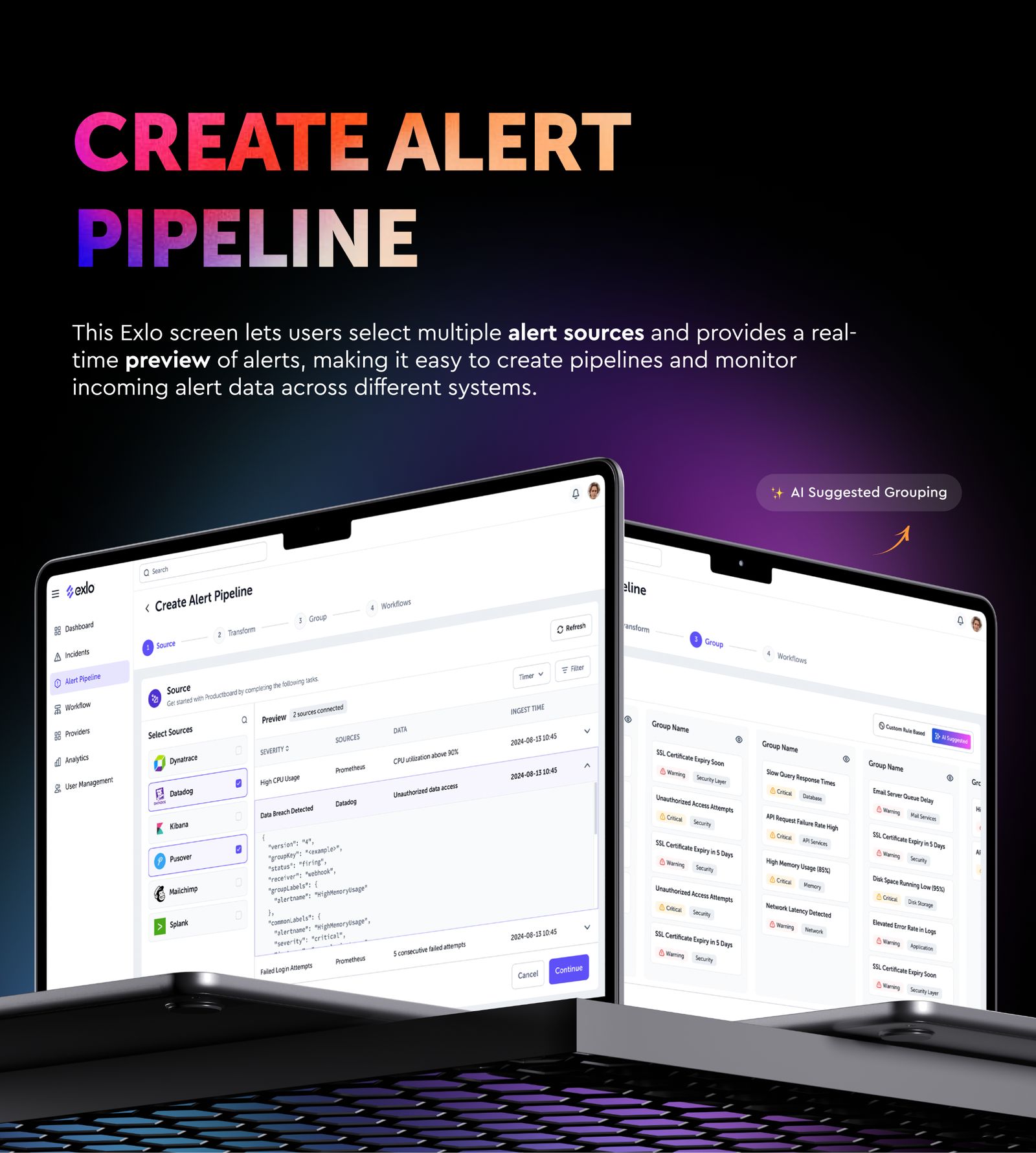
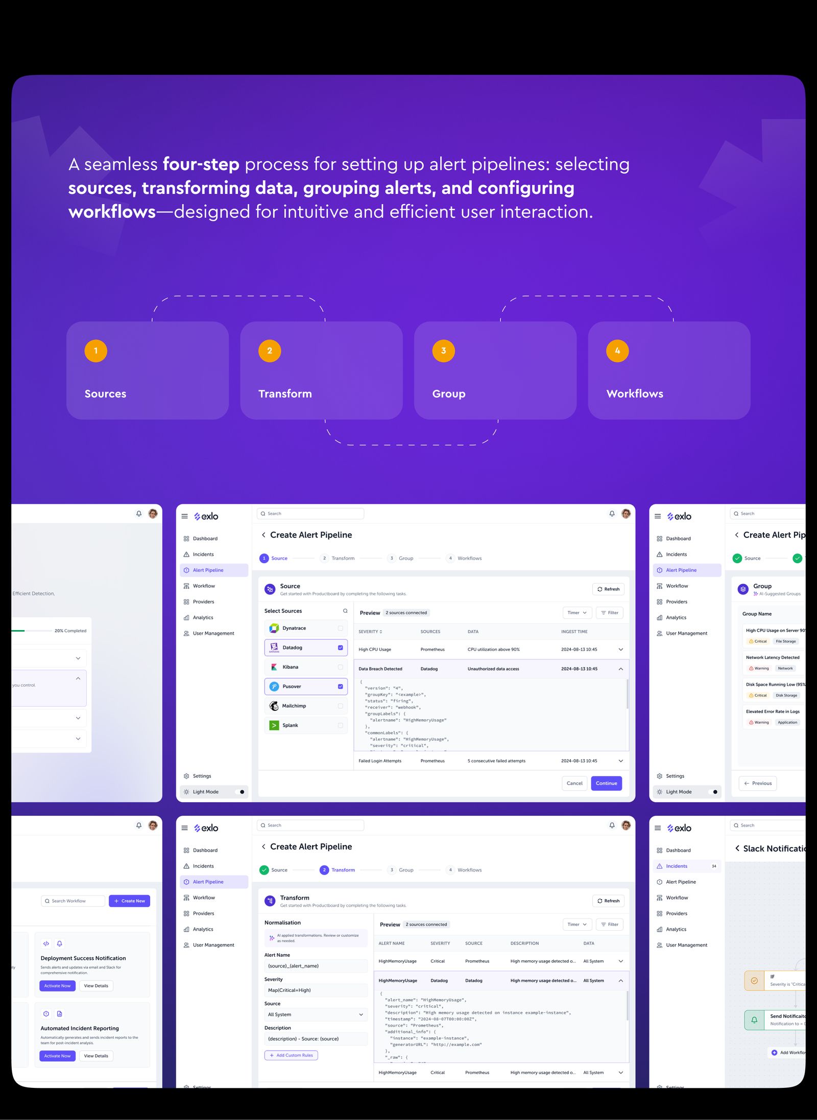
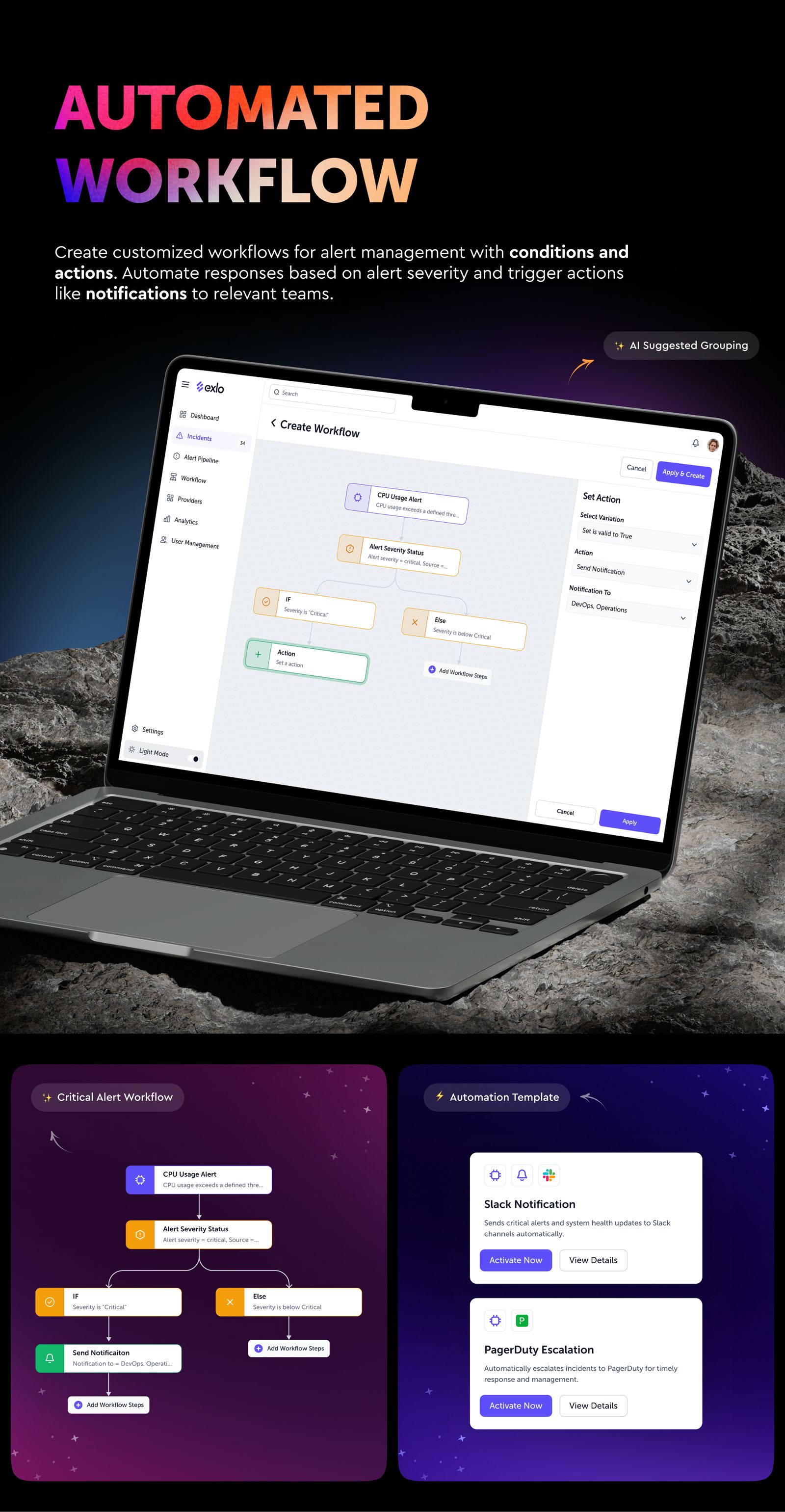
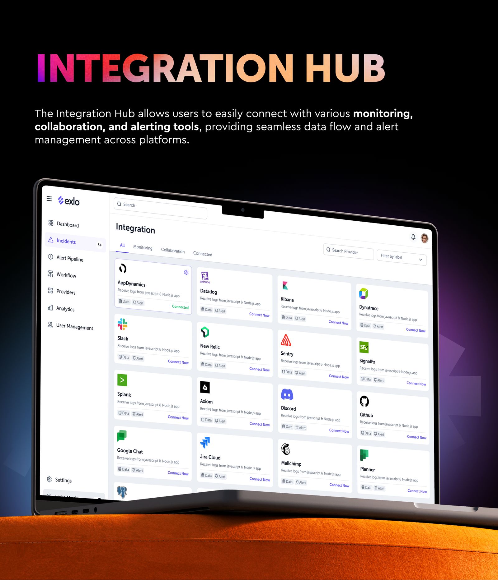
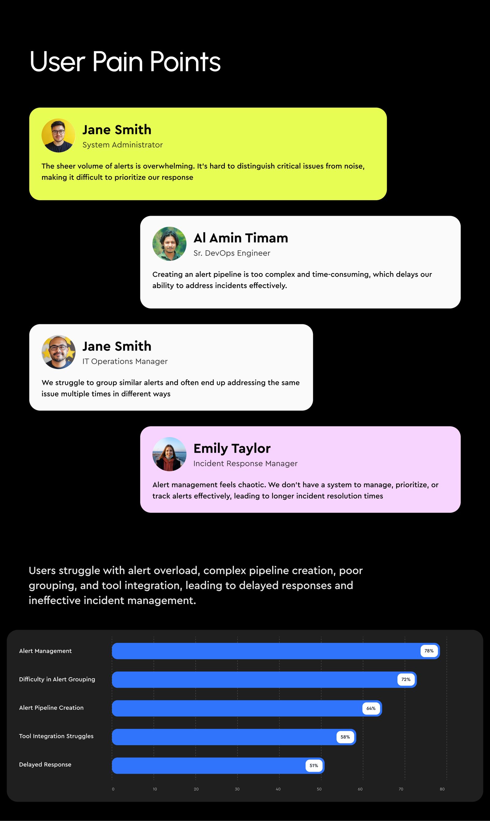
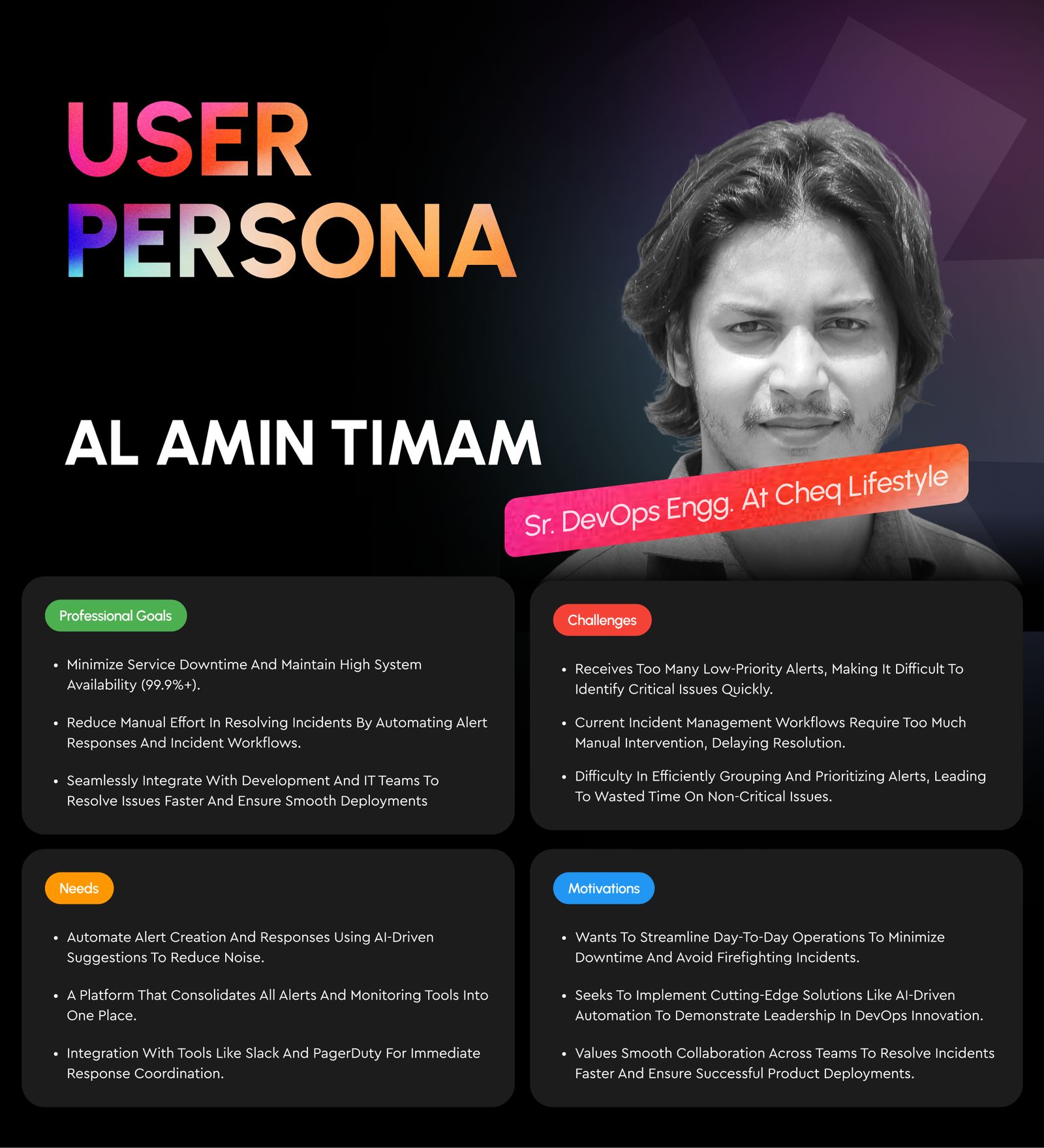
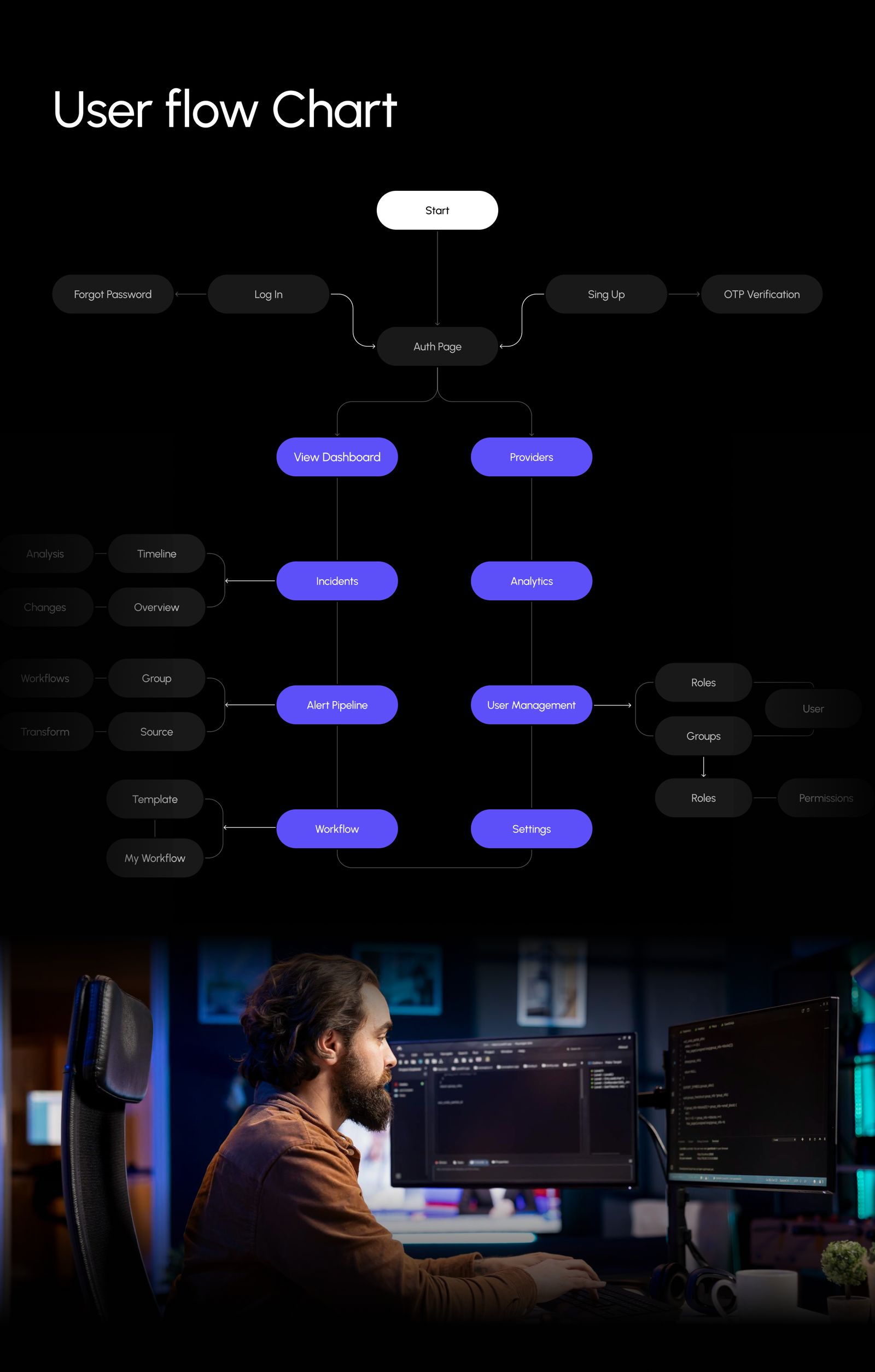
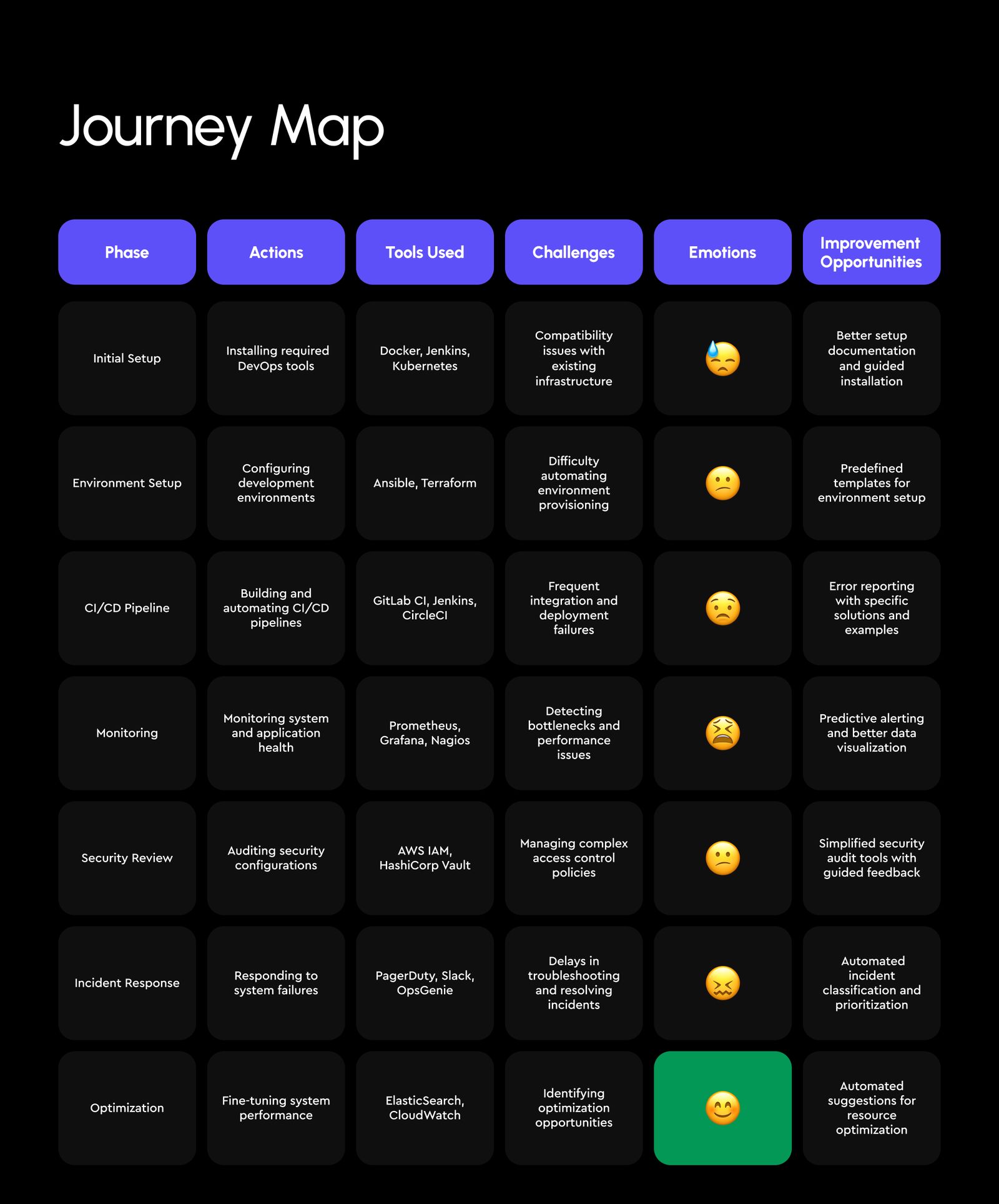
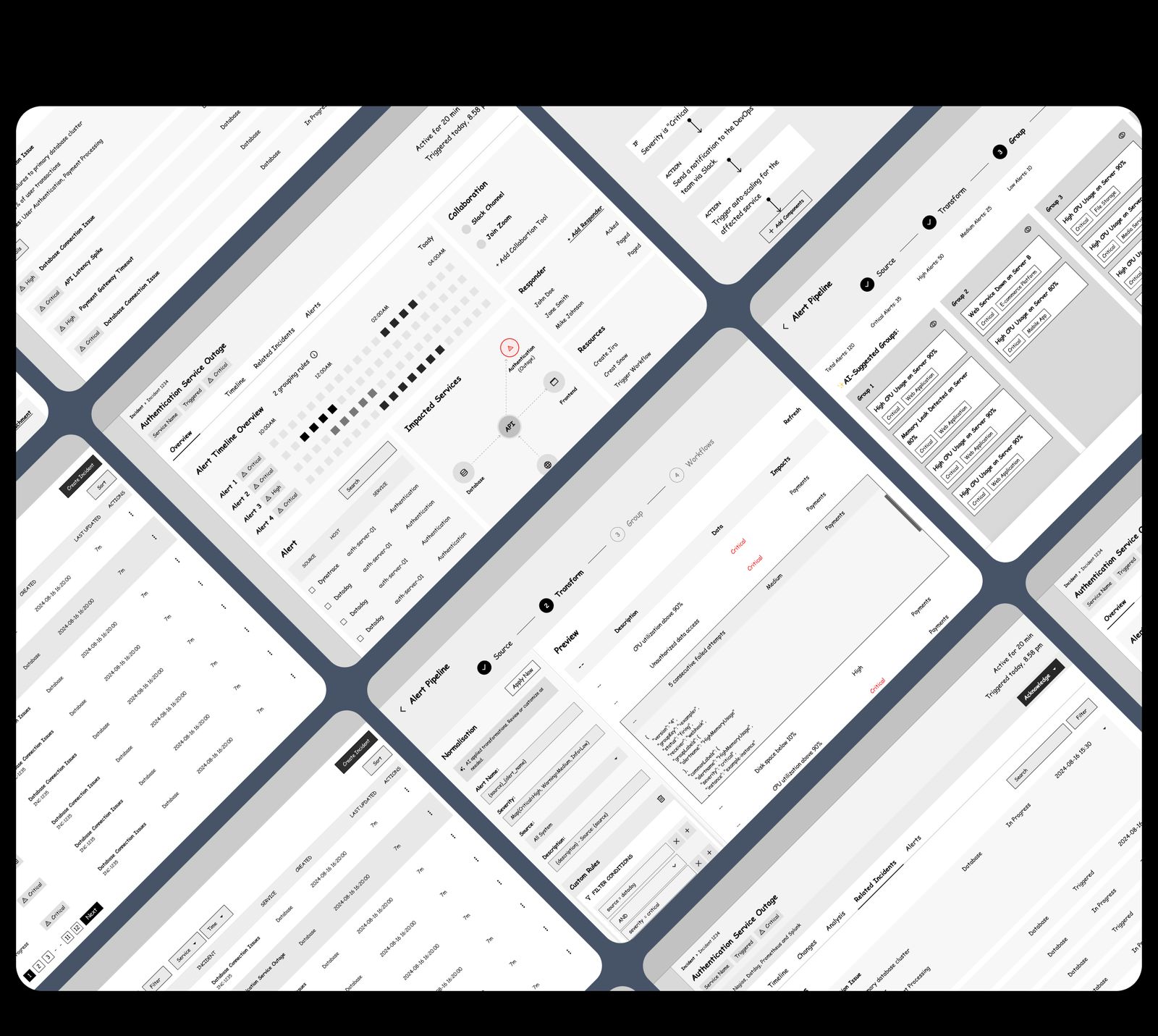
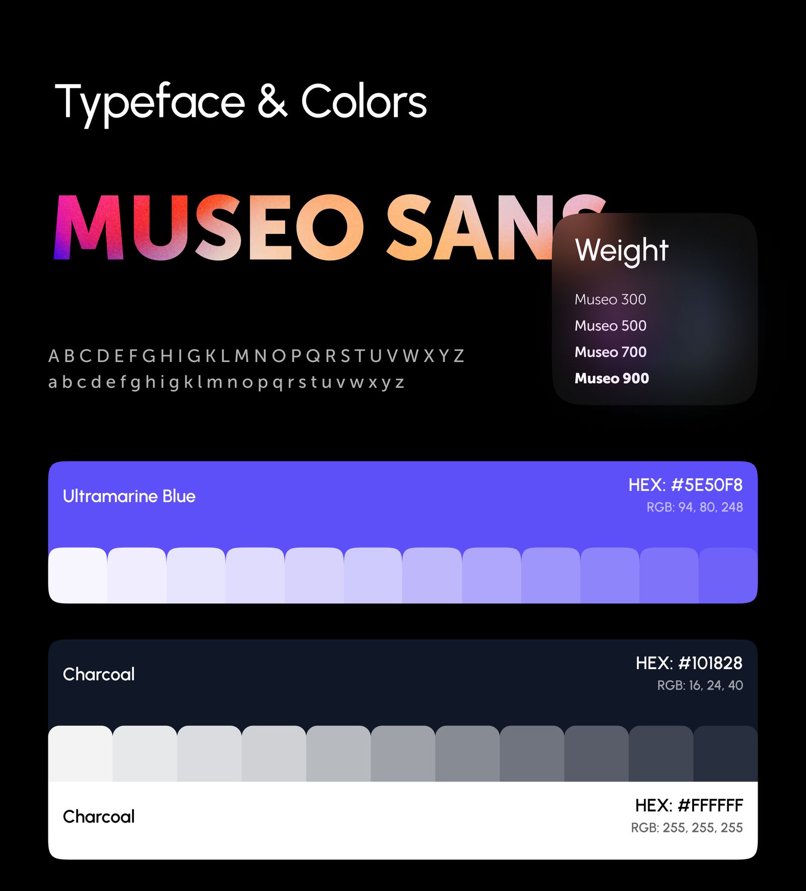
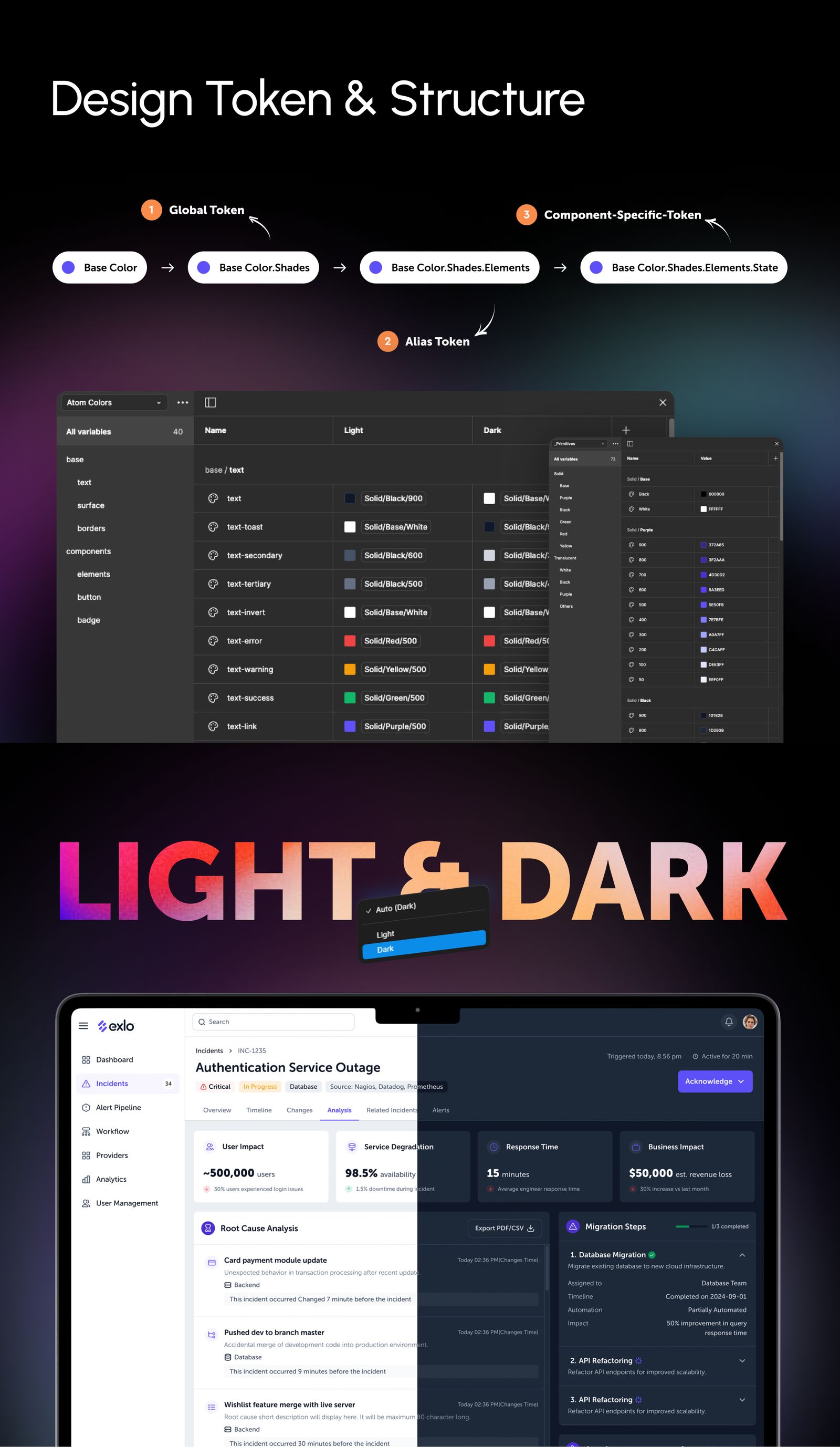
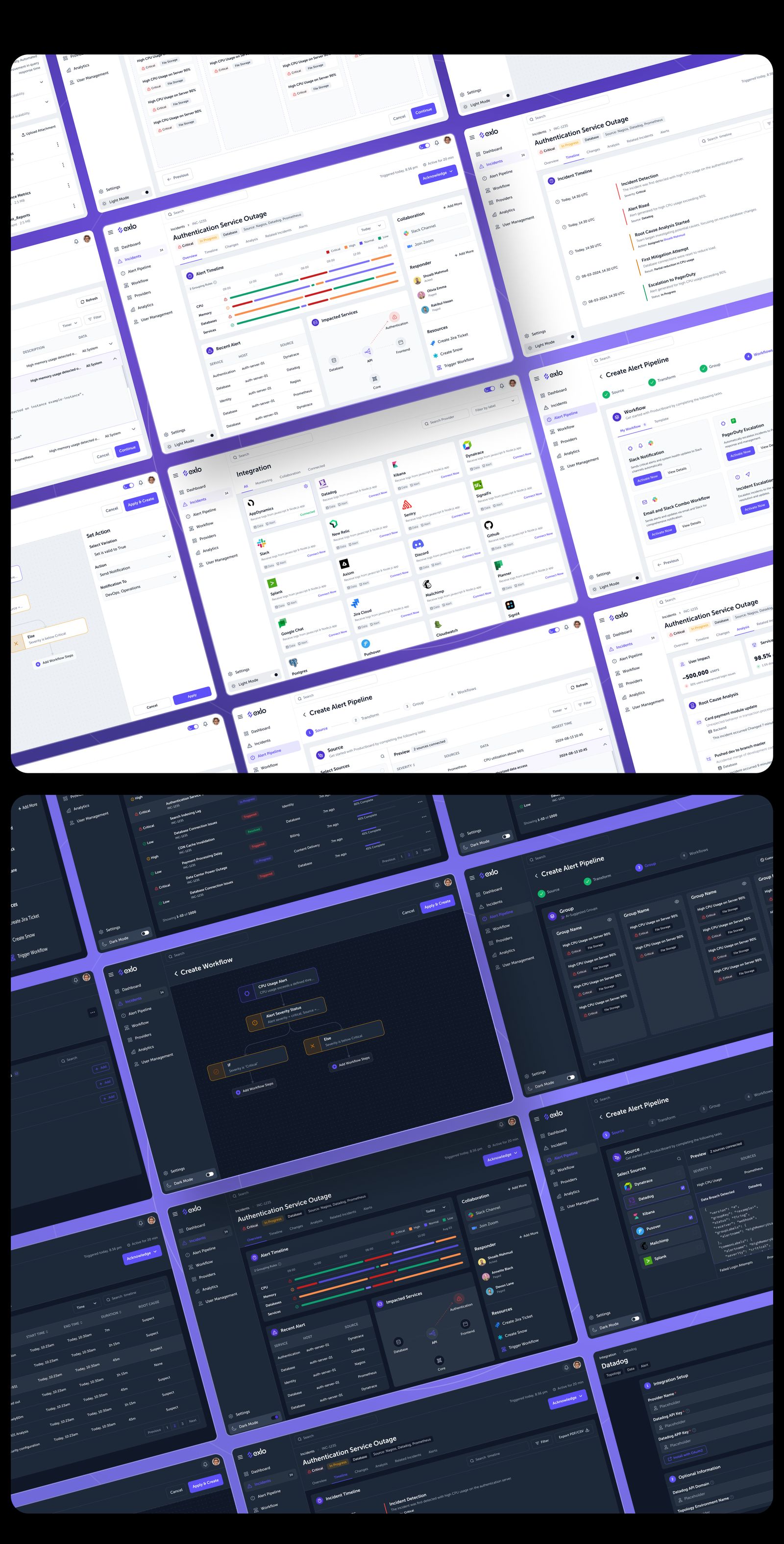
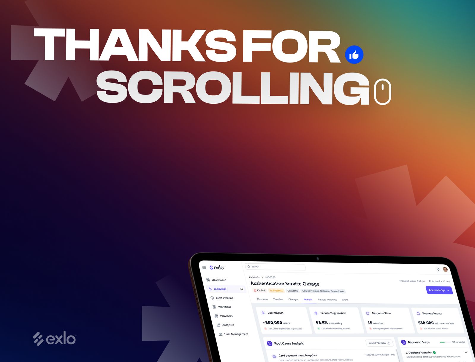
A B2B tool that automates API incident management, so teams can set up real-time alerts and response workflows without the usual configuration pain.


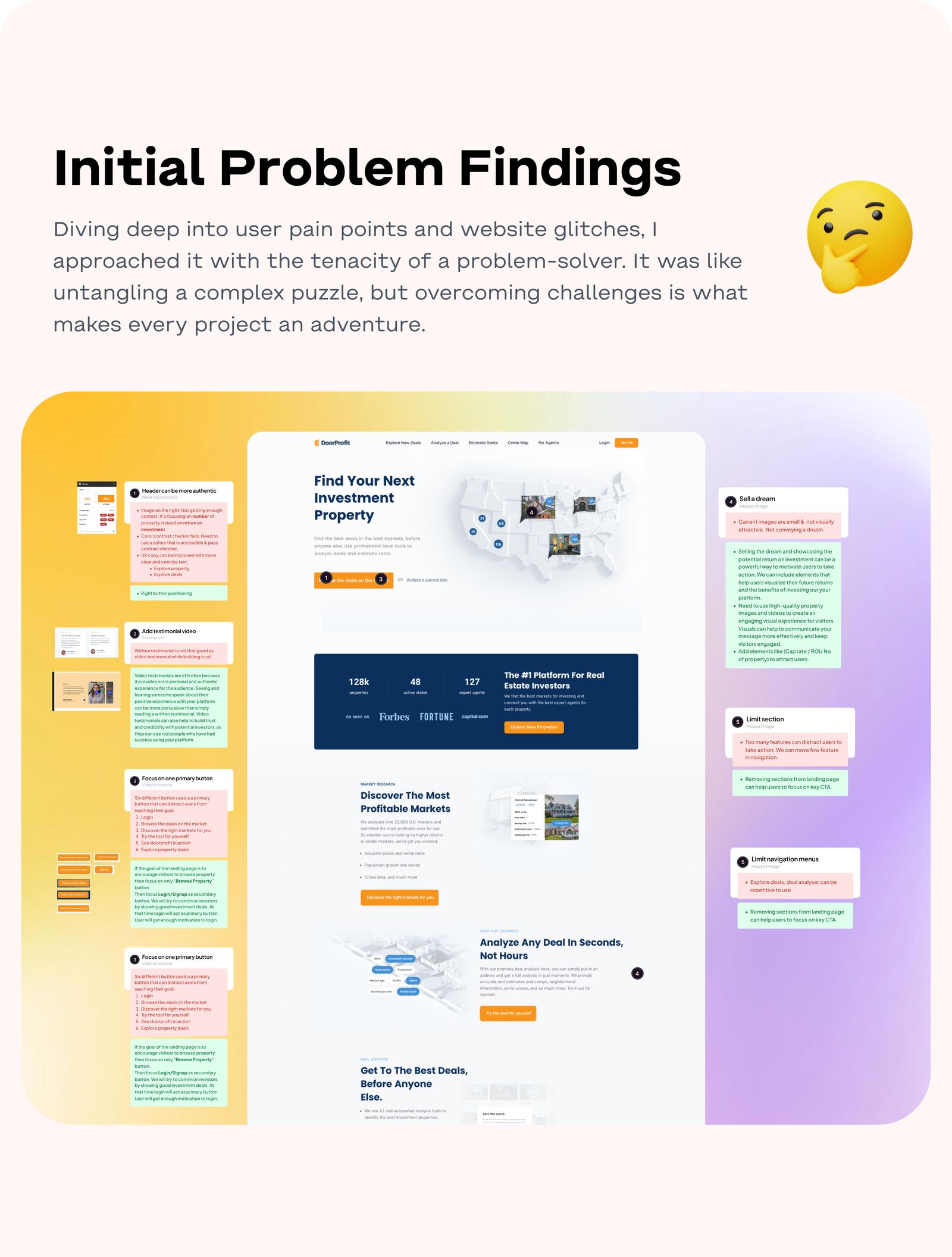
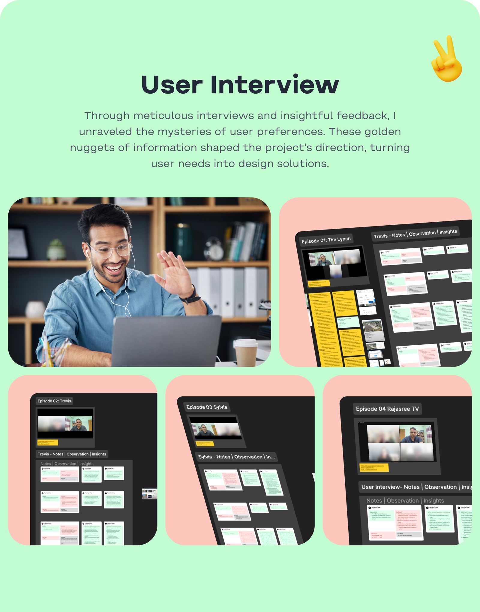
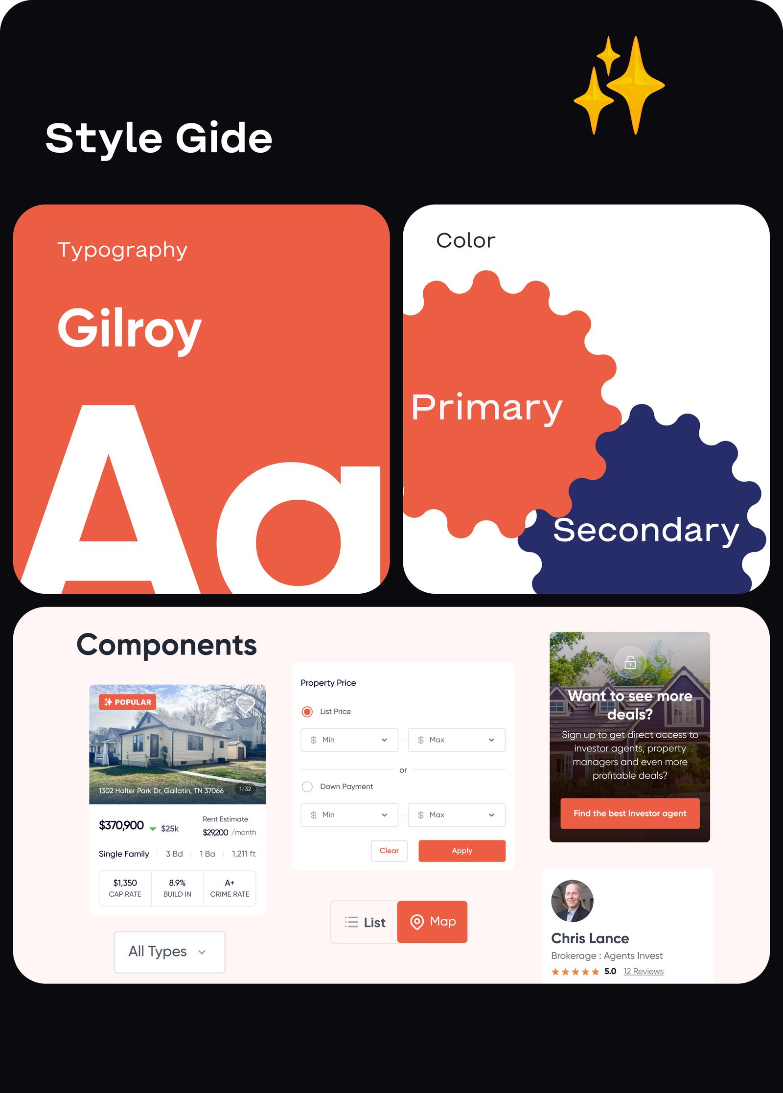
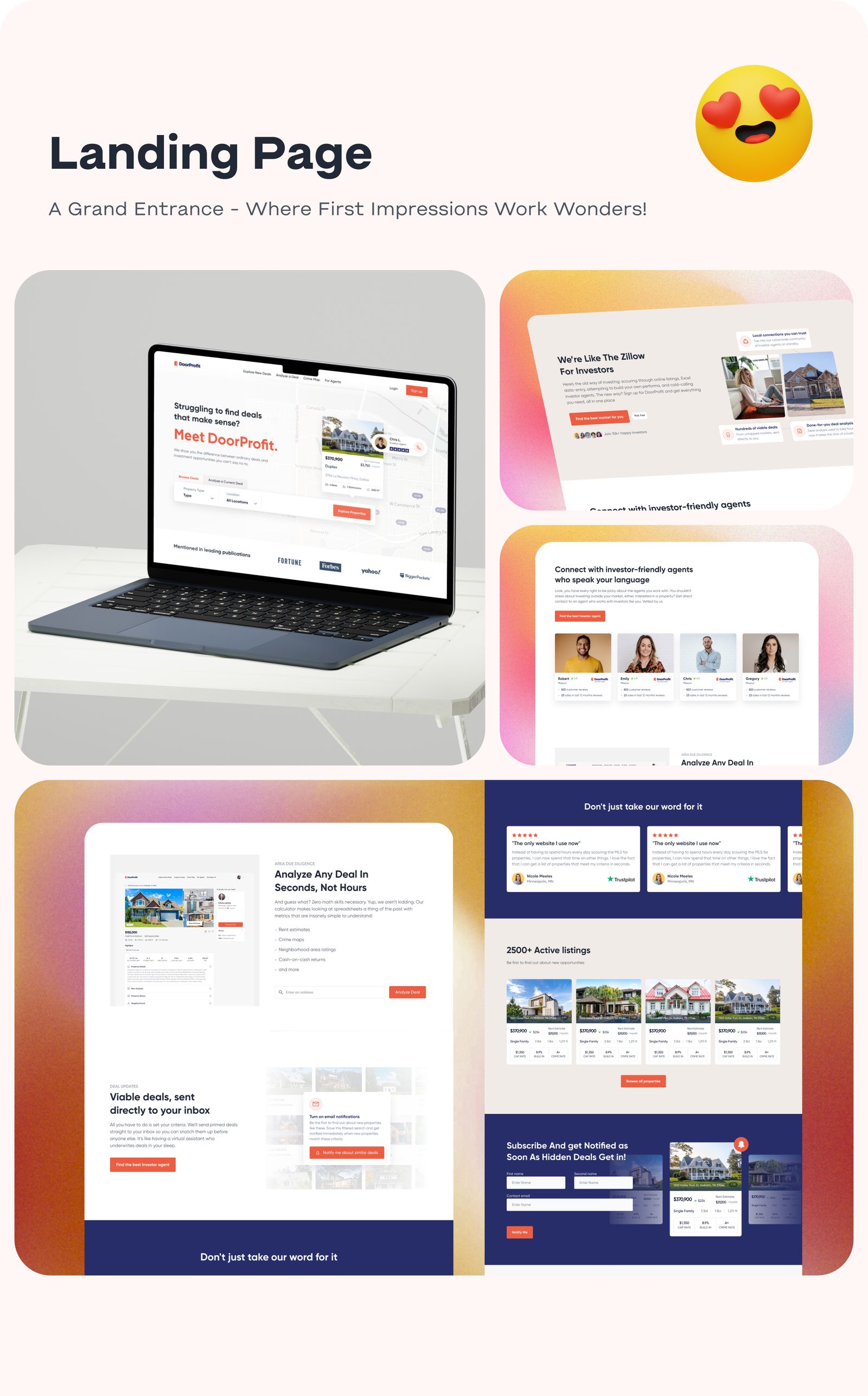
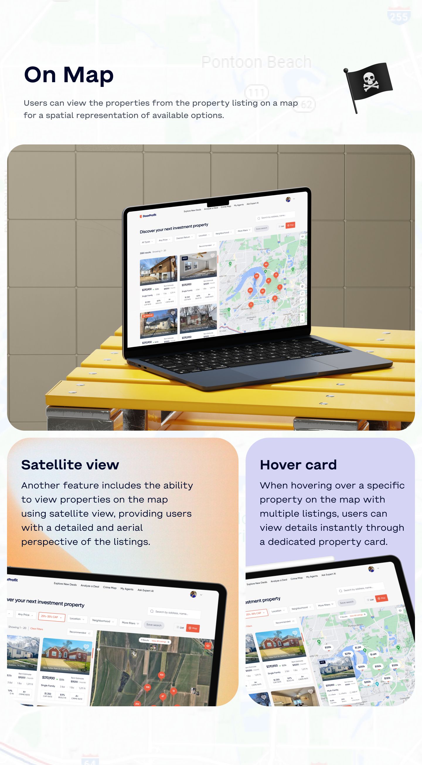
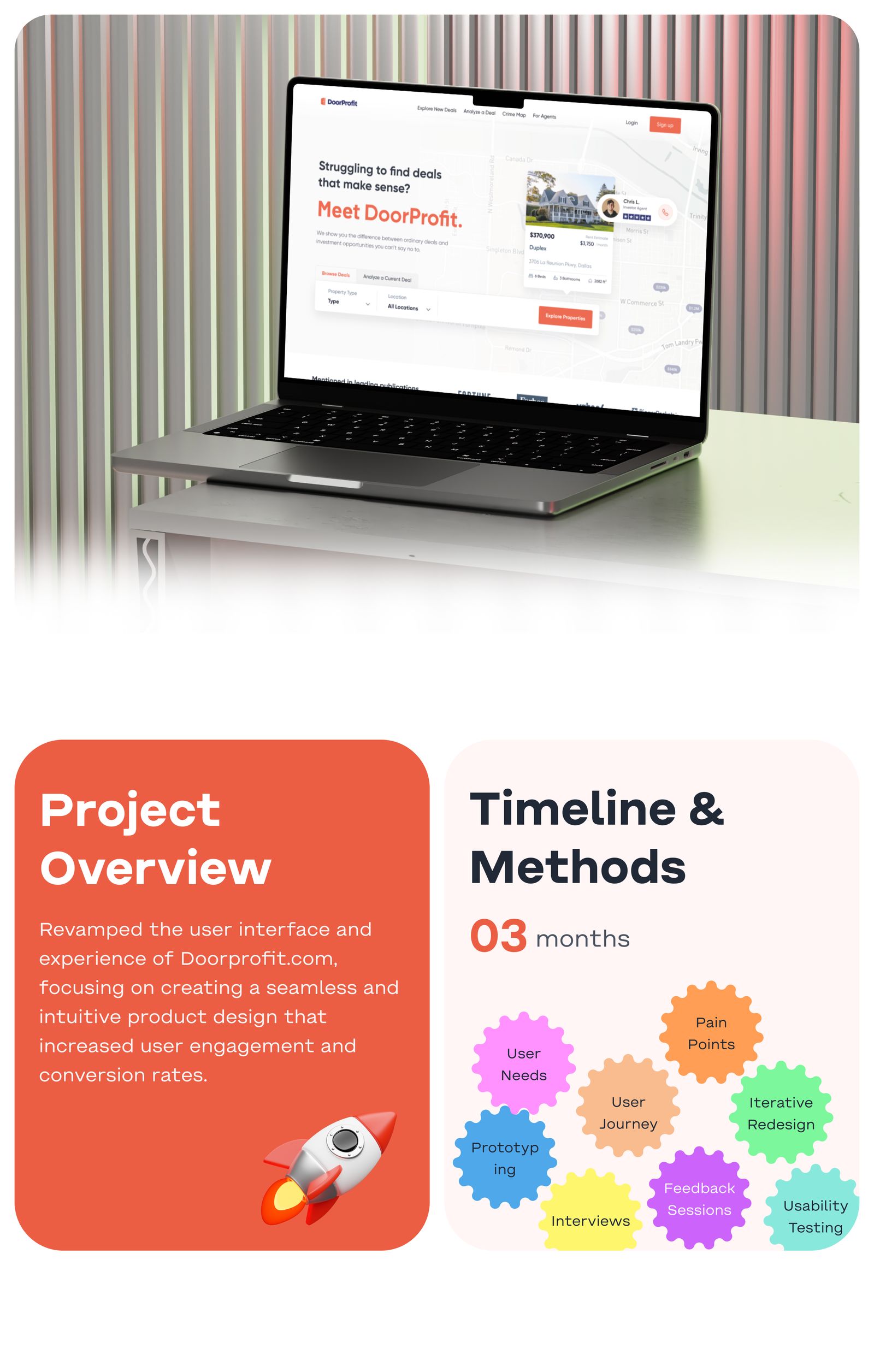
A redesign of a property investment website that makes listings and returns easy to compare for first-time investors.